Links are actions that can be used to navigate or perform tasks.
Overview
As a basic action, Links can be useful when a Button or FAB would be too prominent. Links are great as
From the user experience perspective there is a difference between a Link and Button. Buttons should be used when you are performing tasks such as: "Create new", "Submit", "Upload", etc. Link usage should be based on navigating to another place, such as: "Explore data", "Profile settings", "Subscribe to our newsletter", etc.
Usage
- A basic navigable element
- A tertiary-level action in a group of actions
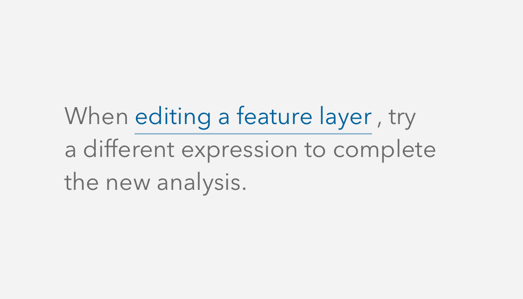
- An inline action in a sentence
Sample
Accessibility
Use unique Link text to provide a purpose to assistive technologies and a larger audience. Avoid Link text such as "Click here" or "Learn more", which can be confusing to assistive technologies and users that are not provided with proper context.
<calcite-link href="https://developers.arcgis.com/calcite-design-system/get-started/">
Get started with Calcite
</calcite-link>Opens in a new window or tab
It is strongly recommended to provide users with guidance when a Link opens in a new window or tab in support of WCAG's Success Criterion's 3.2.1: On Focus and 3.2.2: On Input. Both success criteria are defined as level A conformance, or the minimum level of conformance.
To communicate the guidance to users, provide context with Link's default slot when it opens in a new window or tab.
<calcite-link href="https://developers.arcgis.com/calcite-design-system/" target="_blank">
Calcite Design System (opens in a new window)
</calcite-link>Keyboard navigation
| Key | Function |
|---|---|
Enter | Presses the component. |
Tab | Moves focus in and out of the component. |
Tab and Shift | Moves focus in and out of the component. |
Writing and copy
