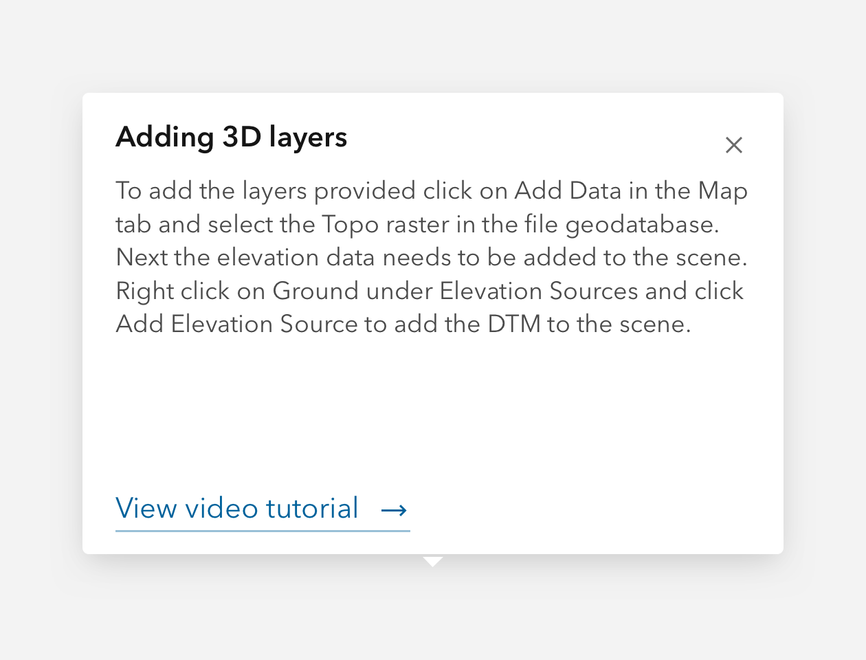
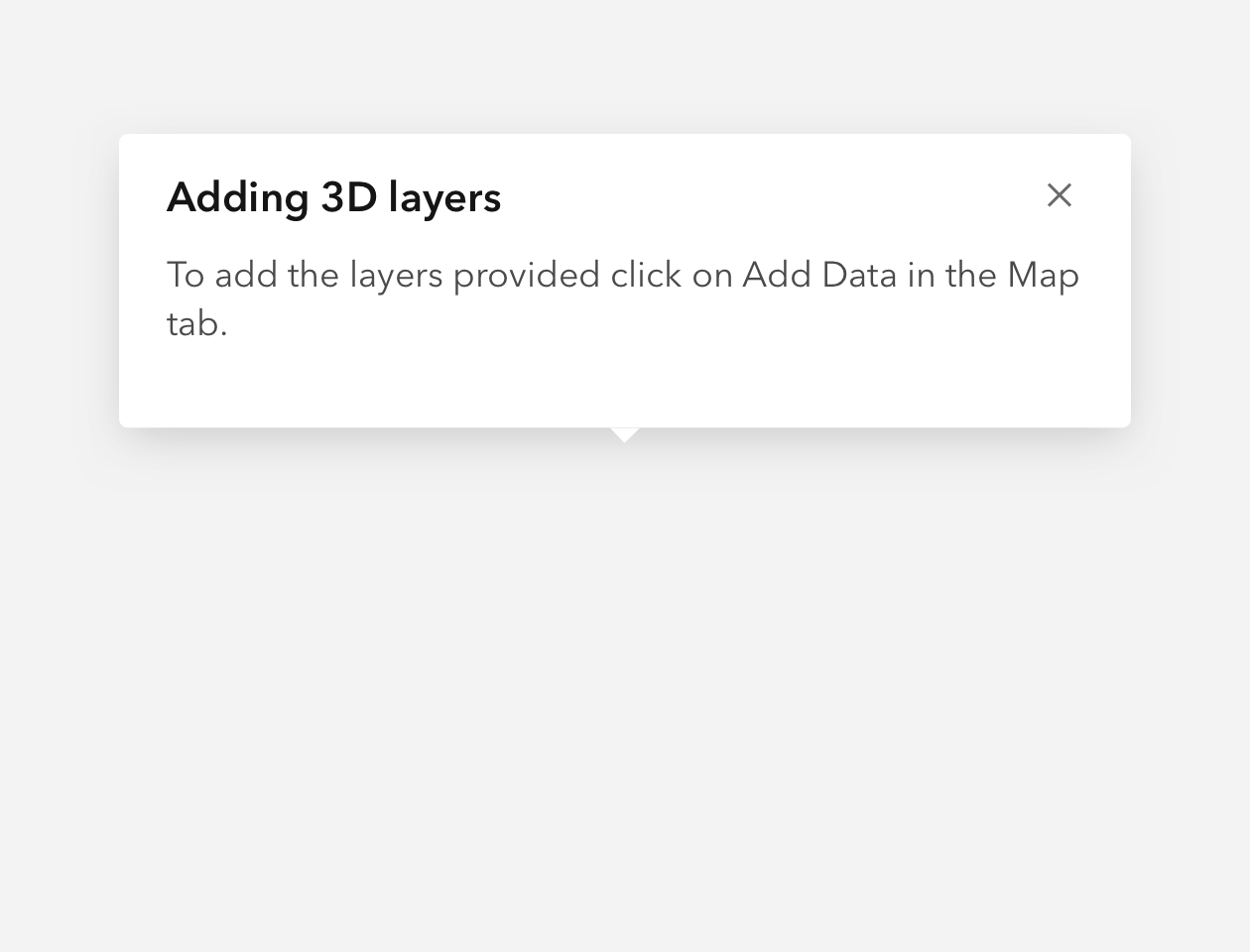
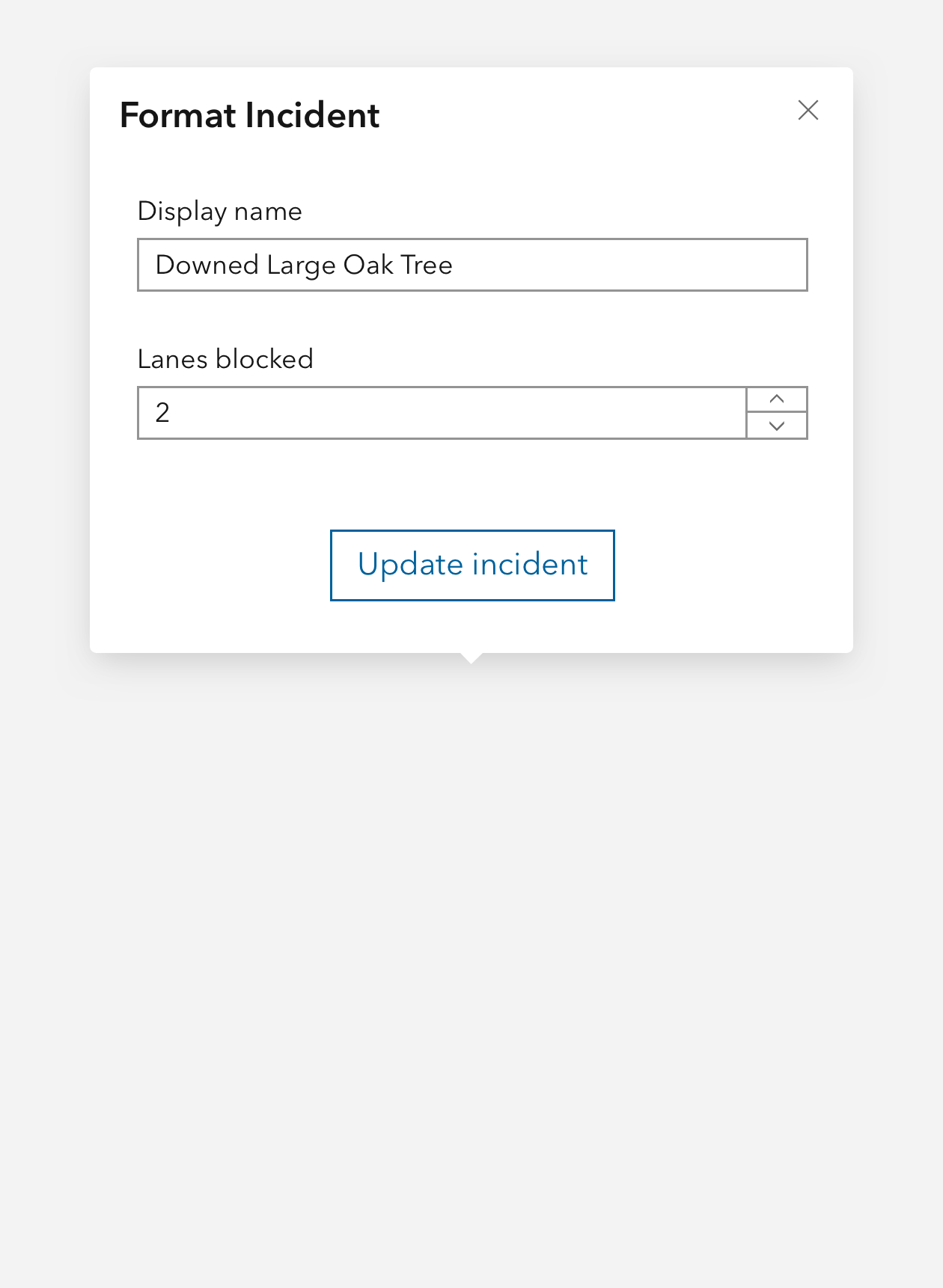
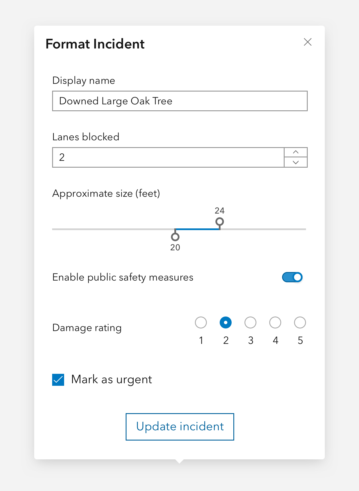
Popovers are floating, dismissible containers for small to medium amounts of content and interactions.
Overview
Popover is useful for providing non-critical interactions in space restrained workflows, which float over other elements in the z-axis. Avoid putting large amounts of content and using scrollbars in Popovers. Popover positioning can be automatic or set manually by using the placement or overlay properties respectfully.
It is recommended to place Popovers shallowly in the DOM.
For minimal text-only content, consider using Tooltip. For workflows that require more space and focus, consider using Dialog.
Usage
- Secondary workflow support that can be invoked from an action
- Descriptions of content
- A few contextual actions or inputs to modify an element
- Clicking an element to show date, author, or other relevant details
Sample
Best practices
Below are important guidelines on using the Popover component.


Accessibility
Focus order
The Popover's focus will navigate content sequentially to preserve meaning and expected use in support of Success Criterion 2.4.3: Focus Order. For this reason the first element depicted visually in the Popover will recieve keyboard focus, such as the component's close button (default).
Keyboard focus
It is strongly recommended to have focusable elements cycle through Popover where focus is false (default) to support assistive technology users. The expected behavior for assistive technologies is while the component is open only the contents and focusable elements are accessible.
Keyboard navigation
| Key | Function |
|---|---|
Tab | Moves focus to next focusable element. If the current focus is the last element and focus is false, focus will cycle to the first element. |
Tab and Shift | Moves focus to previous focusable element. If the current focus is the first element and focus is false, focus will cycle to the last element. |
Esc | Closes the component. |