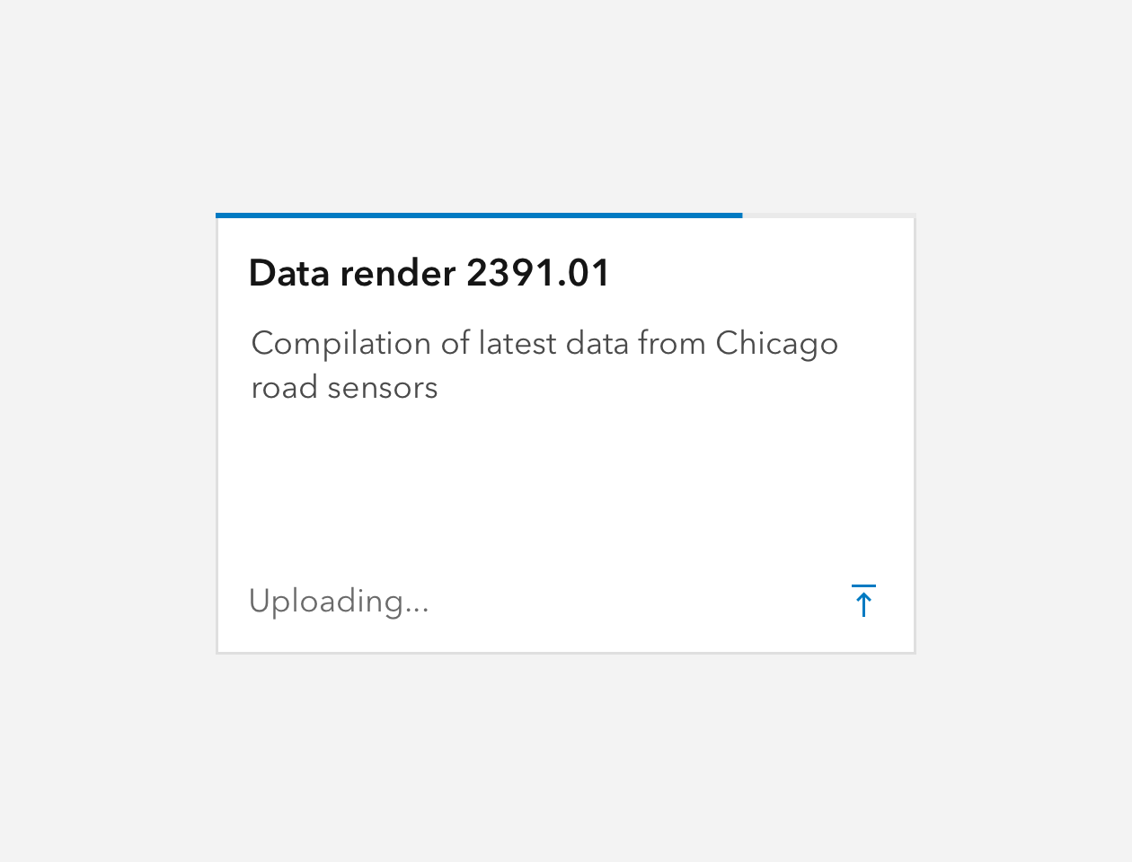
Progress is a thin and linear visual designed to show processing time for a task or workflow.
Overview
Designed to be used on a top or bottom edge of an area, Progress can be a helpful UX device to show the user something is being processed or loaded.
Progress has a smaller height than Loader and is less obtrusive, which can be handy in tight spaces. Prefer the "determinate" type when processing time can be accurately represented.
Usage
- Add to the top or bottom of a Panel, Popover, Dialog, Card, Tile, or area with a clear edge to show processing time
Sample
Best practices
Progress type | Usage |
|---|---|
"determinate" | Preferred type. Use when processing percentage can be relayed to the user. |
"indeterminate" | Use when a processing percentage cannot be relayed. |
