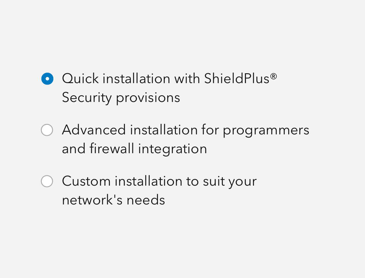
Radio Buttons are circular actions used to make single-choice decisions.
Overview
Radio Buttons are designed to take up small interface area, which can fit within a multitude of workflows. Radio Buttons always have one selected item, denoted with a filled Brand color. You can use Radio Button Group as a convenient utility for layout and group configurations.
For "yes" and "no" interactions, multiple selections, and interactions where a choice is optional, please consider Checkbox. The key difference between a checkbox and radio is that radios must always have something active, whereas a checkbox is optional.
For "on" and "off" or boolean interactions, please consider Switch.
Usage
- Various interactions where a single choice needs to be made
- Forms
Sample
Accessibility
Radio Button should be accompanied by a Label, which provides context of the intent to support assistive technologies.
Keyboard navigation
When Radio Buttons are presented with the same name property value, or contained in a Radio Button Group:
| Key | Function |
|---|---|
Arrow left | Moves focus and selection to previous item. If the current focus and selection is the first item, the focus and selection will cycle to the last item. |
Arrow right | Moves focus and selection to next item. If the current focus and selection is the last item, the focus and selection will cycle to the first item. |
Arrow down | Moves focus and selection to previous item. If the current focus and selection is the first item, the focus and selection will cycle to the last item. |
Arrow up | Moves focus and selection to next item. If the current focus and selection is the last item, the focus and selection will cycle to the first item. |
Tab | Moves focus in and out of component. |
Tab and Shift | Moves focus in and out of component. |
Writing and copy

- Keep labels for Radio Buttons simple and succinct
- Do not use contractions (you're, aren't, can't, haven't) for Radio Button labels in order to reduce confusion
- Avoid writing Radio Button text as questions.