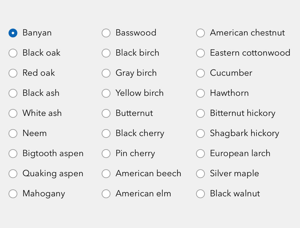
Radio Button Group allows you to switch between horizontal and vertical layouts of Radio Buttons.
Overview
Built of Radio Buttons, you can control the group's scale, layout, and state in a single wrapper.
Usage
- Groups of Radio Buttons
- Easy switching between vertical and horizontal layouts for responsive design
Sample
Best practices
Below are important guidelines on using the Radio Button Group component.

Accessibility
Keyboard navigation
| Key | Function |
|---|---|
Arrow left | Moves focus and selection to previous calcite-radio-button. If the current focus and selection is the first calcite-radio-button, the focus and selection will cycle to the last calcite-radio-button. |
Arrow right | Moves focus and selection to next calcite-radio-button. If the current focus and selection is the last calcite-radio-button, the focus and selection will cycle to the first calcite-radio-button. |
Arrow down | Moves focus and selection to previous calcite-radio-button. If the current focus and selection is the first calcite-radio-button, the focus and selection will cycle to the last calcite-radio-button. |
Arrow up | Moves focus and selection to next calcite-radio-button. If the current focus and selection is the last calcite-radio-button, the focus and selection will cycle to the first calcite-radio-button. |
Tab | Moves focus in and out of component. |
Tab and Shift | Moves focus in and out of component. |
Writing and copy
- Keep Radio Button tone and length consistent within groups
- Avoid forming questions with Radio Button text