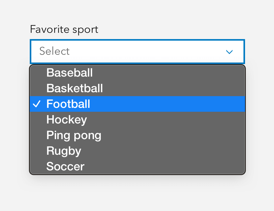
Selects are styled versions of the select HTML element containing a menu of Options, which can be grouped with Option Group.
Overview
Select combines Calcite styling with robust functionality of a native dropdown.
Usage
- Interactions that require a native browser selection
- Form selection
Sample
Best practices
Recommendations

Accessibility
Keyboard navigation
| Key | Function |
|---|---|
Arrow down | Selects the next calcite-option. If the current focus is the last calcite-option, focus will not change. |
Arrow up | Selects the previous calcite-option. If the current focus is the first calcite-option, focus will not change. |
Home | Selects the first calcite-option. |
End | Selects the last calcite-option. |
Enter | Opens the component's menu. If the menu is open, selects the currently focused calcite-option. |
Space | Opens the component's menu. |
Tab | Move focus in and out of component. |
Tab and Shift | Move focus in and out of component. |
Esc | If open, closes the component's menu. |
Writing and copy
Typically, you don't need placeholder text. Do not rely on placeholder text's contents, because when text is entered it disappears and can be frustrating for your user.