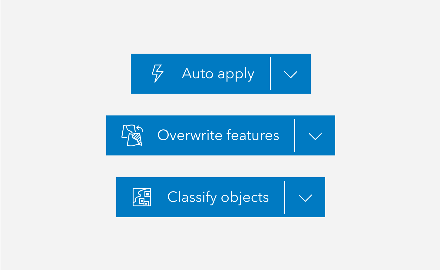
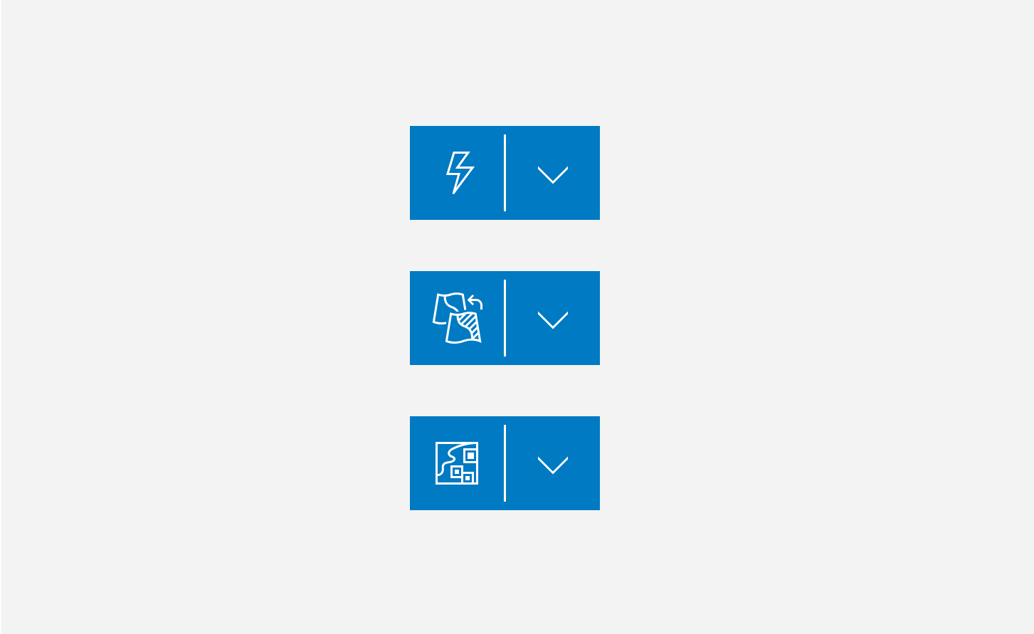
Split Buttons contain two buttons paired to provide different, but related actions.
Overview
Split Buttons house variations of the same action, and are a good utility to save space in the interface. Avoid relying on Split Buttons frequently or in groups.
Split Buttons carry the same color styles and appearances as Buttons.
Usage
Split Buttons can be used to accommodate many workflows. For instance:
| Primary | Secondary |
|---|---|
| Save | Save as |
| Download | Download with a specific file extension |
| Open | Open with a specific program |
| Edit | Edit with |
| Add layer | Type of layer |
Sample
Best practices
Below are important guidelines on using the Split Button component.


Accessibility
Keyboard navigation
| Key | Function |
|---|---|
Enter | If focused on the button, presses the component. If focused on the calcite-dropdown-group, expands or collapses the calcite-dropdown-items. |
Space | If focused on the button, presses the component. If focused on the calcite-dropdown-group, expands or collapses the calcite-dropdown-items. |
Tab | Moves focus to the calcite-dropdown-group. If the calcite-dropdown-group is focused, the focus will leave the component. |
Tab and Shift | Moves focus to the button. If the button is focused, the focus will leave the component. |
Refer to Dropdown for keyboard navigation.
Writing and copy
Refer to Button for writing and copy guidelines.