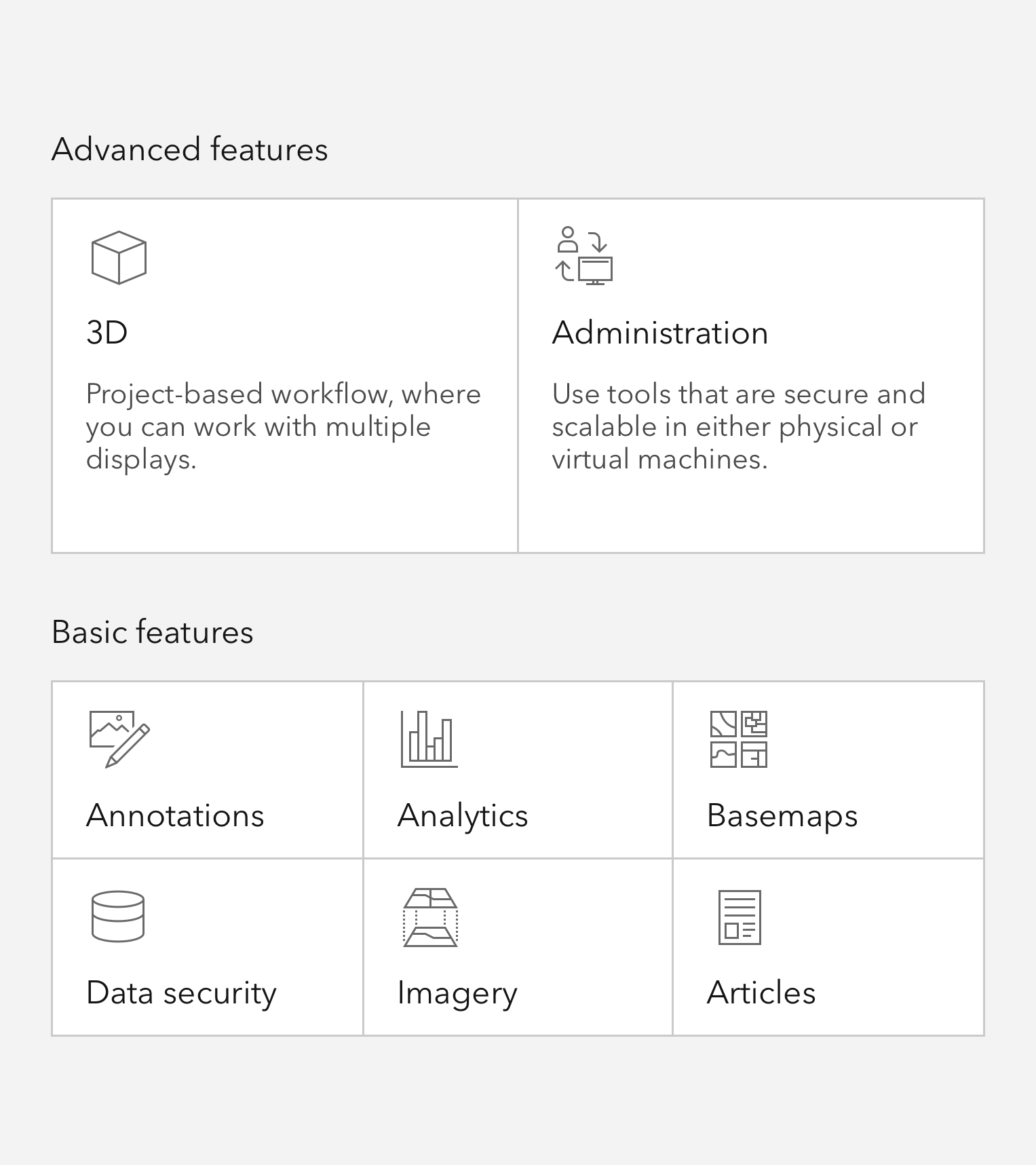
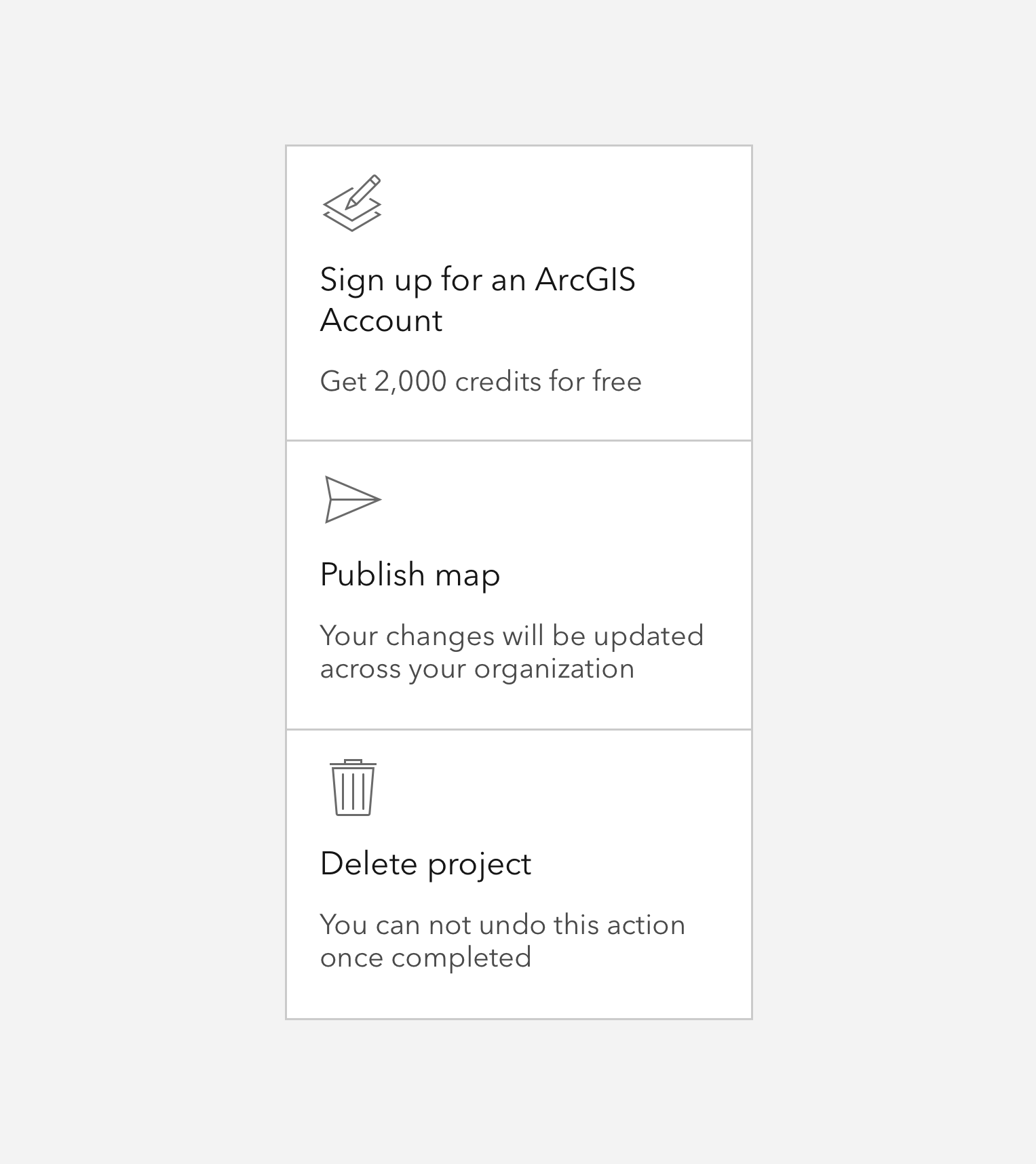
Tiles are presentational components, useful for presenting consequential information in a compact, consistent format.
Overview
Tiles can contain supportive icons, a heading, and a description, and offer support for slotted, non-interactive content.
Usage
- Display of key content or information
- Selection workflows
- Primary navigational actions
Sample
Best practices
While visually similar to the Card, a Tile has distinct capabilities and intended use cases.
Comparison
Recommendations
A Tile is a single focusable element and should not contain slotted interactive elements, whereas Cards may contain one or many individually focusable elements. Because the entire element is interactive, avoid placing focusable elements within the Tile to ensure users can interact with the Tile as a single entity.


Writing and copy
Text for Tiles should be on the shorter side, and as concise as possible.
- Use sentence case for heading and description
- End description with proper punctuation
- Avoid forming questions in Tiles
- Recommended heading character maximum: 50
- Recommended description character maximum: 175