Tile Select

deprecated in v2.9Refer to the Tile component documentation.
Learn more

Overview

Tile Selects are Tiles which can be used functionally like Radio Buttons or Checkboxes.

Consider Tile for a non-selectable version of this component.

Usage

  • Onboarding experiences
  • Layout selection
  • Format selection
  • Visually prominent radio-style selection
  • Visually prominent checkbox-style selections

Best practices

Below are important guidelines on using the Tile Select component.
Do Tile Select Check
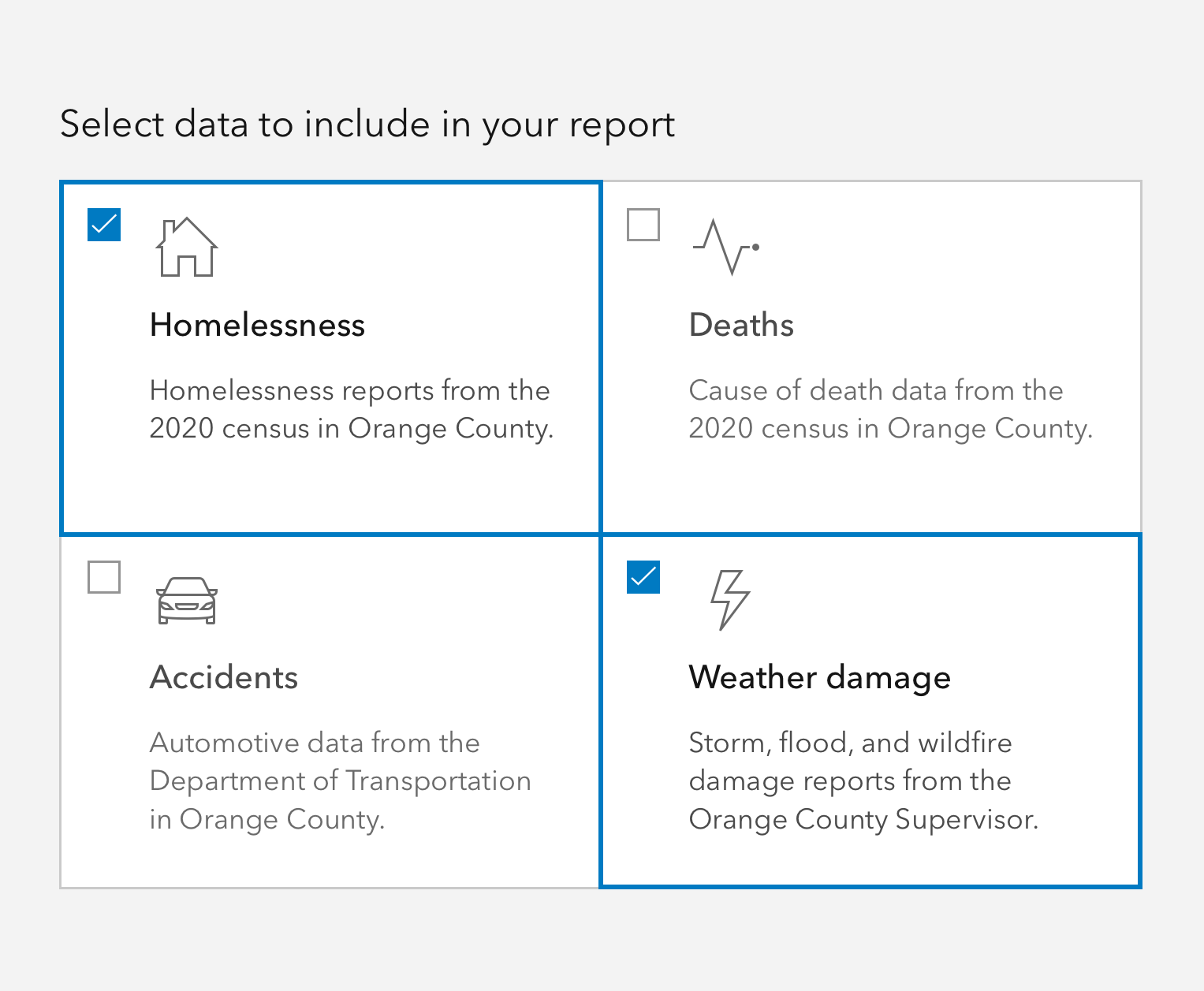
Do use checkbox-style Tile Selects for choosing mutliple relevant items.
Avoid Tile Select Check
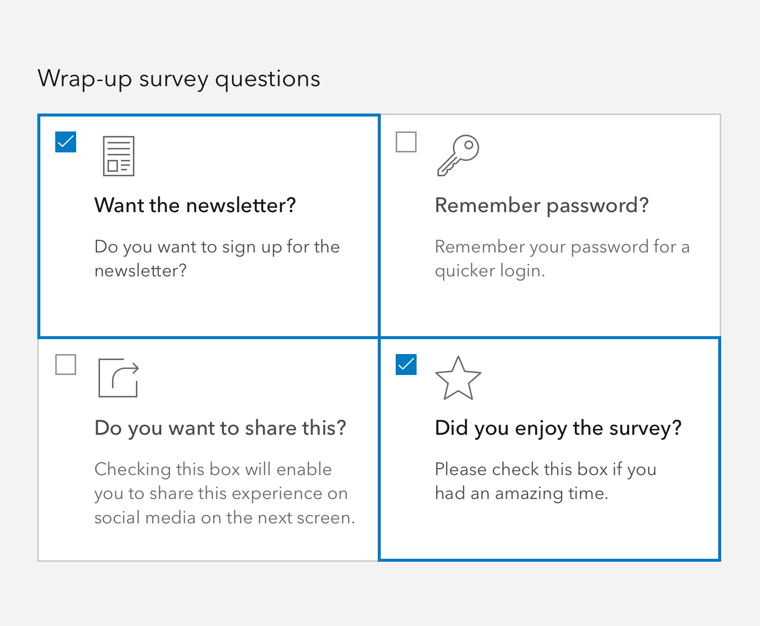
Avoid using the checkbox-style for common form interactions, and avoid forming questions in Tile Selects.
Do Tile Select Radio
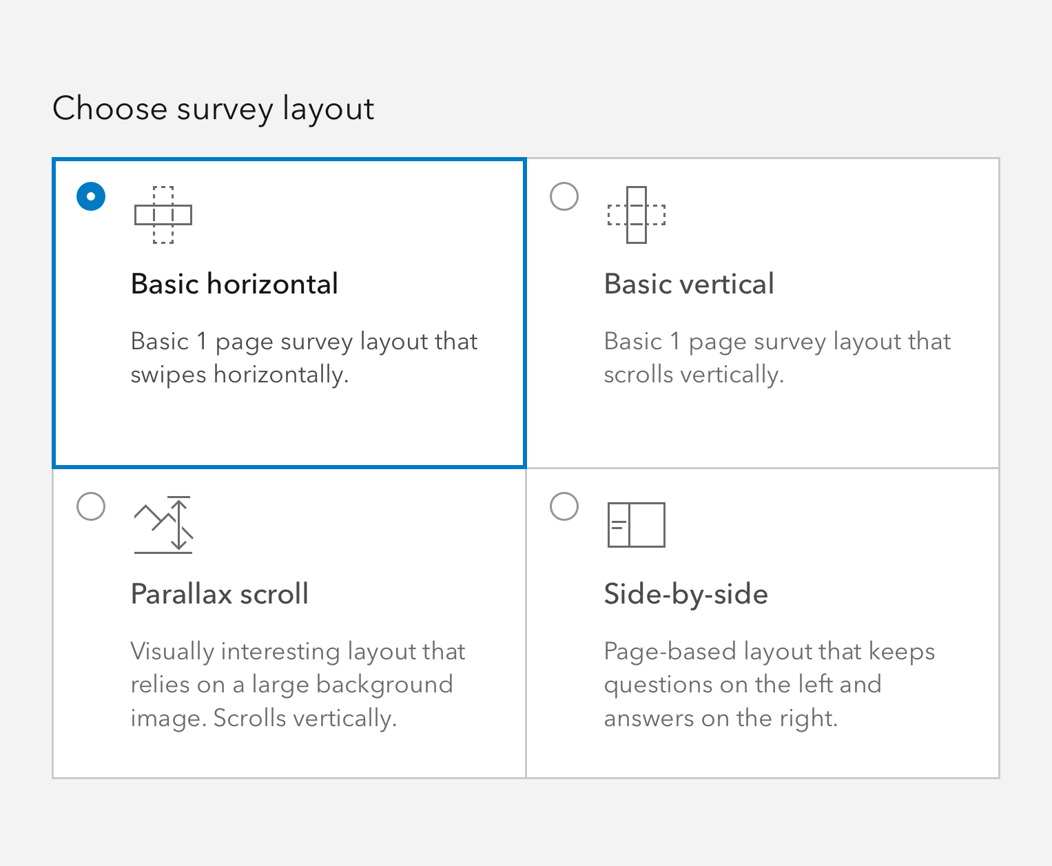
Do use Tile Selects when selections can benefit from descriptions to make a choice.
Avoid Tile Select Radio
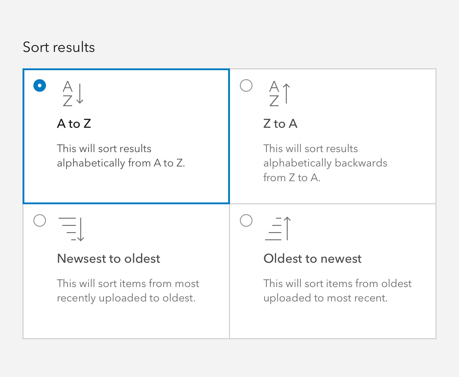
Avoid using Tile Selects for unconventional interactions like sorting.

Writing and copy

Text for Tile Selects should be on the shorter side, and as concise as possible.

  • Use sentence case for heading and description
  • End description with proper punctuation
  • Avoid forming questions in Tile Selects
  • Recommended heading character maximum: 50
  • Recommended description character maximum: 175

API reference

Properties

Slots

Events

Methods

Your browser is no longer supported. Please upgrade your browser for the best experience. See our browser deprecation post for more details.