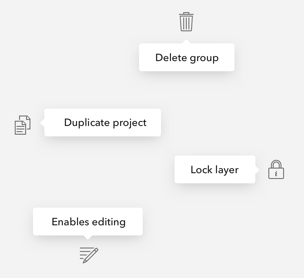
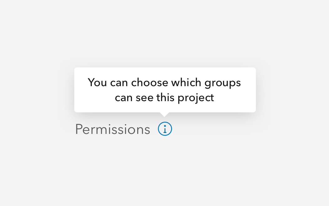
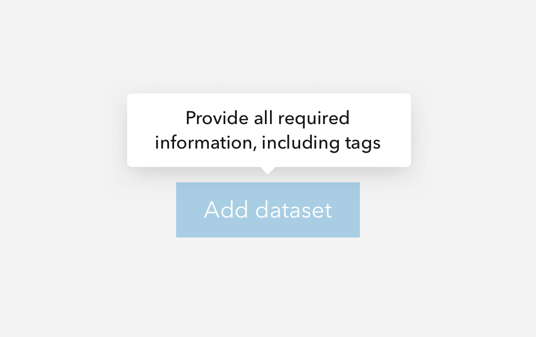
Tooltips are small text-based components that when triggered by a reference element provide context to the user.
Overview
Tooltips float over other elements in the z-axis and provide text to quickly assist the user to understand context, actions, and other elements. A Tooltip can be a helpful UX device to give the user clarity before committing to an action. Avoid relying heavily on Tooltips, as you should prefer headers and labels that accurately describe a workflow. Tooltip positioning can be automatic or manually set to avoid clipping in the interface.
It is recommended to place Tooltips shallowly in the DOM.
To support interactive content, consider Popover.
For more advanced floating workflows, refer to Dialog.
Usage
- General helper text
- Succinct action hints
Sample
Best practices
Below are important guidelines on using the Tooltip component.

Accessibility
It is strongly recommended to house the component's content in an element, such as a span or p, providing context to assistive technologies when accessed.
Keyboard navigation
| Key | Function |
|---|---|
Tab | Moves focus to access the component's contents from its reference element. If the current focus is the reference element, focus will leave the element. |
Tab and Shift | Moves focus to access the component's contents from its reference element. If the current focus is the reference element, focus will leave the element. |
Writing and copy


- Tooltip text should be succinct and straight to the point
- Periods are not necessary for ending Tooltip text
- Avoid contractions such as "you're", "aren't", "don't", and "can't" to avoid confusion and to assist with internationalization
- For longer content, please consider Popover
- Recommended character maximum: 75