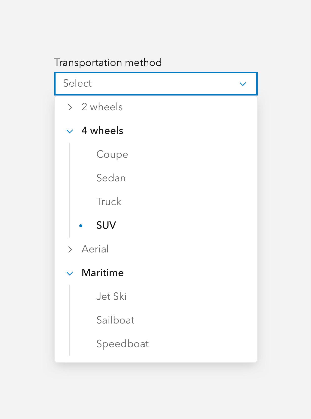
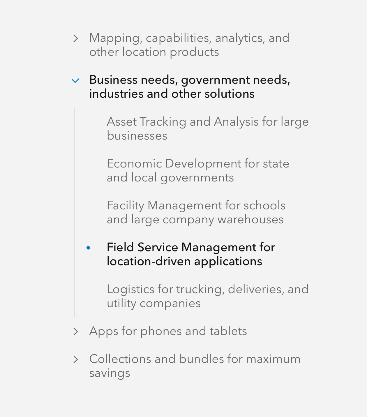
Trees are nestable, expandable text groups that can contain multiple links for navigation or items for filtering.
Overview
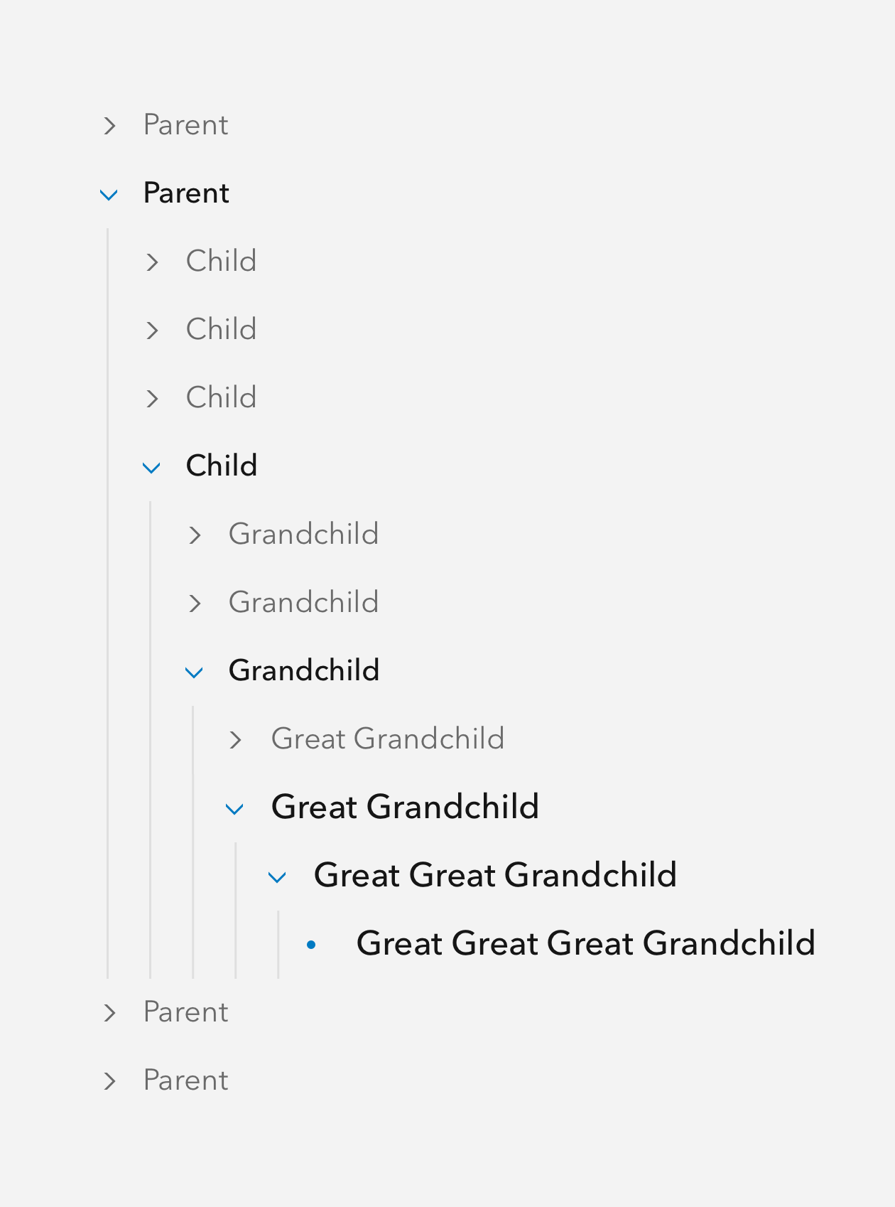
Tree can be used as a filtering component, navigation, or for use in form selection. They are built like a "family tree" in that there are parents, children, grandchildren, and great grandchildren. Parents can expand or collapse to show/hide more items.
Usage
- Side navigation
- Filtering
- Form selection
Sample
Best practices
Below are important guidelines on using the Tree component.


Accessibility
Keyboard navigation
| Key | Function |
|---|---|
Arrow left | If the calcite-tree-item has children, all child elements will collapse. |
Arrow right | If the calcite-tree-item has children, all child elements will expand. |
Arrow top | Moves focus to the previous calcite-tree-item, including expanded child elements. If the current focus is the first calcite-tree-item, focus will not change. |
Arrow bottom | Moves focus to the next calcite-tree-item, including expanded child elements. If the current focus is the last calcite-tree-item, focus will not change. |
Home | Moves focus to the first calcite-tree-item. If the current focus is the first calcite-tree-item, focus will not change. |
End | Moves focus to the last calcite-tree-item. If the current focus is the last calcite-tree-item, focus will not change. |
Tab | Moves focus in and out of the component. |
Tab and Shift | Moves focus in and out of the component. |
Writing and copy

