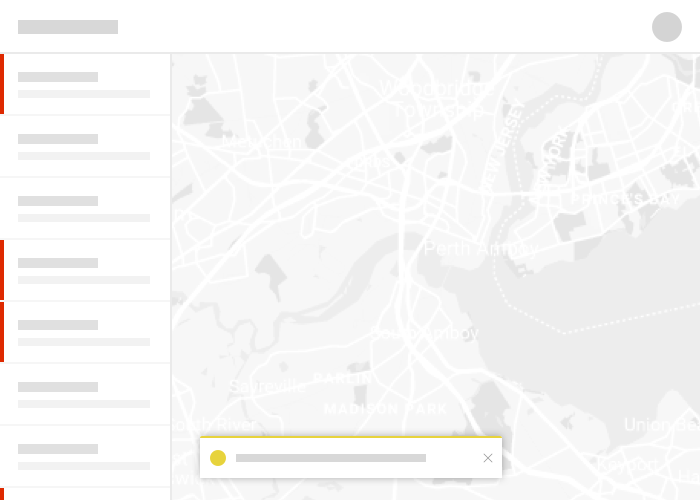
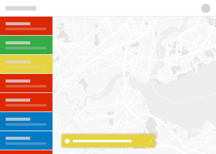
Consistent use of color across the platform creates familiar and engaging experiences. Leveraging a uniform color palette helps to convey meaning and prioritize information and actions.
Theming
Calcite's default theme provides a color palette with values for light and dark modes. These CSS variables can be adjusted to fit your application's needs for branding, messaging, and design. To modify the theme, update CSS variables in both light and dark modes.
Primary colors
Sparse use of color in an interface makes the prioritization of content and actions more apparent. A single actionable color and background color, along with a limited set of text and foreground shades, provides a clear and consistent backdrop for rich map imagery, focused interactions, or complex workflows.
Copy --calcite-color-brand#007AC2Copy --calcite-color-background#F8F8F8
Copy --calcite-color-text-1#151515Copy --calcite-color-text-2#4A4A4ACopy --calcite-color-text-3#6A6A6A
Text
Copy --calcite-color-foreground-1#FFFFFFCopy --calcite-color-foreground-2#F3F3F3Copy --calcite-color-foreground-3#EAEAEA
Foreground
Copy --calcite-color-brand#009AF2Copy --calcite-color-background#353535
Copy --calcite-color-text-1#FFFFFFCopy --calcite-color-text-2#BFBFBFCopy --calcite-color-text-3#9F9F9F
Text
Copy --calcite-color-foreground-1#2B2B2BCopy --calcite-color-foreground-2#202020Copy --calcite-color-foreground-3#151515
Foreground
State colors
Using a limited set of colors in our designs makes the use of color more meaningful. A consistent palette of state colors provides consistency across applications. When used sparingly, these state colors can help quickly communicate priority and importance to a user, creating a unified and engaging experience across applications.
Copy --calcite-color-status-info#00619BCopy --calcite-color-status-success#35AC46Copy --calcite-color-status-warning#EDD317Copy --calcite-color-status-danger#D83020
Copy --calcite-color-status-info#00A0FFCopy --calcite-color-status-success#36DA43Copy --calcite-color-status-warning#FFC900Copy --calcite-color-status-danger#FE583E
Usage guidelines
| State | Usage |
|---|---|
| Information | Non critical information which requires minimal user attention. |
| Success | To be used when an important action has been completed successfully and requires user notification. |
| Warning | To be used when something needs the user's attention, but is not critical or destructive. |
| Danger | A connection error, destructive action, action failure, etc. |
Modes
Calcite Design System provides light and dark modes for your application. The light mode is the default mode, and is available to use without any additional configuration if it's the only mode you wish to use. If you would like to change the mode, use the corresponding CSS classes.
Copy --calcite-color-brand#007AC2Copy --calcite-color-brand-hover#00619BCopy --calcite-color-brand-press#004874Copy --calcite-color-background#F8F8F8Copy --calcite-color-foreground-1#FFFFFFCopy --calcite-color-foreground-2#F3F3F3Copy --calcite-color-foreground-3#EAEAEACopy --calcite-color-text-1#151515Copy --calcite-color-text-2#4A4A4ACopy --calcite-color-text-3#6A6A6ACopy --calcite-color-text-inverse#FFFFFFCopy --calcite-color-text-link#00619BCopy --calcite-color-border-1#CACACACopy --calcite-color-border-2#D4D4D4Copy --calcite-color-border-3#DFDFDFCopy --calcite-color-border-input#949494Copy --calcite-color-status-info#00619BCopy --calcite-color-status-success#35AC46Copy --calcite-color-status-warning#EDD317Copy --calcite-color-status-danger#D83020Copy --calcite-color-status-danger-hover#A82B1ECopy --calcite-color-status-danger-press#7C1D13
Light
Copy --calcite-color-brand#009AF2Copy --calcite-color-brand-hover#007AC2Copy --calcite-color-brand-press#00619BCopy --calcite-color-background#353535Copy --calcite-color-foreground-1#2B2B2BCopy --calcite-color-foreground-2#202020Copy --calcite-color-foreground-3#151515Copy --calcite-color-text-1#FFFFFFCopy --calcite-color-text-2#BFBFBFCopy --calcite-color-text-3#9F9F9FCopy --calcite-color-text-inverse#151515Copy --calcite-color-text-link#00A0FFCopy --calcite-color-border-1#555555Copy --calcite-color-border-2#4A4A4ACopy --calcite-color-border-3#404040Copy --calcite-color-border-input#757575Copy --calcite-color-status-info#00A0FFCopy --calcite-color-status-success#36DA43Copy --calcite-color-status-warning#FFC900Copy --calcite-color-status-danger#FE583ECopy --calcite-color-status-danger-hover#FF0015Copy --calcite-color-status-danger-press#D90012
Dark
Best practices
Use colors sparingly
Limited use of color can help make interfaces more understandable and intuitive. Avoid overusing the brand color.


More Esri colors
This is a subset of our expanded Esri color palette, specifically for use in interactive design applications. The calcite-colors repository is where we host Esri's official color documentation that can be seen and is leveraged by esri.com and our various products.