What are design tokens?
About design tokens
Design tokens, or tokens, encapsulate essential visual elements such as colors, typography, spacing, and more. Tokens are a powerful solution to standardizing, documenting, and reusing shared patterns. They provide design elements agnostic of a specified means, exported for each unique supported context.
In the ever-expanding global digital ecosystem, designing and maintaining user interfaces that resonate across diverse geographical, technological, and spatial contexts is a formidable task. Design systems grapple with the increasingly complex need for consistency and documentation of design decisions.
Benefits of design tokens
- Add consistency across user interfaces
- Facilitate communication and collaboration of shared patterns across teams and modalities
- Provide more opportunities for customized theming
Types of design tokens
Tokens are a design decision represented as data. Each token has a carefully chosen name that follows a set naming convention and communicates its intention and scope.
| Token type | Token naming convention |
|---|---|
| Color | calcite-color- |
| Border | calcite-border- |
| Corner | calcite-corner- |
| Shadow | calcite-shadow- |
| Opacity | calcite-opacity- |
| Stacking | calcite-z-index- |
| Font | calcite-font- |
| Spacing | calcite-spacing- |
Token tiers
Calcite tokens are grouped into tiers based on their purpose and use. Understanding the tiers and their purpose is foundational to understanding how tokens can be implemented in your designs and web apps.
Global tokens
Global tokens are major decisions that serve to associate meaning, context, and/or intent of tokens. Using global tokens is a good way to ensure that your product can evolve alongside Calcite as the design system evolves, and to minimize future maintenance for your web apps.
/* Override global tokens to apply a custom theme across an app */
:root {
--calcite-color-brand: #614F7F;
--calcite-color-brand-hover: #F9EAFF;
--calcite-color-brand-press: #00009B;
--calcite-color-brand-underline: #00009B;
}Core tokens
Core tokens are a collection of raw values. Their purpose is for reference in global tokens, but if needed, may be directly imported for specific use cases, such as theming. It is recommended to use core tokens sparingly when there are no specific global tokens for a necessary use case.
@import "@esri/calcite-design-tokens/dist/css/core.css";
/* Set a different brand color in the app */
:root {
--calcite-color-brand: var(--calcite-color-dark-red-d-rr-430);
}Component tokens
Component tokens provide component-level overrides to global token patterns and allow customization of Calcite's components on the web via CSS variables. They can be set at the document's :root to override all components in an application, or directly to a specified component instance.
Set on the document's root
/* Override all Modals with a background content color */
calcite-modal {
--calcite-modal-content-background: #614F7F;
}Set on the component
/* Override specified Modals with a background content color */
.example-theme-class {
--calcite-modal-content-background: #614F7F;
}Refer to the design tokens reference page for a list of global and core tokens. For component tokens, refer to individual component pages, such as Modal's CSS variables.
Tokens in Figma
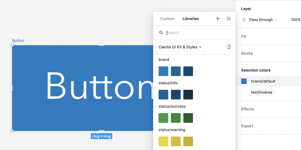
Global tokens are provided as Figma variables in the Web UI Kit.
