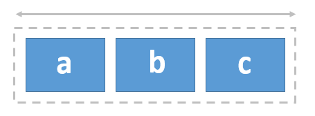
The Row widget is a layout container that you can use to position and organize content side by side in an aligned row on a page. A row consists of a multicolumn grid that guides even placement of widgets that you organize horizontally.

Examples
Use this widget to support app design requirements such as the following:
- You want page elements, such as images and their descriptions, to be aligned horizontally.
- You’re designing a full-screen page and you want to organize some of its content in evenly distributed rows.
Usage notes
The Row widget has a 12-column grid. All the columns in the grid are equal size, and the size adjusts based on the size of the Row widget and the gap and padding settings you specify. The gap and padding spaces are evident in the grid, which appears as you move widgets into the row. As you add widgets and reposition them, they snap to the row’s grid. A widget that you add to a row can be sized to span across one or more columns in the grid.
You can add other layout widgets to a row (such as a Column widget) for additional control when designing your pages.
Settings
The Row widget includes the following settings:
- Gap—Specify the space between nested widgets (in pixels). For example, if you want the edge of widgets to touch, change the Gap value to
0. - Padding—Change the default 10-pixel padding space around the inner edge of the Row widget to adjust the space between the row’s boundary and the boundary of its nested widgets. You can adjust the padding on any side (top, right, bottom, and left) by pixels or percent. You can lock independent padding to synchronize the padding for all sides; type a value for one side and they all update to match. The padding is automatically applied to the group of widgets nested in the row.