The PureComponent class, provides a function called render() and most of your
UI work will be implemented inside of this function.
Writing JSX
The syntax React used for writing UI templates is called JSX. It is very similar to writing HTML but with full JavaScript capability baked into it.
Here is a simple example of adding some basic HTML elements to your widget UI:
// in widget.tsx:
import { React, AllWidgetProps } from 'jimu-core';
export default class Widget extends React.PureComponent<AllWidgetProps<{}>, any>{
render() {
return <div className="myWidget">
<p>This is a sample widget</p>
<button type="button" style={{background: 'orange'}}>I'm a button</button>
</div>;
}
}Output:

Using the Jimu UI library
The Jimu framework provides a UI library of components for developers to use in their widget development, such as:
- Basic UI components: button, dropdown, form controls, icon, navigation, modal, grid layout container, etc.
- Advanced UI components: date picker, resource selector, expression builder, etc.
Under the hood, Jimu UI components are extended and customized from a React Bootstrap framework called Reactstrap. The library follows a similar pattern in terms of component usage as well as other similar React UI libraries.
You can preview most of the commonly used components and icons by visiting the Storybook site:
https.
Read more about Storybook in Experience Builder.
Jimu UI is the official UI library for Experience Builder, and it is highly recommended that the components from this library are considered and utilized in your UI development. The reasons are as follows:
- UI/UX consistency: the overall look and feel of the widgets, as well as the apps created with them, follows a consistent pattern.
- Themeable: the styles of components are configurable and themeable, which makes it easier to make your widgets compatible with different themes.
- Better integration with Experience Builder and ArcGIS.
UI components:
Import components:
The basic UI components can be directly imported from 'jimu-ui', and the advanced UI components need to be imported separately by using their paths:
import { Button, Icon, TextInput } from 'jimu-ui'; // basic
import { DatePicker } from 'jimu-ui/date-picker'; // advancedQuick sample:
Here we add a Button component with the "primary" style and an extra star icon to the widget:
// in widget.tsx:
import { React, AllWidgetProps } from 'jimu-core';
import { Button, Icon } from 'jimu-ui'; // import components
import { StarFilled } from 'jimu-icons/filled/application/star'
// Create an svg icon using Icon component:
const iconNode = <StarFilled />;
export default class Widget extends React.PureComponent<AllWidgetProps, any>{
render(){
// Add Button component containing an icon to the widget:
return <Button type="primary">{iconNode} primary button</Button>;
}
}Output:

CSS utility classes:
Jimu UI provides the same CSS utility classes as Bootstrap to quickly apply styles to UI elements.
Quick sample:
Here we add w-100, p-3, bg-primary, text-white to make an element:
- take 100% width of its parent
- have paddings of 1 rem
- use primary color from the theme as its background color
- use white color from the theme as its text color
// in the render() function:
return <div className="w-100 p-3 bg-primary text-white">
<p>This is a sample widget</p>
</div>;Output:

Style your widget
In Experience Builder, there are three options to style a widget:
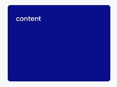
Inline CSS
In the context of React, inline CSS styles are written as JavaScript objects and
applied to the style attribute of a DOM element, such as:
// in the render() function:
const containerStyle = {
background: 'darkblue',
color: 'white',
width: 200,
height: 150,
padding: '1rem',
borderRadius: 5
};
return <div
style={containerStyle} // CSS styles applied
> content </div>;Output:

External CSS style sheets
Another way is to define CSS styles in external stylesheet files and import them separately in the widget.
Accepted stylesheet file extensions are: .css, .sass, and .scss.
Take the previous code sample as an example; we can move the CSS styles into a separate stylesheet (e.g., style.css):
/* style.css */
.my-widget {
background: 'darkblue';
color: 'white';
width: 200px;
height: 150px;
padding: '1rem';
border-radius: 5px;
}then import the file in your widget as:
// widget.tsx:
import 'path/to/style.css';and don't forget to add the class name to the DOM element defined in the style.css:
// widget.tsx:
// in the render() function:
return <div className="my-widget"> content </div>;Output:

⭐️CSS-in-JS (recommended)
CSS-in-JS refers to a way of writing CSS in JavaScript to tackle issues that CSS does not solve, such as vendor prefixes, scoped CSS, JS logics, theming capability, etc.
There are many popular CSS-in-JS libraries out there, such as Styled Components and Emotion. In Experience Builder, we use Emotion as the framework for styling and theming purposes.
Emotion provides two styling patterns:
1. css prop
The css prop from Emotion allows you to write CSS styles in a more natural and friendly way compared to React's style prop.
CSS styles can be written in template literals, which allows you to write JS logics inside of CSS.
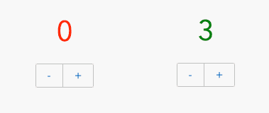
For example, the following sample Counter widget changes its text color from red to green when the count value is greater than 2:
// widget.tsx:
/** @jsx jsx */ // <-- make sure to include the jsx pragma
import { React, AllWidgetProps } from 'jimu-core';
import { css, jsx } from 'jimu-core';
import { Button, ButtonGroup } from 'jimu-ui';
interface State {
count: number;
}
export default class Widget extends React.PureComponent<AllWidgetProps<{}>, State>{
constructor(props) {
super(props);
this.state = {
count: 0,
};
}
render() {
const numberStyle = css`
font-size: 2.5rem;
color: ${this.state.count > 2 ? 'green' : 'red'};
`;
return <div className="text-center">
<p css={numberStyle}>{this.state.count}</p>
<ButtonGroup>
<Button type="secondary" onClick={e => {this.setState({
count: this.state.count - 1
})}}> - </Button>
<Button type="secondary" onClick={e => {this.setState({
count: this.state.count + 1
})}}> + </Button>
</ButtonGroup>
</div>;
}
}Output:

2. Styled components
This pattern is inspired by the Styled-Components library and the usage is very similar. The "styled" approach is perfect for creating re-usable components within your widget.
/** @jsx jsx */ // <-- make sure to include the jsx pragma
import { React, AllWidgetProps } from 'jimu-core';
import { styled, jsx } from 'jimu-core';
// A styled button component:
const StyledButton = styled.button`
color: white;
background-color: blue;
transition: 0.15s ease-in all;
&:hover {
background-color: darkblue;
}
`;
export default class Widget extends React.PureComponent<AllWidgetProps<{}>>{
render() {
return <StyledButton>
A styled HTML Button
</StyledButton>;
}
}Output:

Working with theme
This is required if you would like your widget to look consistent with the rest of the application and if you would like to update the look and feel automatically when the theme changes.
Under the hood, Experience Builder framework provides the theme variables as a JSON object and injects it into the widgets as a property. You have access to all theme variables, such as colors, fonts, sizes, components, etc.
Use this.props.theme to access the theme variables within your widget and reference them in your CSS declaration. For example:
/** @jsx jsx */ // <-- make sure to include the jsx pragma
import { React, AllWidgetProps } from 'jimu-core';
import { css, jsx } from 'jimu-core';
export default class Widget extends React.PureComponent<AllWidgetProps<{}>>{
render() {
const theme = this.props.theme;
const style = css`
background: ${theme.colors.palette.primary[100]};
color: ${theme.colors.black};
padding: ${theme.sizes[3]};
`;
return <div css={style}>
<p>This is a sample widget</p>
</div>;
}
}Output:

default theme vs. dark theme