Visualizing and mapping your spatial data is a powerful step to provide context and help uncover patterns, trends, and relationships. Visualizing and mapping is analogous to charting and plotting with non-spatial data. It's a way to verify your analysis, iterate, and create shareable and engaging results.
In GeoAnalytics Engine you can visualize your data in two ways:
- You can visualize datasets in your notebook. This allows you to view results as you analyze them.
- You can write out your data to visualize your datasets in other applications. This allows you to complete further analysis, share your results with your organization, or create other data products.
Visualization in a notebook
There are two options for visualizing spatial results in your notebook:
- The
st.plotmethod in GeoAnalytics Engine—For quick visualization. - The map widget in ArcGIS API for Python—For more interactive visualization and exploration.
The capabilities of each option are outlined in the table below. In many cases, you can use both, depending on your needs.
| GeoAnalytics Engine | ArcGIS API for Python | |
|---|---|---|
| Basemaps | 1 | |
| Draw multiple layers | ||
| Zooming | ||
| Identify records | ||
| Modify colors and symbols | ||
| Included with GeoAnalytics | ||
| Record limit |
- 1. New in version 1.1.0. Requires a connection to ArcGIS Online
The st.plot method in GeoAnalytics Engine extends
matplotlib
to enable simple visualization of geometries from one or more DataFrames in a PySpark notebook.
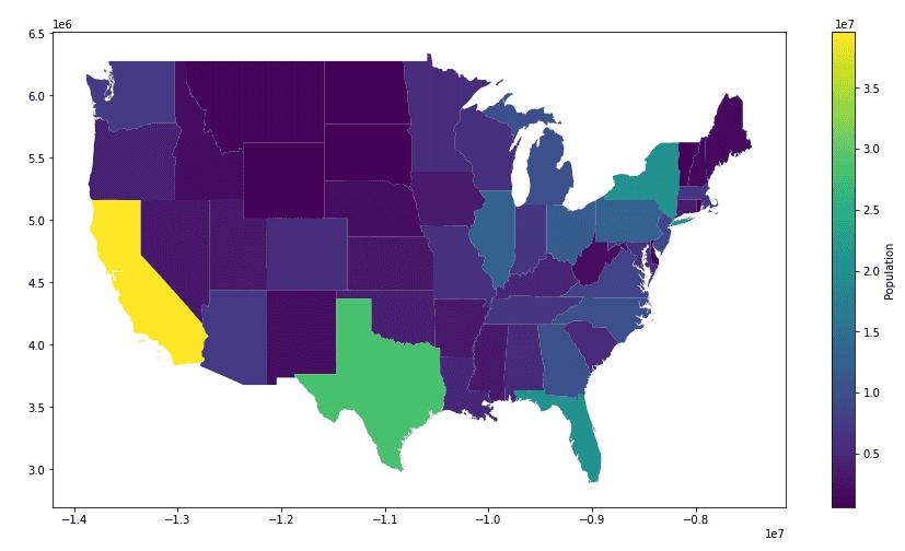
By calling st.plot() on a DataFrame with a geometry column you can plot each geometry record in the column
and configure the plot's coloring, extent, axes, legend and more. For example, the snippet below shows
how you can plot a dataset, symbolize on a column, and generate a legend with just one line of code.
import geoanalytics
# Get states polygons
url = "https://services.arcgis.com/P3ePLMYs2RVChkJx/ArcGIS/rest/services/USA_States_Generalized/FeatureServer/0"
states = spark.read.format("feature-service").load(url).where("STATE_ABBR NOT IN ('AK','HI')")
# Plot states
states.st.plot(cmap_values="POPULATION", figsize=(15, 8), legend=True, legend_kwds={"label": "Population"})
To learn more about using st.plot, see the API reference and the tutorial on plotting in GeoAnalytics Engine.
Map widget in the ArcGIS API for Python
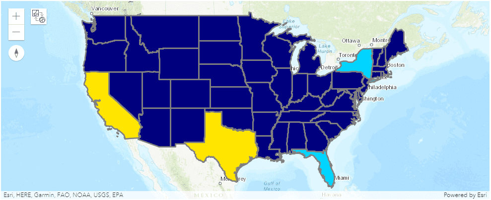
With the ArcGIS API for Python, you can visualize your geometries in a map widget with interactive functionality that includes zooming, panning, and feature identification. The code snippet below shows how you can convert a PySpark DataFrame to a Spatially Enabled DataFrame and visualize it using arcgis.features.GeoAccessor.plot.
import geoanalytics
# Get states polygons
url = "https://services.arcgis.com/P3ePLMYs2RVChkJx/ArcGIS/rest/services/USA_States_Generalized/FeatureServer/0"
states = spark.read.format("feature-service").load(url).where("STATE_ABBR NOT IN ('AK','HI')")
# Plot states
states.select("SHAPE", "STATE_NAME", "POPULATION").st.to_pandas_sdf().astype({'POPULATION': 'int64'}) \
.spatial.plot(renderer_type='c', col='POPULATION')
The ArcGIS map widget is only supported in Jupyter and JupyterLab notebooks. The map widget is not supported in
any other notebook distribution, including JupyterHub, Zeppelin, Databricks, or EMR. If working in a non-Jupyter notebook,
use st.plot in GeoAnalytics Engine to visualize your data.
To learn more about using the ArcGIS API for Python to visualize PySpark DataFrames, see the tutorial on plotting using the ArcGIS API for Python.
Other visualization options
GeoAnalytics Engine supports writing Spark DataFrames to multiple formats that can be visualized in common mapping and GIS applications:
-
Vector tile layers—For fast drawing of point data at multiple scales in desktop and web applications. To learn more see Vector tiles.
-
Shapefiles—Supports points, lines, and polygons. Can be used in most GIS applications. Learn more about using shapefiles in this tutorial.
In addition, you can convert a PySpark DataFrame to a Spatially Enabled DataFrame using the to method
and write the Spatially Enabled DataFrame to a feature service
for visualization in ArcGIS.
ArcGIS Online, ArcGIS Enterprise,
and ArcGIS Pro are Esri products for
mapping, visualization, and analysis of spatial data that support feature services, shapefiles, and vector tile layers.