Why does view scale matter?
Web maps often span multiple scale levels. This makes styling layers complicated. For example, you may define icon sizes that work well at one scale, but zooming in or out could quickly turn your good cartographic decisions into mediocre ones.
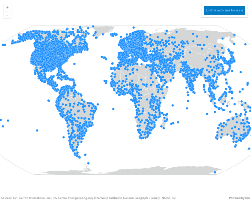
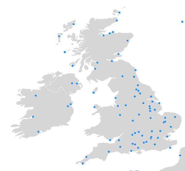
In fact, one icon size usually doesn’t look good at all scales. This is especially true for dense layers. For example, the points in the map below look good with a size of 10px at a national scale.
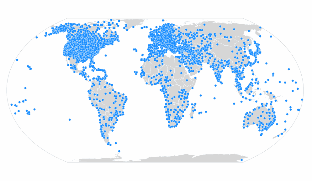
But when zoomed out to a worldwide extent, 10px appears too big in the dense areas. The large icon size obscures the underlying data, potentially misrepresenting its density.
With a smaller point symbol, many of the issues listed above can be reduced or eliminated.
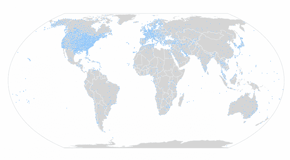
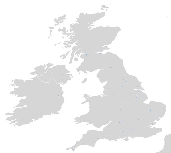
However, the 3px size makes the points almost impossible to see when you zoom back to regional scales or beyond.
Scale-dependent properties
Because icon sizes, line widths, and densities don't display well at all scales, the ArcGIS JS API allows you to configure various symbol and renderer properties based on view scale.
The following symbol and renderer properties can be adjusted according to the view scale.
- Symbol sizes
- Polygon outline widths
- Data-driven size ranges (i.e. graduated symbols)
- Dot density values
Symbol sizes
You can dynamically change point sizes and line widths to work well at any scale using a size visual variable. You must add an Arcade expression that returns the view scale to the size variable (e.g. $view.scale). Then you can map specific scale values to sizes in the stops property. All other scale levels will interpolate the size linearly.
The following snippet treats the view scale as if it were a data value. The raw scale value is returned, and the values in the size stops correspond to scale levels. The renderer will display point sizes (or line widths) at the sizes indicated for each scale in the stops.
renderer.visualVariables = [
{
type: "size",
valueExpression: "$view.scale",
stops: [
// view scales larger than 1:1,155,581
// will have a symbol size of 7.5 pts
{ size: 7.5, value: 1155581 },
{ size: 6, value: 9244648 },
{ size: 3, value: 73957190 },
// view scales smaller than 1:591,657,527
// will have a symbol size of 1.5 pts
{ size: 1.5, value: 591657527 }
]
}
];Example
The following example demonstrates how to adjust the size of points by view scale. This size variable can be used for any point or polyline visualization regardless of renderer type (as long as it supports visual variables).
Use the Disable/enable auto size by scale button to explore how not adjusting icon sizes by scale affects the visualization at various scale levels.
const sizeVV = {
type: "size",
valueExpression: "$view.scale",
stops: [
{ size: 9, value: 1155581 },
{ size: 6, value: 9244648 },
{ size: 3, value: 73957190 },
{ size: 1.5, value: 591657527 }
]
};
const renderer = new SimpleRenderer({
symbol: {
type: "simple-marker",
color: "dodgerblue",
outline: {
color: [255, 255, 255, 0.7],
width: 0.5
},
size: "3px"
},
visualVariables: [sizeVV]
});
Polygon outlines
Overly thick outlines can hide small features and distract from the purpose of a visualization. Because of this, many people instinctively remove outlines. However, this practice can be problematic.
For example, the image below shows outlines that are so thick they completely obscure the fill color of small polygons in the downtown Houston area.
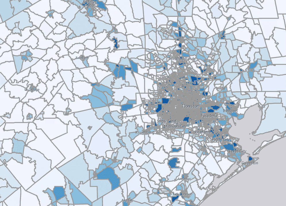
That outline width is clearly unacceptable. But if you zoom to a very large scale, that outline choice may actually work well.
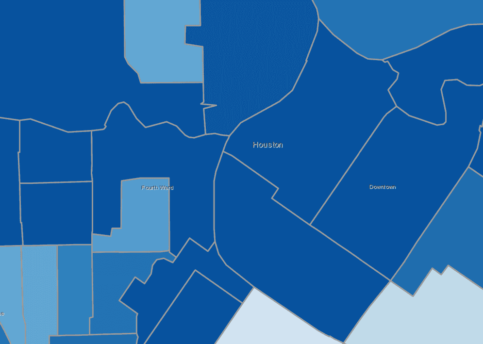
Removing outlines at large scales makes it impossible to see the boundaries of neighboring features with the same color.
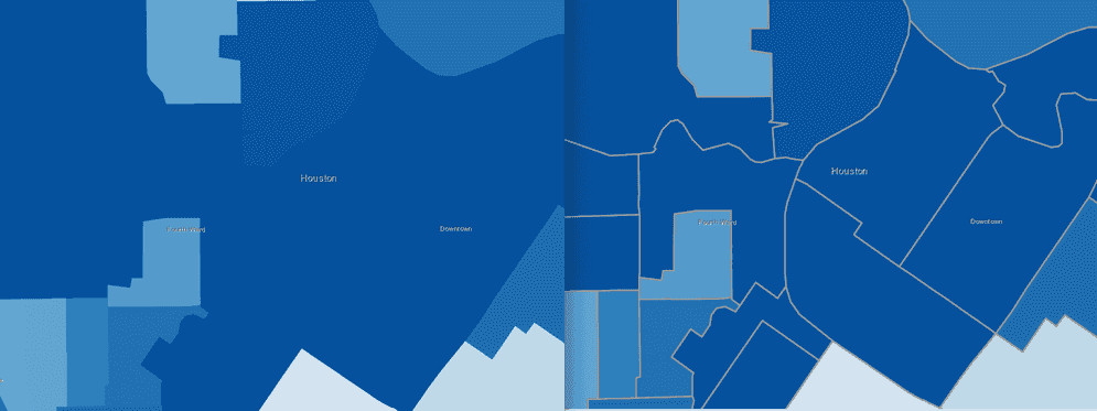
Similar to adjusting symbol sizes by scale, you can adjust polygon outline widths using a size visual variable with a $view.scale Arcade expression. This scenario requires setting the target property to outline so the renderer knows to apply the size variable to the symbol outline.
renderer.visualVariables = [
{
type: "size",
valueExpression: "$view.scale",
target: "outline",
stops: [
{ size: 2, value: 56187 },
{ size: 1, value: 175583 },
{ size: 0.5, value: 702332 },
{ size: 0, value: 1404664 }
]
}
];Example
The following example demonstrates how to adjust the outline of polygons by view scale. Zoom in to observe the thickening of the outlines. Zoom out to see the outlines get thinner and eventually disappear.
renderer.visualVariables = [ {
type: "size",
valueExpression: "$view.scale",
target: "outline",
stops: [
{ size: 2, value: 56187 },
{ size: 1, value: 175583 },
{ size: 0.5, value: 702332 },
{ size: 0, value: 1404664 }
]
}];
Data-driven size ranges
You can also optimize visualizations of data-driven continuous size (i.e. graduated symbols) by scale. This will cause the entire range of symbols to grow in size as you zoom in, and shrink as you zoom out. When creating a continuous size visualization, you set a min and max that correspond to a min and a max.
renderer.visualVariables = [{
type: "size",
field: "Population",
minDataValue: 1,
maxDataValue: 1000000,
maxSize: 40,
minSize: 4
}]You can adjust the range of all symbol sizes by scale even though they vary depending on a data value. In this scenario you must set a scale-dependent size variable to both the max and min properties. See the example below.
Example
The following example demonstrates how to adjust symbol sizes that vary based on a data value by view scale.
visualVariables: [
{
type: "size",
valueExpression: sizeValueExpression,
valueExpressionTitle: "Shift in percentage points",
minDataValue: 0,
maxDataValue: 30,
maxSize: {
type: "size",
valueExpression: "$view.scale",
stops: [
{ size: 42, value: 288895 },
{ size: 38.6, value: 2311162 },
{ size: 24, value: 18489297 },
{ size: 11, value: 147914381 }
]
},
minSize: {
type: "size",
valueExpression: "$view.scale",
stops: [
{ size: 8, value: 288895 },
{ size: 4, value: 2311162 },
{ size: 1, value: 18489297 },
{ size: 0.4, value: 147914381 }
]
}
}
]
Dot density values
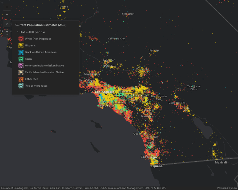
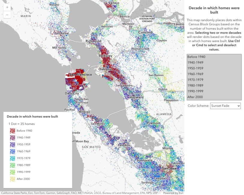
Dot density visualizations are sensitive to view scale. At a constant dot value, the density of features will appear inconsistent as the user zooms in and out. The DotDensityRenderer allows you to linearly scale the dot value based on the view scale. This is configured with the reference property. As you zoom in and out of the initial view, the relative density of points remains the same across scales.
In addition to setting a reference, you should typically set a min on the layer. Dot density visualizations are difficult to read when dots are no longer distinguishable, either because they coalesce or because they are too dispersed.
Setting a max on the layer is also important because dot density maps tend to become unreadable at larger scales. Users may start seeing patterns in the random distribution of dots that do not exist in reality. They may also mistakenly interpret the location of each dot as an actual point feature. Users are particularly susceptible to this when the dot is set to 1. As an example, dot density visualizations on county datasets should only be viewed at the state or regional level.
Example
The example below visualizes the density of the population by race in the United States. At a scale of 1:577,790, each dot represents 100 people. That dot will automatically adjust as the user zooms in and out. You can note this change in the legend.
const dotDensityRenderer = new DotDensityRenderer({
dotValue: 100,
outline: null,
referenceScale: 577790, // 1:577,790 view scale
legendOptions: {
unit: "people"
}
});
