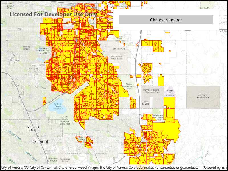
Display a shapefile with custom symbology.

Use case
Feature layers created from shapefiles do not possess any rendering information, and will be assigned with a default symbology. You can apply custom styling to ensure that the content is visible and usable in the context of a specific map. For example, you could use this to visually differentiate between features originating from two different shapefiles, by applying a blue color to one, and a red color to the other.
How to use the sample
Click the button to apply a new symbology renderer to the feature layer created from the shapefile.
How it works
- Create a
ShapefileFeatureTable, providing the path to a shapefile. - Create a
FeatureLayerand associate it with theShapeFileFeatureTable. - Create a
SimpleRendererto override the default symbology. The simple renderer takes a symbol and applies that to all features in a layer. - Apply the renderer to the
FeatureLayerby setting the renderer.
Relevant API
- FeatureLayer
- ShapefileFeatureTable
- SimpleFillSymbol
- SimpleLineSymbol
- SimpleRenderer
Offline data
This sample downloads the following items from ArcGIS Online automatically:
- Aurora_CO_shp.zip - Shapefiles that cover Aurora Colorado: Public art (points), Bike trails (lines), and Subdivisions (polygons).
About the data
This sample displays a shapefile containing subdivisions in Aurora, CO.
Additional information
While shapefiles contain no rendering information, other data sources such as Service Feature Tables or Geodatabase Feature Tables can contain such information. As a result, the rendering properties of the other data sources can be pre-defined by the author.
Tags
package, shape file, shapefile, symbology, visualization
Sample Code
<UserControl
x:Class="ArcGISRuntime.UWP.Samples.SymbolizeShapefile.SymbolizeShapefile"
xmlns="http://schemas.microsoft.com/winfx/2006/xaml/presentation"
xmlns:x="http://schemas.microsoft.com/winfx/2006/xaml"
xmlns:esriUI="using:Esri.ArcGISRuntime.UI.Controls">
<Grid>
<esriUI:MapView x:Name="MyMapView" />
<Border Style="{StaticResource BorderStyle}">
<Button x:Name="RendererButton"
Content="Change renderer"
IsEnabled="False"
HorizontalAlignment="Stretch"
Click="RendererButton_Click" />
</Border>
</Grid>
</UserControl>