The Spatially Enabled Dataframe has a plot() method that uses a syntax and symbology similar to matplotlib for visualizing features on a map. With this functionality, you can easily visualize aspects of your data both on a map and on a matplotlib chart using the same symbology!
Some unique characteristics of working with the visualization capabalities on the SDF:
- Uses Pythonic syntax
- Uses the same syntax as visualizing charts on Pandas DataFrames
- Uses symbology familiar to users of matplotlib
- Works on features and attributes simultaneously, eliminating to a great extent the need to iterate over all features (rows)
- Handles reading and writing to multiple formats aiding data conversion
Checkout the Introduction to Spatially Enabled DataFrame guide to learn how to create a Spatially Enabled DataFrame.
Quickstart
Let us read a census data on major cities and load that into a Spatially Enabled DataFrame
from arcgis import GIS
gis = GIS()
# create an anonymous connection to ArcGIS Online and get a public item
item = gis.content.get("85d0ca4ea1ca4b9abf0c51b9bd34de2e")
flayer = item.layers[0]

# Specify a SQL query and get a sub-set of the original data as a DataFrame
df = flayer.query(where="AGE_45_54 < 1500").sdf

# Visualize the top 5 records
df.head()| FID | NAME | CLASS | ST | STFIPS | PLACEFIPS | CAPITAL | POP_CLASS | POPULATION | POP2010 | ... | MARHH_NO_C | MHH_CHILD | FHH_CHILD | FAMILIES | AVE_FAM_SZ | HSE_UNITS | VACANT | OWNER_OCC | RENTER_OCC | SHAPE | |
|---|---|---|---|---|---|---|---|---|---|---|---|---|---|---|---|---|---|---|---|---|---|
| 0 | 1 | Ammon | city | ID | 16 | 1601990 | 6 | 15181 | 13816 | ... | 1131 | 106 | 335 | 3352 | 3.61 | 4747 | 271 | 3205 | 1271 | {"x": -12462673.723706165, "y": 5384674.994080... | |
| 1 | 2 | Blackfoot | city | ID | 16 | 1607840 | 6 | 11946 | 11899 | ... | 1081 | 174 | 381 | 2958 | 3.31 | 4547 | 318 | 2788 | 1441 | {"x": -12506251.313993266, "y": 5341537.793529... | |
| 2 | 4 | Burley | city | ID | 16 | 1611260 | 6 | 10727 | 10345 | ... | 861 | 139 | 358 | 2499 | 3.37 | 3885 | 241 | 2183 | 1461 | {"x": -12667411.402393516, "y": 5241722.820606... | |
| 3 | 6 | Chubbuck | city | ID | 16 | 1614680 | 6 | 14655 | 13922 | ... | 1281 | 172 | 370 | 3586 | 3.40 | 4961 | 229 | 3324 | 1408 | {"x": -12520053.904151963, "y": 5300220.333409... | |
| 4 | 12 | Jerome | city | ID | 16 | 1641320 | 6 | 11403 | 10890 | ... | 779 | 210 | 385 | 2640 | 3.44 | 3985 | 292 | 2219 | 1474 | {"x": -12747828.64784961, "y": 5269214.8197742... |
5 rows × 50 columns
Note: If the above cell looks new to you, please checkout the Introduction to Spatially Enabled DataFrame guide.
Let us create a map of the United States
m1 = GIS().map("United States")
m1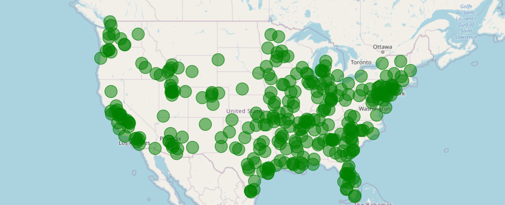
m1.zoom = 4
m1.center = [39,-98]
Plotting the DataFrame
You can quickly visualize the points by calling the plot() method off the DataFrame's spatial accessor and passing the map you created above.
df.spatial.plot(map_widget= m1)True
You can customize the symbols, their color, shape, border etc. like you would in a typical matplotlib plot. The rest of this guide talks about such customizations and suggestions to visualize your spatial and non-spatial data.
The code below plots the same set of points on a new map using a common structure used amongst many different Python packages for defining symbology. It is built off of the matplotlib libraries for simple, straightforward plotting. We'll explain some of the parameters below, and the plot() API Reference outlines more options.
m2= GIS().map('United States', zoomlevel=4)
m2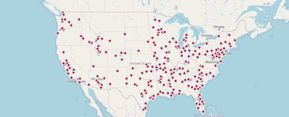
m2.center=[39,-98]
df.spatial.plot(map_widget=m2,
                renderer_type='s',
                symbol_type='simple',
                symbol_style='d', # d - for diamonds
                colors='Reds_r',
                cstep=50,
                outline_color='Blues',
                marker_size=10)
True
If this type of plotting is new to you, this is a good time to checkout matplotlib.pyplot documentation and Pandas dataframe plot documentation to get an idea.
Understanding renderers
In the snippets above, you visualized all the features with the same symbology. While this helps understand the geographic distribution of your data, your Spatially Enabled DataFrame object can do much more. For instance, you can group the features based on certain attributes that you choose and symbolize each group by a certain color or size or both. To help with this, let us understand the concept of renderers.
Renderers define how to visually represent a feature layer by defining symbols to represent individual features. The SeDF provides you with functionality to control the way features appear by choosing the symbol the renderer uses.
Previous versions of the ArcGIS API for Python provided a method to specify a renderer manually, but you had to know details about the renderer before you drew your data. The map.add_layer() method did not provide access to all options avialble for rendering datasets. The new visualization capabilities provided by the SEDF allow you to draw spatial data quickly and easily with access to more rendering options.
Supported renderers
The renderering options below are documented in further detail in the DatFrame Reference. At a high level, you have the following renderers:
| Renderer | Syntax | Explanation |
|---|---|---|
| Simple | 's' | renders using one symbol only (the examples in quickstart above) |
| Unique | 'u' | renders each unique value with a different symbol. Suitable for categorical columns |
| Unique | 'u-a' | renders each unique value with a different symbol using arcade expressions. Suitable for categorical columns |
| Class breaks | 'c' | renders each group of values with a different color or size. Suitable for numerical columns |
| Heatmap | 'h' | renders density of point data as raster of varying colors |
Visualizing unique values
Let us explore the major cities census data further and explore if there are any categorical columns
df.columnsIndex(['FID', 'NAME', 'CLASS', 'ST', 'STFIPS', 'PLACEFIPS', 'CAPITAL',
'POP_CLASS', 'POPULATION', 'POP2010', 'WHITE', 'BLACK', 'AMERI_ES',
'ASIAN', 'HAWN_PI', 'HISPANIC', 'OTHER', 'MULT_RACE', 'MALES',
'FEMALES', 'AGE_UNDER5', 'AGE_5_9', 'AGE_10_14', 'AGE_15_19',
'AGE_20_24', 'AGE_25_34', 'AGE_35_44', 'AGE_45_54', 'AGE_55_64',
'AGE_65_74', 'AGE_75_84', 'AGE_85_UP', 'MED_AGE', 'MED_AGE_M',
'MED_AGE_F', 'HOUSEHOLDS', 'AVE_HH_SZ', 'HSEHLD_1_M', 'HSEHLD_1_F',
'MARHH_CHD', 'MARHH_NO_C', 'MHH_CHILD', 'FHH_CHILD', 'FAMILIES',
'AVE_FAM_SZ', 'HSE_UNITS', 'VACANT', 'OWNER_OCC', 'RENTER_OCC',
'SHAPE'],
dtype='object')The ST column contains state names in abbreviation is a good candidate. We could symbolize the points such that all which fall under the same state get the same symbol:
df[['ST', 'NAME']].head()| ST | NAME | |
|---|---|---|
| 0 | ID | Ammon |
| 1 | ID | Blackfoot |
| 2 | ID | Burley |
| 3 | ID | Chubbuck |
| 4 | ID | Jerome |
gis = GIS()
m3 = gis.map("United States", zoomlevel=4)
m3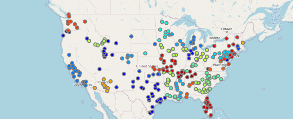
df.spatial.plot(map_widget = m3,
                renderer_type='u', # specify the unique value renderer using its notation 'u'
                col='ST'  # column to get unique values from
               )
True
By default, the API picks a unique color from the jet colormap for each category (US State names in this case) and assigns it. You can override this by choosing your own colormap (prism for instance) and customizing the symbol style, symbol type, outline color, thickness, transparency etc. Keep reading to learn more about these customizations.
It is a good cartographic practice to not have too many unique values in your legend. Human eyes can only preceive so many colors and there are only a limited number of colors to choose from in a given color map before the colors become indistinguishable.
As a safe practice, the Python API caps the maximum number of unique values to 256, the remaining are generalized and plotted with a default color. If you have several unique values, you should consider picking a different column that better represents your data or consider using a different renderer.
Visualizing Unique Values with Arcade Expressions
Arcade is an expression language that can be used across the ArcGIS Platform. Whether writing simple scripts to control how features are rendered, or expressions to control label text, Arcade provides a simple scripting syntax to deliver these capabilities.
In the sense of visualization, Arcade expressions are used to create rich and dynamic symbology. This example will follow the JavaScript guide.
Obtain the Data
Access the enterprise to gain access to the FeatureLayer information and query it into a Spatially Enabled DataFrame.
item = gis.content.get("8444e275037549c1acab02d2626daaee")
flayer = item.layers[0]
df2 = flayer.query().sdf
fset = flayer.query()from arcgis.geometry import Geometry
g = Geometry(fset.features[0].geometry)
g.as_arcpyWrite out the Arcade Expressions and Stops
Arcade expressions require the stops to be manually provided. In this case, we first create an opacity visual variable based on a percent of dominant parties in registered citizens.
opacity_expression = ("var republican = $feature.MP06025a_B;var democrat = $feature.MP06024a_B;"
                      "var independent = $feature.MP06026a_B;var parties = [republican, democrat, independent];"
                      "var total = Sum(parties);var max = Max(parties);return (max / total) * 100;")
opacity_stops = [
    { "value": 33, "transparency": 0.05 * 255, "label": "< 33%" },
    { "value": 44, "transparency": 1.0 * 255, "label": "> 44%" }]
Next we develop another Arcade expression to obtain the majority party in a given county.
arcade_expression = ("var republican = $feature.MP06025a_B;var democrat = $feature.MP06024a_B;"
                     "var independent = $feature.MP06026a_B;var parties = [republican, democrat, independent];"
                     "return Decode( Max(parties),republican, 'republican', democrat, 'democrat',independent, "
                     "'independent','n/a' );")
uv = [{"label":"Democrat","symbol":{"type":"esriSFS","color":[0,195,255,255],
                                    "outline":{"type":"esriSLS","color":[0,0,0,51],
                                               "width":0.5,"style":"esriSLSSolid"},
                                    "style":"esriSFSSolid"},"value":"democrat"},
      {"label":"Republican","symbol":{"type":"esriSFS","color":[255,0,46,255],"outline":{
          "type":"esriSLS","color":[0,0,0,51],"width":0.5,"style":"esriSLSSolid"},
                                      "style":"esriSFSSolid"},"value":"republican"},
      {"label":"Independent/other party","symbol":{"type":"esriSFS","color":[250,255,0,255],
                                                   "outline":{"type":"esriSLS","color":[0,0,0,51],
                                                              "width":0.5,"style":"esriSLSSolid"},
                                                   "style":"esriSFSSolid"},"value":"independent"}]
gis = GIS()
m3_ua = gis.map('United States', zoomlevel=4)
m3_ua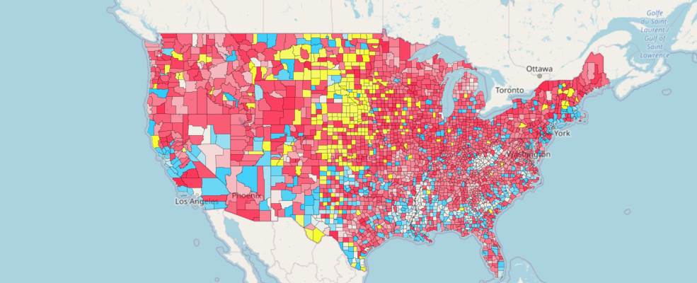
Visualize the Data
Provide the color scheme, and the arcade_expression to render the data in a dynamic/rich form.
df2.spatial.plot(colors='coolwarm',
                map_widget=m3_ua,
                renderer_type='u-a',  # 'u-a' stands for uniqe value with arcade expression
                unique_values=uv,
                opacity_stops=opacity_stops,
                opacity_expression=opacity_expression,
                arcade_expression=arcade_expression)
True
Visualizing classes with different colors
Often, you may want to classify the numerical values in your data into groups and visualize them on a map. You can accomplish this with a class break renderer which splits your data into specific number of groups and uses color to differentiate each group. You can choose the algorithm that performs the class splits or go with the defualt.
Let us visualize the same major cities point dataset using its POPULATION column.
df[['ST', 'NAME', 'POPULATION']].head()| ST | NAME | POPULATION | |
|---|---|---|---|
| 0 | ID | Ammon | 15181 |
| 1 | ID | Blackfoot | 11946 |
| 2 | ID | Burley | 10727 |
| 3 | ID | Chubbuck | 14655 |
| 4 | ID | Jerome | 11403 |
m4 = gis.map('USA', zoomlevel=4)
m4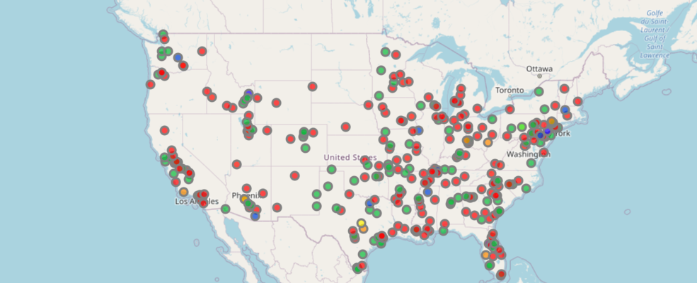
df.spatial.plot(map_widget=m4,
               renderer_type='c',  # for class breaks renderer
               method='esriClassifyNaturalBreaks',  # classification algorithm
               class_count=20,  # choose the number of classes
               col='POPULATION',  # numeric column to classify
               cmap='prism',  # color map to pick colors from for each class
               alpha=0.7  # specify opacity
               )
True
You can take this further by plotting a histogram of the same POPULATION column and try to match the colors. To get the class breaks for the above map, you can inspect the layer definition from MapView object as shown below:
dict(m4.layers[0].layer.layerDefinition.drawingInfo.renderer).keys()dict_keys(['type', 'visualVariables', 'rotationType', 'minValue', 'field', 'defaultSymbol', 'defaultLabel', 'classificationMethod', 'classBreakInfos'])
class_breaks = m4.layers[0].layer.layerDefinition.drawingInfo.renderer.classBreakInfos
print(len(class_breaks))
20
We can loop through each of the class breaks and obtain the min, max values and the colors for each class.
cbs_list = []
cmap_list = []
for cb in class_breaks:
    print(cb.description)  # print the class break labels
    cbs_list.append(cb.classMaxValue)
    cmap_list.append([x/255.0 for x in cb.symbol.color])
7957.0 - 11659.315789473683 11659.315789473683 - 15361.631578947368 15361.631578947368 - 19063.947368421053 19063.947368421053 - 22766.263157894737 22766.263157894737 - 26468.57894736842 26468.57894736842 - 30170.894736842107 30170.894736842107 - 33873.21052631579 33873.21052631579 - 37575.52631578947 37575.52631578947 - 41277.84210526316 41277.84210526316 - 44980.15789473684 44980.15789473684 - 48682.47368421053 48682.47368421053 - 52384.78947368421 52384.78947368421 - 56087.10526315789 56087.10526315789 - 59789.42105263158 59789.42105263158 - 63491.73684210526 63491.73684210526 - 67194.05263157895 67194.05263157895 - 70896.36842105264 70896.36842105264 - 74598.68421052632 74598.68421052632 - 78301.0 78301.0 - 78301.0
Now that we have the individual class splits and the colors, we can plot a histogram using the same breaks and colors.
import matplotlib.pyplot as plt
# build a histogram for the same class breaks
n, bins, patches = plt.hist(df['POPULATION'], bins=cbs_list)

# apply the same color for each class to match the map
idx = 0
for c, p in zip(bins, patches):
    plt.setp(p, 'facecolor', cmap_list[idx])
    idx+=1

plt.title('Histogram of POPULATION column')
Text(0.5, 1.0, 'Histogram of POPULATION column')
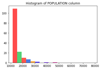
The shape and color of the bars in the histogram match with the number and color of major cities drawn on the map.
Thus using the Spatially Enabled DataFrame we can easily visualize both the spatial and numeric distribution of data using the same symbology.
Colormaps and Colors
The examples above use the default colormap jet. However you can customize them by using the colors paramater. You can specify colors as:
- a string representing named colors
- an array of RGB values
- a named color ramp.
Color Array
RGB + Alpha values can be used to create colors for symbols called in the plot method. RGB stands for red, green, and blue respectively. Each RGB value is a value between 0-255, and the alpha value is a number between 0-255.
Example to produce :
color = [255,0,100,1]
The above example produces a purplish color. Many websites provide details about using colors. For example, see here for a color codes chart.
Color Maps
A color map is a collection of string values that can be given to generate a series of related colors from a defined set.
Color maps can be viewed here: https://matplotlib.org/examples/color/colormaps_reference.html
Color Map Helpers
To better understand the syntax for each input type, the ArcGIS API for Python provides some helper functions:
from arcgis.mapping import display_colormapsThe display_colormaps function provides a quick, easy way to visualize the pre-defined set of colormaps you can use.
display_colormaps()You can retrieve a list of colormaps as well:
from arcgis.mapping import symbol

colormaps = symbol.ALLOWED_CMAPS
for a,b,c,d,e in zip(colormaps[::5], colormaps[1::5], colormaps[2::5], colormaps[3::5], colormaps[4::5]):
    print("{:<20}{:<20}{:<20}{:<20}{:<}".format(a,b,c,d,e))
You can enter a list of color ramp names as input to the display_colormaps function to filter the output:
display_colormaps(['Greens_r', 'PRGn', 'Dark2', 'Set1'])The examples above used jet which is the default and some used prism both of which can be seen in the list above. You can customize your charts by using a different colormap of your choice.
Symbology for Simple Renderers
The ArcGIS API for Python provides you the ability to set symbol types so you control data appearance. The show_styles function in the arcgis.mapping module assists you with the syntax to define symbols.
Getting the different symbol styles
from arcgis.mapping import show_styles# get the styles that are relevant to the current geometry type (points)
show_styles(df.spatial.geometry_type[0]) # the DataFrame in this example is of Point type| MARKER | ESRI_STYLE | |
|---|---|---|
| 0 | o | Circle (default) |
| 1 | + | Cross |
| 2 | d | Diamond |
| 3 | s | Square |
| 4 | x | X |
show_styles('Polygon')| MARKER | ESRI_STYLE | |
|---|---|---|
| 0 | \ | Backward Diagonal |
| 1 | / | Forward Diagonal |
| 2 | | | Vertical Bar |
| 3 | - | Horizontal Bar |
| 4 | x | Diagonal Cross |
| 5 | + | Cross |
| 6 | s | Solid Fill (default) |
show_styles('Line')| MARKER | ESRI_STYLE | |
|---|---|---|
| 0 | s | Solid (default) |
| 1 | - | Dash |
| 2 | -. | Dash Dot |
| 3 | -.. | Dash Dot Dot |
| 4 | . | Dot |
| 5 | -- | Long Dash |
| 6 | --. | Long Dash Dot |
| 7 | n | Null |
| 8 | s- | Short Dash |
| 9 | s-. | Short Dash Dot |
| 10 | s-.. | Short Dash Dot Dot |
| 11 | s. | Short Dot |
For instance, you can represent the same set of points using square symbols instead of default circle using the snippet shown below:
m7 = GIS().map('United States', 4)
m7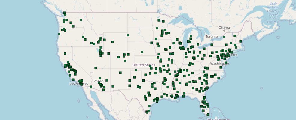
m7.center = [39, -98]
df.spatial.plot(map_widget=m7,
                renderer_type='s',
                symbol_type='simple',
                symbol_style='s',  # for square
                cmap='Greens_r',   # color map is Greens_r for green reversed
                cstep=35,   # the individual color in the colormap
                outline_color='binary',
                marker_size=5,
                line_width=.5,)
True
Visualizing line features using simple symbols
Let us search for USA freeway layer and visualize it by looping through the different line symbols
search_result = gis.content.search('title:USA Freeway System AND owner:esri_dm',
                                  item_type = 'Feature Layer')
freeway_item = search_result[0]
freeway_itemfreeway_sdf = freeway_item.layers[0].query().sdf
freeway_sdf.head()| OBJECTID | ROUTE_NUM | CLASS | NUMBER | SUFFIX | DIST_MILES | DIST_KM | SHAPE | |
|---|---|---|---|---|---|---|---|---|
| 0 | 1 | CG8 | C | G8 | 5.12996 | 8.25588 | {"paths": [[[-121.892261711658, 37.32391610061... | |
| 1 | 2 | I105 | I | 105 | 19.83041 | 31.91401 | {"paths": [[[-118.368428716304, 33.93055610296... | |
| 2 | 3 | I205 | I | 205 | 48.25566 | 77.66011 | {"paths": [[[-122.561879717577, 45.54969107336... | |
| 3 | 4 | I215 | I | 215 | 93.43523 | 150.36972 | {"paths": [[[-117.319118714291, 34.14458511089... | |
| 4 | 5 | I238 | I | 238 | 2.03548 | 3.27579 | {"paths": [[[-122.137358724846, 37.69015308551... |
m8 = gis.map('USA', 10)
m8
m8.center=[34.05,-118.2]
m8.zoom=12
m8.basemap='dark-gray'
import time
for row, style in show_styles('Line').iterrows():
#m8.remove_layers()
time.sleep(1) # sleep for 1 second so animation can finish
print(f"{style['ESRI_STYLE']:19}\t{style['MARKER']}")
freeway_sdf.spatial.plot(map_widget=m8,
renderer_type='s',
cmap='Spectral', # use a different color map
symbol_type='simple',
symbol_style=style['MARKER']
)Solid (default) s Dash - Dash Dot -. Dash Dot Dot -.. Dot . Long Dash -- Long Dash Dot --. Null n Short Dash s- Short Dash Dot s-. Short Dash Dot Dot s-.. Short Dot s.
Visualizing area features using different symbols
from arcgis.features import FeatureLayer
fl = FeatureLayer("https://sampleserver6.arcgisonline.com/arcgis/rest/services/Census/MapServer/2")
county_sdf = fl.query("STATE_NAME='Washington'", out_sr=4326).sdf
county_sdf.head()| OBJECTID | NAME | STATE_NAME | STATE_FIPS | CNTY_FIPS | FIPS | POP2000 | POP2007 | POP00_SQMI | POP07_SQMI | ... | OWNER_OCC | RENTER_OCC | NO_FARMS97 | AVG_SIZE97 | CROP_ACR97 | AVG_SALE97 | SQMI | Shape_Length | Shape_Area | SHAPE | |
|---|---|---|---|---|---|---|---|---|---|---|---|---|---|---|---|---|---|---|---|---|---|
| 0 | 2953 | Adams | Washington | 53 | 001 | 53001 | 16428 | 17555 | 8.5 | 9.1 | ... | 3576 | 1653 | 628 | 1746 | 808651 | 321.45 | 1930.0 | 3.879553 | 0.590994 | {"rings": [[[-119.36961802215399, 46.737285024... |
| 1 | 2954 | Asotin | Washington | 53 | 003 | 53003 | 20551 | 21237 | 32.1 | 33.1 | ... | 5612 | 2752 | 140 | 2175 | 87282 | 69.59 | 640.6 | 2.127905 | 0.193369 | {"rings": [[[-117.48006100031489, 46.085736986... |
| 2 | 2955 | Benton | Washington | 53 | 005 | 53005 | 142475 | 164259 | 81.0 | 93.3 | ... | 36344 | 16522 | 1078 | 568 | 440291 | 278.79 | 1760.0 | 3.259149 | 0.531696 | {"rings": [[[-119.87687899986594, 46.562399986... |
| 3 | 2956 | Chelan | Washington | 53 | 007 | 53007 | 66616 | 71939 | 22.3 | 24.0 | ... | 16178 | 8843 | 1113 | 111 | 41046 | 131.54 | 2993.7 | 6.259164 | 0.932106 | {"rings": [[[-121.17981297788657, 47.896832976... |
| 4 | 2957 | Clallam | Washington | 53 | 009 | 53009 | 64525 | 70908 | 36.6 | 40.2 | ... | 19757 | 7407 | 292 | 72 | 12116 | 20.58 | 1764.3 | 5.627030 | 0.551224 | {"rings": [[[-124.73315299891175, 48.163761012... |
5 rows × 53 columns
m9 = gis.map('Seattle, WA', zoomlevel=6)
m9.basemap='gray'
m9
for idx, style in show_styles('Polygon').iterrows():
    m9.remove_layers()
    time.sleep(0.5)

    print(f"{style['ESRI_STYLE']:22}\t{style['MARKER']}")
    county_sdf.spatial.plot(map_widget=m9,
                           renderer_type='s',
                           cmap = 'RdPu',  # use a red to purple color map
                           symbol_type='simple',
                           symbol_style=style['MARKER'],
                           outline_style='s',
                           outline_color=[0,0,0,255],
                           line_width=1.0)
Backward Diagonal \ Forward Diagonal / Vertical Bar | Horizontal Bar - Diagonal Cross x Cross + Solid Fill (default) s
Conclusion
The Spatially Enabled DataFrame gives you powerful visualization capabilities that allows you to plot your data on the interactive map widget. You specify colors and symbols using the same syntax that you would specify for a normal Pandas or a matplotlib plot.
