Smart Mapping is designed to help developers get started with data visualization. It consists of more than a dozen APIs that generate renderers specific to an input dataset. These APIs are designed to help users and developers understand their data so they can make informed decisions best suited for visualizing it.
Smart mapping will help you understand the nature of the data (the statistics and spread), and suggest a set of color ramps designed by seasoned cartographers specifically for the desired style.
To learn more about this exciting capability visit the help page and this blog article. Here is a detailed help on the various ways you can symbolize your data.
Visualizing line features
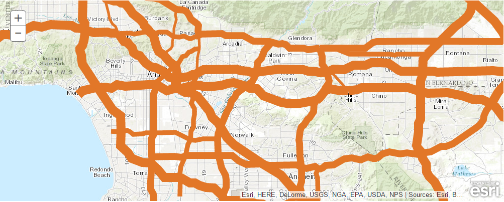
The first example shows some ideas on visualizing linear features using a streets layer. When you add an Item object to your map, the map widget renders it using the default symbology of the item. With smart mapping, you can customize this. In this example we will use ClassBreaksRenderer to emphasize differences in value by varying the thickness of line features.
from arcgis.gis import *

gis = GIS()
map1 = gis.map("Anaheim, CA")
map1
Let us search for an item titled USA Freeway System by Esri and add that to the map
search_result = gis.content.search(
    "title:USA freeway system AND owner:esri_dm", item_type="Feature Layer"
)
search_result
[<Item title:"USA Freeway System" type:Feature Layer Collection owner:esri_dm>, <Item title:"USA Freeway System" type:Feature Layer Collection owner:esri_dm>]
Note: Either feature layer collection returned should work for this exercise. If the layer doesn't draw immediately, you may need to zoom in before features draw.
freeway_item = search_result[0]
map1.content.add(freeway_item)
The freeway layer uses a simple symbology. Let us visualize it by one of the fields available on the feature layer. To do that, we get the Item's layers as FeatureLayer objects. From the FeatureLayer object, we can find the url and available fields.
# Use the first layer available on the service.
freeway_feature_layer = freeway_item.layers[0]

# Print the layer's url and field names.
print(freeway_feature_layer.url)
for field in freeway_feature_layer.properties["fields"]:
    print(field["name"])
https://services.arcgis.com/P3ePLMYs2RVChkJx/arcgis/rest/services/USA_Freeway_System/FeatureServer/1 OBJECTID ROUTE_NUM CLASS NUMBER SUFFIX DIST_MILES DIST_KM
Let us use DIST_MILES field and symbolize it with varying colors. Let us also change the extent of the map to illustrate the differences better.
map1.content.add(freeway_feature_layer)map1.content.layers[Group Layer: USA Freeway System, <FeatureLayer url:"https://services.arcgis.com/P3ePLMYs2RVChkJx/arcgis/rest/services/USA_Freeway_System/FeatureServer/1">]
renderer_manager = map1.content.renderer(1)
smart_mapping_manager = renderer_manager.smart_mapping()
smart_mapping_manager.class_breaks_renderer(break_type="size", field="DIST_MILES")
# Change map's extent to Los Angeles city
map1.center = [34, -118]map1.zoom = 10Thus, we represented longer freeways as thicker lines and shorter ones with thinner lines.
Visualizing area features
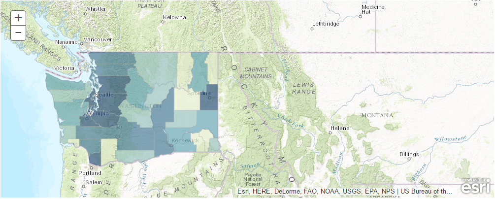
Area or polygon features are typically symbolized in varying colors to represent the differences in values. The example below shows how a Classed Color Renderer can be used to visualize the population differences between the counties of the state of Washington.
As you have seen in the previous sample, by using the SmartMappingManager class, you can author the map, add your layer, and create the smart mapping class by specifying the layer to use. From this you can utilize any of the smart mapping methods and the necessary parameters, and your GIS does the rest, such as identifying a suitable color scheme based on your basemap and the min and max values for the color ramp.
The sample also shows how querying can be used to limit the features displayed from the layer, and how the layer can be represented with transparency allowing the basemap to be seen.
map2 = gis.map("Seattle, WA")map2
The steps to search for a Feature Layer item and obtaining its url is demonstrated in the previous sample. For brevity, this sample skips that part.
from arcgis.layers import Service

fl = Service(
    "https://sampleserver6.arcgisonline.com/arcgis/rest/services/Census/MapServer/2"
)
fl
<MapFeatureLayer url:"https://sampleserver6.arcgisonline.com/arcgis/rest/services/Census/MapServer/2">
washington_counties = fl.query(where="STATE_NAME='Washington'", out_fields="*")
washington_counties
<FeatureSet> 39 features
map2.content.add(washington_counties, options={"opacity": 0.7})renderer_manager = map2.content.renderer(0)
smart_mapping_manager = renderer_manager.smart_mapping()
smart_mapping_manager.class_breaks_renderer(
break_type="color",
field="POP2007",
)Visualizing location data
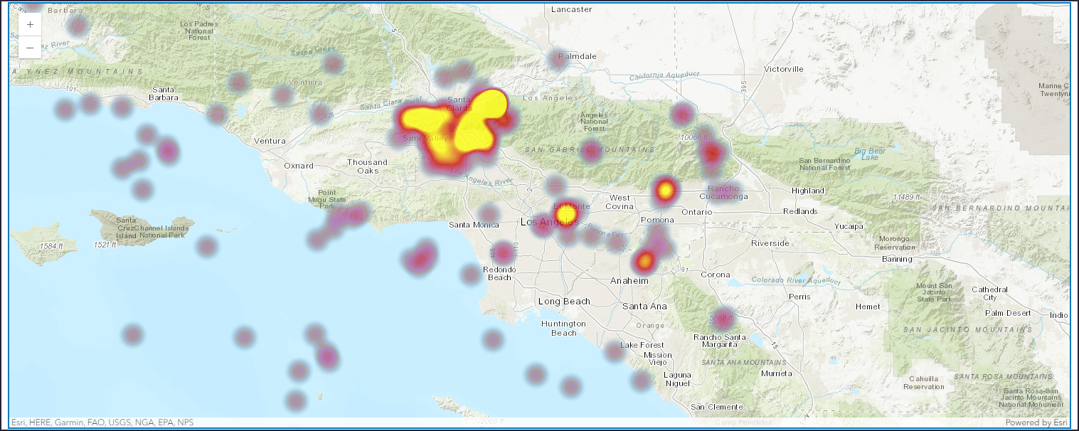
Point features are the most common type of location data. Smart mapping provides a special visualization technique called heatmap. The heatmap renderer is useful when representing the spatial distribution or clustering of points as it represents the relative density of points on a map as smoothly varying sets of colors ranging from cool (low density) to hot (many points).
The sample below visualizes earthquake occurrences in Southern California using the heatmap renderer.
map3 = gis.map("Los Angeles")map3
feature_layer = Service(
    "http://services1.arcgis.com/hLJbHVT9ZrDIzK0I/arcgis/rest/services/EQMagGt4/FeatureServer/0"
)
feature_layer
<FeatureLayer url:"http://services1.arcgis.com/hLJbHVT9ZrDIzK0I/arcgis/rest/services/EQMagGt4/FeatureServer/0">
map3.content.add(feature_layer, options={"opacity": 0.75})renderer_manager = map3.content.renderer(0)
smart_mapping_manager = renderer_manager.smart_mapping()
smart_mapping_manager.heatmap_renderer()