According to WHO, 2019 Novel Corona Virus (COVID-19) is a virus (more specifically, a coronavirus) identified as the cause of an outbreak of respiratory illness, which was unknown before the outbreak began in Wuhan, China, in December 2019 [1]. Early on, the disease demonstrated an animal-to-person spread, then a person-to-person spread. Infections with COVID-19, were reported in a growing number of international locations, including the United States". The United States reported the first confirmed instance of person-to-person spread with this virus on January 30, 2020 [2].
This notebook shows how to use the ArcGIS API for Python to monitor the spread of COVID-19 as it became a pandemic (updated as of June 28th, 2021).
1. Import Data
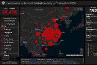
Esri provides an open-to-public and free-to-share feature layer that contains the most up-to-date COVID-19 cases covering China, the United States, Canada, Australia (at province/state level), and the rest of the world (at country level, represented by either the country centroids or their capitals). Data sources are WHO, US CDC, China NHC, ECDC, and DXY. The China data is updated automatically at least once per hour, and non-China data is updating manually. The data source repo that this layer referenced from, is created and maintained by the Center for Systems Science and Engineering (CSSE) at the Johns Hopkins University, and can be viewed here. In this notebook, we will use the feature layer supported by Esri Living Atlas team and JHU Data Services, and provide a different perspective in viewing the global maps of COVID-19 via the use of ArcGIS API for Python.
NOTE: "Since COVID-19 is continuously evolving, the sample reflects data as of June 28th, 2021 (or if you are looking at a previously published version of this notebook, the data and maps were fetched/made as of July 4th, 2020). Running this notebook at a later date might reflect a different result, but the overall steps should hold good."
DISCLAIMER: "This notebook is for the purpose of illustrating an analytical process using Jupyter Notebooks and ArcGIS API for Python, and should not be used as medical or epidemiological advice."
Necessary Imports
from io import BytesIO
import requests
import pandas as pd
from arcgis.layers import Service
from arcgis.gis import GIS
from arcgis.map import Map
"""
# if you are using arcgis api for python with version 1.8.0 or above,
# make sure that the pandas version>=1.0,
# if not, use `pip install --upgrade pandas>=1` to upgrade.
"""
pd.__version__'2.1.4'
Get data for the analysis
Query the source feature layer
The dashboard item contributed to the public by Esri and JHU CSSE, is accessible through here:
gis = GIS(profile="your_online_profile")item = gis.content.search("Coronavirus_2019_nCoV_Cases owner:CSSE_covid19", outside_org=True)[0]
itemThrough the API Explorer provided along with the dashboard product, we can easily fetch the source URL for the Feature Service containing daily updated COVID-19 statistics, which can then be used to create a FeatureLayer object good for querying and visualizing.
src_url = "https://services1.arcgis.com/0MSEUqKaxRlEPj5g/arcgis/rest/services/Coronavirus_2019_nCoV_Cases/FeatureServer/1"
fl = Service(src_url)
df_global = fl.query(where="1=1",
return_geometry=True,
as_df=True)As stated in the dashboard, the source data can be grouped into:
- A. Countries or regions of which data are collected at province/state level, e.g. China, the United States, Canada, Australia;
- B. Countries or regions for the rest of the world of which data collected at country level, and shape represented by either the country centroids or their capitals;
- C. Cruise Ships with confirmed COVID-19 cases.
Group A
Let us first take a look at how many countries are within group A, that Country_Region and Province_State are not null or NAN.
df_global[~pd.isnull(df_global['Province_State'])].groupby('Country_Region').sum(numeric_only=True)[['Confirmed', 'Recovered', 'Deaths']]| Confirmed | Recovered | Deaths | |
|---|---|---|---|
| Country_Region | |||
| Australia | 10114810 | 0 | 14426 |
| Belgium | 4497199 | 0 | 32575 |
| Brazil | 34516739 | 0 | 684813 |
| Canada | 4225396 | 0 | 44607 |
| Chile | 4559801 | 0 | 60749 |
| China | 2615637 | 0 | 15020 |
| Colombia | 6304317 | 0 | 141708 |
| Denmark | 46629 | 0 | 49 |
| France | 1180540 | 0 | 4517 |
| Germany | 32452250 | 0 | 148299 |
| India | 44495359 | 0 | 528150 |
| Italy | 22035291 | 0 | 176204 |
| Japan | 20074857 | 0 | 42554 |
| Malaysia | 4803624 | 0 | 36277 |
| Mexico | 7056269 | 0 | 329736 |
| Netherlands | 8507272 | 0 | 23253 |
| New Zealand | 6386 | 0 | 1 |
| Pakistan | 1570796 | 0 | 30598 |
| Peru | 4125208 | 0 | 216086 |
| Russia | 19722556 | 0 | 377462 |
| Spain | 13367647 | 0 | 113130 |
| Sweden | 2573548 | 0 | 20006 |
| US | 95242750 | 0 | 1050318 |
| Ukraine | 5363758 | 0 | 116685 |
| United Kingdom | 23771572 | 0 | 206751 |
Each country/region in Group A, has more than 1 feature, as what we have seen below from the query() results.
fset_usa = fl.query(where="Country_Region='US'")
fset_usa
<FeatureSet> 60 features
fset_china = fl.query(where="Country_Region='China'")
fset_china
<FeatureSet> 34 features
fl.query(where="Country_Region='Denmark'")<FeatureSet> 3 features
Group C
Group C contains cruise ships across the globe with reported cases:
df_cruise_ships = fl.query(where="Province_State='Diamond Princess' or \
                                  Province_State='Grand Princess' or \
                                  Country_Region='MS Zaandam' or \
                                  Country_Region='Diamond Princess'",
as_df=True)df_cruise_ships[["Province_State", "Country_Region", "Last_Update", "Confirmed", "Recovered", "Deaths"]]| Province_State | Country_Region | Last_Update | Confirmed | Recovered | Deaths | |
|---|---|---|---|---|---|---|
| 0 | Diamond Princess | Canada | 2020-12-21 13:27:30 | 0 | 0 | 1 |
| 1 | Grand Princess | Canada | 2020-12-21 13:27:30 | 13 | 0 | 0 |
| 2 | <NA> | Diamond Princess | 2022-09-11 05:20:45 | 712 | 0 | 13 |
| 3 | <NA> | MS Zaandam | 2022-09-11 05:20:45 | 9 | 0 | 2 |
| 4 | Grand Princess | US | 2020-08-04 02:27:56 | 103 | 0 | 3 |
| 5 | Diamond Princess | US | 2020-08-04 02:27:56 | 49 | 0 | 0 |
Group B
In the df_global, other than the 22 countries (Australia, Canada, China, etc.) in Group A, and those cruise ships in Group C, all other countries/regions fall into Group B, e.g. Thailand. The major difference between Group A and Group B is that the latter contains one and only feature per country.
fl.query(where="Country_Region='Thailand'")<FeatureSet> 1 features
Query the reference feature layers
Because the geo-information provided by the dashboard contains only the coordinates representing the centroid of each country/region, the feature layer can only be rendered as points on Map. If this is what you want, you can now skip the rest of section 1, and jump right onto section 2.
On the other hand, if you want to visualize the confirmed/death/recovered cases per country/region as polygons, in other words as a choropleth map, please read along:
First, we need to access the feature service that contains geometry/shape info for all provinces in Mainland China, and merge with the COVID-19 DataFrame.
Access the reference feature layer of China
provinces_item = gis.content.get("0f57da7f853c4a1aa5b2e048ff8655d2")
provinces_itemprovinces_flayer = provinces_item.layers[0]
provinces_df = provinces_flayer.query(as_df=True)
provinces_df.columnsIndex(['OBJECTID', 'ID', 'NAME', 'AREA', 'TOTPOP_CY', 'ISO_CODE', 'ISO_SUB',
'ISO2_CC', 'ISO3_CC', 'Shape__Area', 'Shape__Length', 'ID_1',
'sourceCountry', 'ENRICH_FID', 'aggregationMethod',
'populationToPolygonSizeRating', 'apportionmentConfidence', 'HasData',
'TOTPOP_CY_1', 'YEAR2018', 'SHAPE'],
dtype='object')tmp = provinces_df.sort_values('NAME', ascending=True)
provinces_df = tmp.drop_duplicates(subset='NAME', keep='last')
provinces_df.shape(31, 21)
DataFrame Merging for China Dataset
The subsets of dataframe being created in the previous section now needs to be merged with feature services which have geographic information (e.g. geometries, shape, or longitude/latitude) in order to provide location and geometries required for geographic mapping. First, let's acquire the geometries from feature services existing on living atlas or arcgis online organization to represent the geographic information needed of overlap_rows_china.
df_china = fset_china.sdf[['Province_State', 'Confirmed', 'Recovered', 'Deaths']]
df_china = df_china.assign(NAME = df_china["Province_State"])
df_china.head()| Province_State | Confirmed | Recovered | Deaths | NAME | |
|---|---|---|---|---|---|
| 0 | Anhui | 1506 | 0 | 6 | Anhui |
| 1 | Beijing | 4088 | 0 | 9 | Beijing |
| 2 | Chongqing | 1012 | 0 | 6 | Chongqing |
| 3 | Fujian | 4176 | 0 | 1 | Fujian |
| 4 | Gansu | 1348 | 0 | 2 | Gansu |
Because the names are inconsistent between the two data sources (e.g. provinces represented differently in df_china['Province_State'] and provinces_df['NAME"]), the replace_value_in_column method is declared below to edit the records and unify the column names.
def replace_value_in_column(data_frame, l_value, r_value, column_name = 'NAME'):
    data_frame.loc[data_frame[column_name] == l_value, column_name] = r_value

replace_value_in_column(df_china, 'Guangxi', 'Guangxi Zhuang Autonomous Region')
replace_value_in_column(df_china, 'Inner Mongolia', 'Inner Mongolia Autonomous Region')
replace_value_in_column(df_china, 'Ningxia', 'Ningxia Hui Autonomous Region')
replace_value_in_column(df_china, 'Tibet', 'Tibet Autonomous Region')
Now the two DataFrame objects have got unified column names, we can go ahead to use a single function in Pandas called merge as an entry point to perform in-memory standard database join operations (similar to that of relational databases such as SQL), and its syntax is shown here -
pd.merge(left, right, how='inner', on=None, left_on=None, right_on=None,
         left_index=False, right_index=False, sort=True)
Note that, the how argument specifies how to merge (a.k.a. how to determine which keys are to be included in the resulting table). If a key combination does not appear in either the left or the right tables, the values in the joined table will be NA. The table below then shows a summary of the how options and their SQL equivalent names −
| Merge Method | SQL Equivalent | Description |
|---|---|---|
| left | LEFT OUTER JOIN | Use keys from left object |
| right | RIGHT OUTER JOIN | Use keys from right object |
| outer | FULL OUTER JOIN | Use union of keys |
| inner | INNER JOIN | Use intersection of keys |
In this case, we will be calling merge() with how='inner' to perform the inner join of the two DataFrame objects on the index field "NAME" and only to keep the intersection of keys.
cols_2 = ['NAME', 'AREA', 'TOTPOP_CY','SHAPE']
overlap_rows_china = pd.merge(left = provinces_df[cols_2], right = df_china,
                              how='inner', on = 'NAME')
overlap_rows_china.head()| NAME | AREA | TOTPOP_CY | SHAPE | Province_State | Confirmed | Recovered | Deaths | |
|---|---|---|---|---|---|---|---|---|
| 0 | Anhui | 140139.795987 | 61795934 | {"rings": [[[116.36710167, 34.643320083], [116... | Anhui | 1506 | 0 | 6 |
| 1 | Beijing | 16535.630276 | 22237467 | {"rings": [[[116.647890001, 41.0513740000001],... | Beijing | 4088 | 0 | 9 |
| 2 | Chongqing | 82390.600691 | 30365055 | {"rings": [[[108.50186348, 32.20025444], [108.... | Chongqing | 1012 | 0 | 6 |
| 3 | Fujian | 121789.666833 | 38659398 | {"rings": [[[118.426801682, 28.2953205110001],... | Fujian | 4176 | 0 | 1 |
| 4 | Gansu | 401138.394581 | 26268236 | {"rings": [[[97.1721363070001, 42.793840408000... | Gansu | 1348 | 0 | 2 |
cols_2 = ['NAME', 'AREA', 'TOTPOP_CY','SHAPE','Shape__Area', 'Shape__Length']
overlap_rows_china = pd.merge(left = provinces_df[cols_2], right = df_china, how='inner',
                        on = 'NAME')
overlap_rows_china.head()| NAME | AREA | TOTPOP_CY | SHAPE | Shape__Area | Shape__Length | Province_State | Confirmed | Recovered | Deaths | |
|---|---|---|---|---|---|---|---|---|---|---|
| 0 | Anhui | 140139.795987 | 61795934 | {"rings": [[[116.36710167, 34.643320083], [116... | 13.352904 | 32.965496 | Anhui | 1506 | 0 | 6 |
| 1 | Beijing | 16535.630276 | 22237467 | {"rings": [[[116.647890001, 41.0513740000001],... | <NA> | <NA> | Beijing | 4088 | 0 | 9 |
| 2 | Chongqing | 82390.600691 | 30365055 | {"rings": [[[108.50186348, 32.20025444], [108.... | 7.708492 | 30.308633 | Chongqing | 1012 | 0 | 6 |
| 3 | Fujian | 121789.666833 | 38659398 | {"rings": [[[118.426801682, 28.2953205110001],... | 10.989105 | 54.634113 | Fujian | 4176 | 0 | 1 |
| 4 | Gansu | 401138.394581 | 26268236 | {"rings": [[[97.1721363070001, 42.793840408000... | 41.085703 | 80.438096 | Gansu | 1348 | 0 | 2 |
As shown in overlap_rows_china, each province/state in China is now merged while retaining the SHAPE column, and is ready to be rendered as polygons.
Access the reference feature layer of the United States
Next, we need to access the feature service that contains geometry/shape info for all states in the U. S., and merge with the DataFrame depicting COVID-19 statistics.
us_states_item = gis.content.get('99fd67933e754a1181cc755146be21ca')
us_states_itemus_states_flayer = us_states_item.layers[0]
us_states_df = us_states_flayer.query(as_df=True)
us_states_df.columnsIndex(['FID', 'STATE_NAME', 'STATE_FIPS', 'SUB_REGION', 'STATE_ABBR',
'POPULATION', 'POP_SQMI', 'POP2010', 'POP10_SQMI', 'WHITE', 'BLACK',
'AMERI_ES', 'ASIAN', 'HAWN_PI', 'HISPANIC', 'OTHER', 'MULT_RACE',
'MALES', 'FEMALES', 'AGE_UNDER5', 'AGE_5_9', 'AGE_10_14', 'AGE_15_19',
'AGE_20_24', 'AGE_25_34', 'AGE_35_44', 'AGE_45_54', 'AGE_55_64',
'AGE_65_74', 'AGE_75_84', 'AGE_85_UP', 'MED_AGE', 'MED_AGE_M',
'MED_AGE_F', 'HOUSEHOLDS', 'AVE_HH_SZ', 'HSEHLD_1_M', 'HSEHLD_1_F',
'MARHH_CHD', 'MARHH_NO_C', 'MHH_CHILD', 'FHH_CHILD', 'FAMILIES',
'AVE_FAM_SZ', 'HSE_UNITS', 'VACANT', 'OWNER_OCC', 'RENTER_OCC',
'NO_FARMS12', 'AVE_SIZE12', 'CROP_ACR12', 'AVE_SALE12', 'SQMI',
'Shape__Area', 'Shape__Length', 'GlobalID', 'SHAPE'],
dtype='object')DataFrame Merging for U.S. Dataset
df_usa = fset_usa.sdf[['Province_State', 'Confirmed', 'Recovered', 'Deaths']]
df_usa = df_usa.assign(STATE_NAME = df_usa["Province_State"])
df_usa.head()| Province_State | Confirmed | Recovered | Deaths | STATE_NAME | |
|---|---|---|---|---|---|
| 0 | Mississippi | 918874 | 0 | 12821 | Mississippi |
| 1 | Grand Princess | 103 | 0 | 3 | Grand Princess |
| 2 | Oklahoma | 1182071 | 0 | 16759 | Oklahoma |
| 3 | Delaware | 304393 | 0 | 3080 | Delaware |
| 4 | Minnesota | 1645653 | 0 | 13509 | Minnesota |
cols_4 = ['STATE_NAME','SHAPE']
overlap_rows_usa = pd.merge(left = us_states_df[cols_4], right = df_usa,
                            how='inner', on = 'STATE_NAME')
overlap_rows_usa.head()| STATE_NAME | SHAPE | Province_State | Confirmed | Recovered | Deaths | |
|---|---|---|---|---|---|---|
| 0 | Alaska | {"rings": [[[-17959594.8053098, 8122953.575198... | Alaska | 295596 | 0 | 1338 |
| 1 | California | {"rings": [[[-13543710.3257494, 4603367.827345... | California | 11166567 | 0 | 95311 |
| 2 | Hawaii | {"rings": [[[-17819334.303422, 2512026.7784964... | Hawaii | 340729 | 0 | 1655 |
| 3 | Idaho | {"rings": [[[-13027307.5891034, 5415905.134774... | Idaho | 491564 | 0 | 5131 |
| 4 | Nevada | {"rings": [[[-13263990.1054907, 4637763.931898... | Nevada | 835618 | 0 | 11417 |
Access the reference feature layer of world countries
countries_item = gis.content.get('2b93b06dc0dc4e809d3c8db5cb96ba69')
countries_itemcountries_flayer = countries_item.layers[0]
countries_df = countries_flayer.query(as_df=True)
countries_df.columnsIndex(['FID', 'COUNTRY', 'ISO', 'COUNTRYAFF', 'AFF_ISO', 'Shape__Area',
'Shape__Length', 'SHAPE'],
dtype='object')DataFrame Merging for global Dataset
The df_global has listed its Country_Region column with their current best-known names in English, while the countries_df uses their currently best-known equivalents, and this difference in naming countries has created a problem for the merge() operation to understand if the two countries listed in two DataFrame objects are the same. We need to hence run the following cell in order to make country names consistent between the two DataFrames to be merged.
df_global.loc[df_global['Country_Region']=='US', 'Country_Region'] = 'United States'
df_global.loc[df_global['Country_Region']=='Korea, South', 'Country_Region'] = 'South Korea'
df_global.loc[df_global['Country_Region']=='Korea, North', 'Country_Region'] = 'North Korea'
df_global.loc[df_global['Country_Region']=='Russia', 'Country_Region'] = 'Russian Federation'
df_global.loc[df_global['Country_Region']=='Czechia', 'Country_Region'] = 'Czech Republic'
List the top 10 countries with largest numbers
With df_global ready, we can now sort countries or regions by their numbers of confirmed/recovered/death cases, through usage of groupby(), and sort_values().
# sorted by # of confirmed cases
df_global_sum = df_global.groupby('Country_Region').sum(numeric_only=True)[['Confirmed', 'Recovered', 'Deaths']]
df_global_sum_c = df_global_sum.sort_values(by = ['Confirmed'], ascending = False)
df_global_sum_c.head(10)| Confirmed | Recovered | Deaths | |
|---|---|---|---|
| Country_Region | |||
| United States | 95242750 | 0 | 1050318 |
| India | 44495359 | 0 | 528150 |
| France | 34898909 | 0 | 155508 |
| Brazil | 34516739 | 0 | 684813 |
| Germany | 32452250 | 0 | 148299 |
| South Korea | 24004887 | 0 | 27476 |
| United Kingdom | 23771572 | 0 | 206751 |
| Italy | 22035291 | 0 | 176204 |
| Japan | 20074857 | 0 | 42554 |
| Russian Federation | 19722556 | 0 | 377462 |
# sorted by death tolls
df_global_sum_d = df_global_sum.sort_values(by = ['Deaths'], ascending = False)
df_global_sum_d.head(10)| Confirmed | Recovered | Deaths | |
|---|---|---|---|
| Country_Region | |||
| United States | 95242750 | 0 | 1050318 |
| Brazil | 34516739 | 0 | 684813 |
| India | 44495359 | 0 | 528150 |
| Russian Federation | 19722556 | 0 | 377462 |
| Mexico | 7056269 | 0 | 329736 |
| Peru | 4125208 | 0 | 216086 |
| United Kingdom | 23771572 | 0 | 206751 |
| Italy | 22035291 | 0 | 176204 |
| Indonesia | 6390553 | 0 | 157757 |
| France | 34898909 | 0 | 155508 |
Joining the COVID-19 stats and world countries DataFrames
world_merged1 = pd.merge(df_global_sum_c, countries_df[['COUNTRY', 'SHAPE']],
                         left_index=True, right_on='COUNTRY',
                         how="left")
world_merged1[['COUNTRY', 'Confirmed','Deaths', 'Recovered']].head(10)| COUNTRY | Confirmed | Deaths | Recovered | |
|---|---|---|---|---|
| 238.0 | United States | 95242750 | 1050318 | 0 |
| 104.0 | India | 44495359 | 528150 | 0 |
| 78.0 | France | 34898909 | 155508 | 0 |
| 31.0 | Brazil | 34516739 | 684813 | 0 |
| 85.0 | Germany | 32452250 | 148299 | 0 |
| 211.0 | South Korea | 24004887 | 27476 | 0 |
| 237.0 | United Kingdom | 23771572 | 206751 | 0 |
| 111.0 | Italy | 22035291 | 176204 | 0 |
| 113.0 | Japan | 20074857 | 42554 | 0 |
| 184.0 | Russian Federation | 19722556 | 377462 | 0 |
Now, each country/region in world_merged1 is now merged with the SHAPE column, and is ready to be rendered as polygons.
2. Map the COVID-19 cases in China
Next, let us start visualizing the following scenarios targeting at China:
- Confirmed cases rendered as points, and polygons
- Death cases rendered as points, and polygons
- Recovered cases rendered as points, and polygons
Map the confirmed COVID-19 cases in China
We can call the map.content.add method or the data frame's spatial.plot() method to add the specified layer or item (i.e. the FeatureLayer object created as fl) to the map widget. Once we do that, we can use that layer's RendererManager to access the smart_mapping() method to use class breaks rendering to visualize the data, distinguishing by size or color.
Display confirmed cases in China as points
map1 = gis.map('China')
map1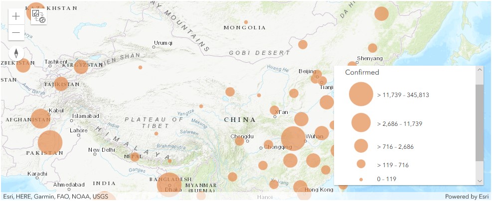
map1.content.add(fl)render_1 = map1.content.renderer(0)
render_1.smart_mapping().class_breaks_renderer(break_type="size", field="Confirmed", num_classes=5)map1.zoom = 3
map1.legend.enabled = TrueDisplay confirmed cases in China as polygons
map1b = gis.map('China')
map1b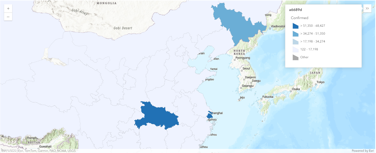
map1b.basemap.basemap = "topo-vector"overlap_rows_china.spatial.plot(map1b)True
render_1 = map1b.content.renderer(0)
render_1.smart_mapping().class_breaks_renderer(break_type="color", field="Confirmed", num_classes=4)
map1b.zoom = 4
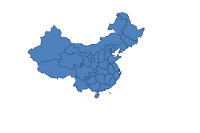
map1b.legend.enabled=TrueThe Map view above (map1b) displays the number of confirmed cases per province in Mainland China. Dark blue polygons refer to provinces with number of confirmed cases in the range of 51,350 - 68,427, and light-blue polygons represent those in the range of 122 - 17,198.
Also, we can save the MapView object into a Web Map item for the purpose of future references and modifications.
map1b.save({'title':'Confirmed COVID-19 Cases in China',
            'snippet':'Map created using Python API showing confirmed COVID-19 cases in China',
'tags':['automation', 'COVID19', 'world health', 'python']})Map the deaths caused by COVID-19 in China
Display death cases in China as points
map2 = gis.map('China')
map2.basemap.basemap = "topo-vector"
map2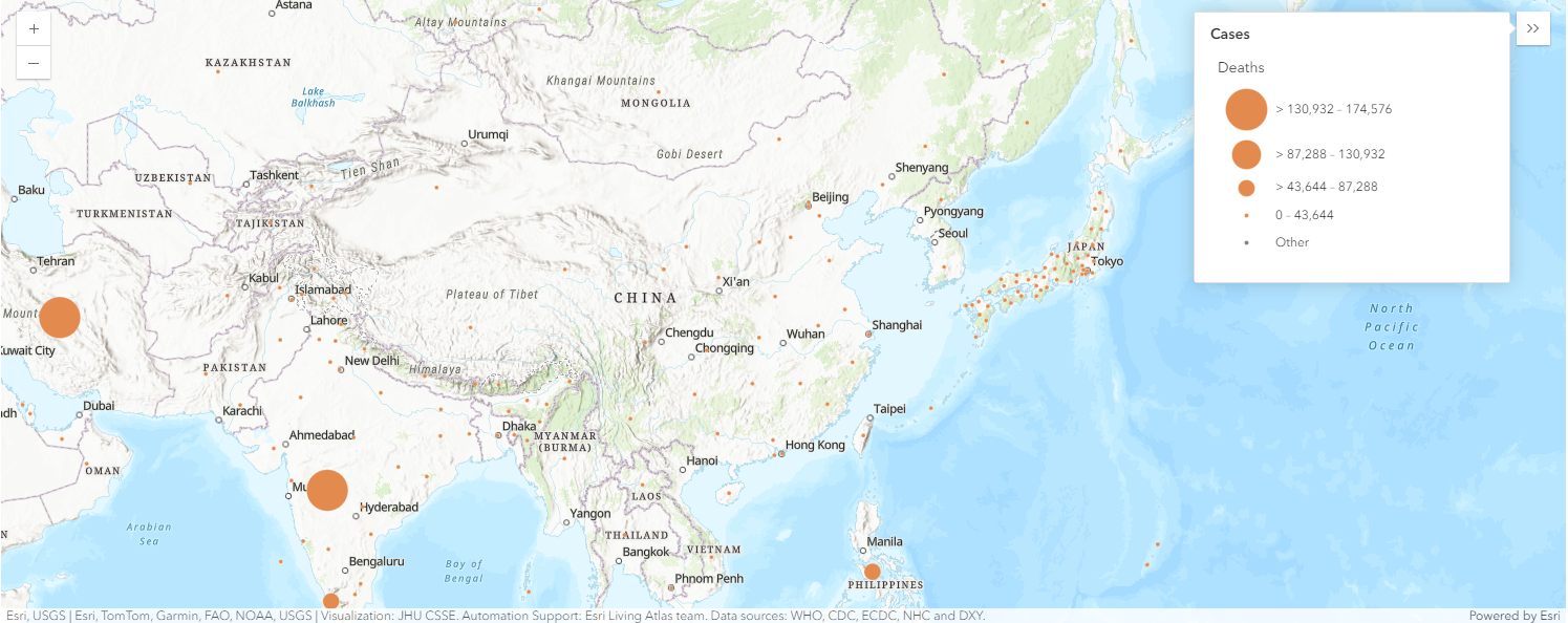
map2.content.add(fl)render_1 = map2.content.renderer(0)
render_1.smart_mapping().class_breaks_renderer(break_type="size", field="Deaths", num_classes=4)map2.legend.enabled = TrueDisplay death cases in China as polygons
map2b = gis.map('China')
map2b.basemap.basemap = "topo-vector"
map2b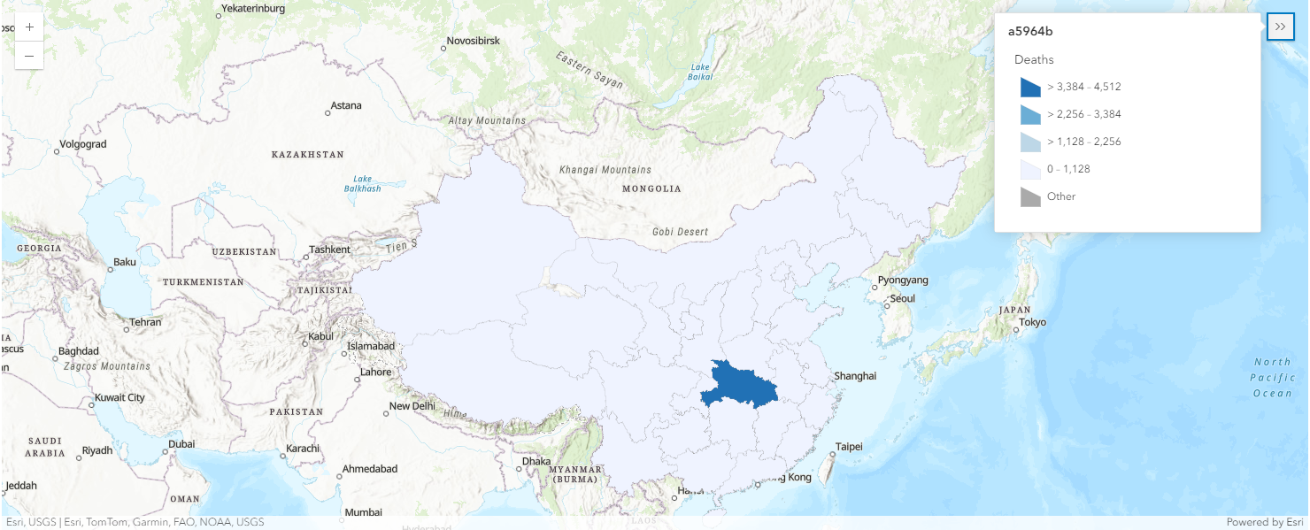
overlap_rows_china.spatial.plot(map2b)True
render_1 = map2b.content.renderer(0)
render_1.smart_mapping().class_breaks_renderer(break_type="color", field="Deaths", num_classes=4)
Using the same approach, we can then map the number of death cases per province in Mainland China. With legend displayed, map2b shows us light blue polygons refer to provinces with number of death cases in the range of 0 - 1,128, while dark blue polygons represent those in the range of 3,384 - 4512.
Similarly, we can create an additional deliverable - the Web Map Item created on the active GIS - and then browse the web map in the browser, change its symbology to different color maps in the configuration pane, and/or visualize it again with different looks here.
map2b.zoom = 4
map2b.legend.enabled = True
map2b_item = map2b.save({'title':'COVID-19 Death Cases in China',
'snippet':'Map created using Python API showing COVID-19 death cases in China',
'tags':['automation', 'COVID19', 'world health', 'python']})Map the recovered COVID-19 cases in China
Display the recovered cases in China as points
map3 = gis.map("China")
map3
map3.content.add(fl)render_1 = map3.content.renderer(0)
render_1.smart_mapping().class_breaks_renderer(break_type="size", field="Recovered", num_classes=6)map3.legend.enabled = TrueDisplay the recovered cases in China as polygons
map3b = gis.map('China')
map3b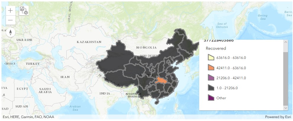
overlap_rows_china.spatial.plot(map3b)True
render_1 = map3b.content.renderer(0)
render_1.smart_mapping().class_breaks_renderer(break_type="size", field="Recovered", num_classes=4)
map3b.zoom = 4
map3b.legend.enabled = TrueSame here in map3b, with legend displayed, we can tell orange polygons refer to provinces with number of recovered cases in the range of 42,411 - 63,616, and black polygons represent those in the range of 1 - 21206.
Based on the sets of maps plotted above, the Hubei province has topped all provinces in China no matter when we are looking at the confirmed cases, or the recovered/death tolls.
Again as how we create an additional deliverable - the Web Map Item - on the active GIS in previous two sections, we can then browse the web map in the browser, change its symbology to different color maps in the configuration pane, and/or visualize it again with different looks.
map3b_item = map3b.save({'title':'COVID-19 Recovered Cases in China',
                         'snippet':'Map created using Python API showing COVID-19 recovered cases in China',
                         'tags':['automation', 'COVID19', 'world health', 'python']})
3. Map the COVID-19 cases in the U.S.
Similar to how we map the scenarios in China, visualizing these scenarios targeting at the United States can be divided into these sub-sections:
- Confirmed cases rendered as points, and polygons
- Death cases rendered as points, and polygons
Map the confirmed COVID-19 cases in the U. S.
We'll add data to the map in two different ways:
- calling the
add()method of the MapContent (contentproperty) class to add the specified layer or item (i.e. the FeatureLayer object created asfl) to the map widget - plot the derived SeDF on the map view directly.
We'll then use the layer's RendererManager to call the smart_mapping() manager and set visualization options to use the ClassedBreaksRenderer differentiating values by size and then by color.
Map the confirmed cases in the U.S. as points
map4 = gis.map("US")
map4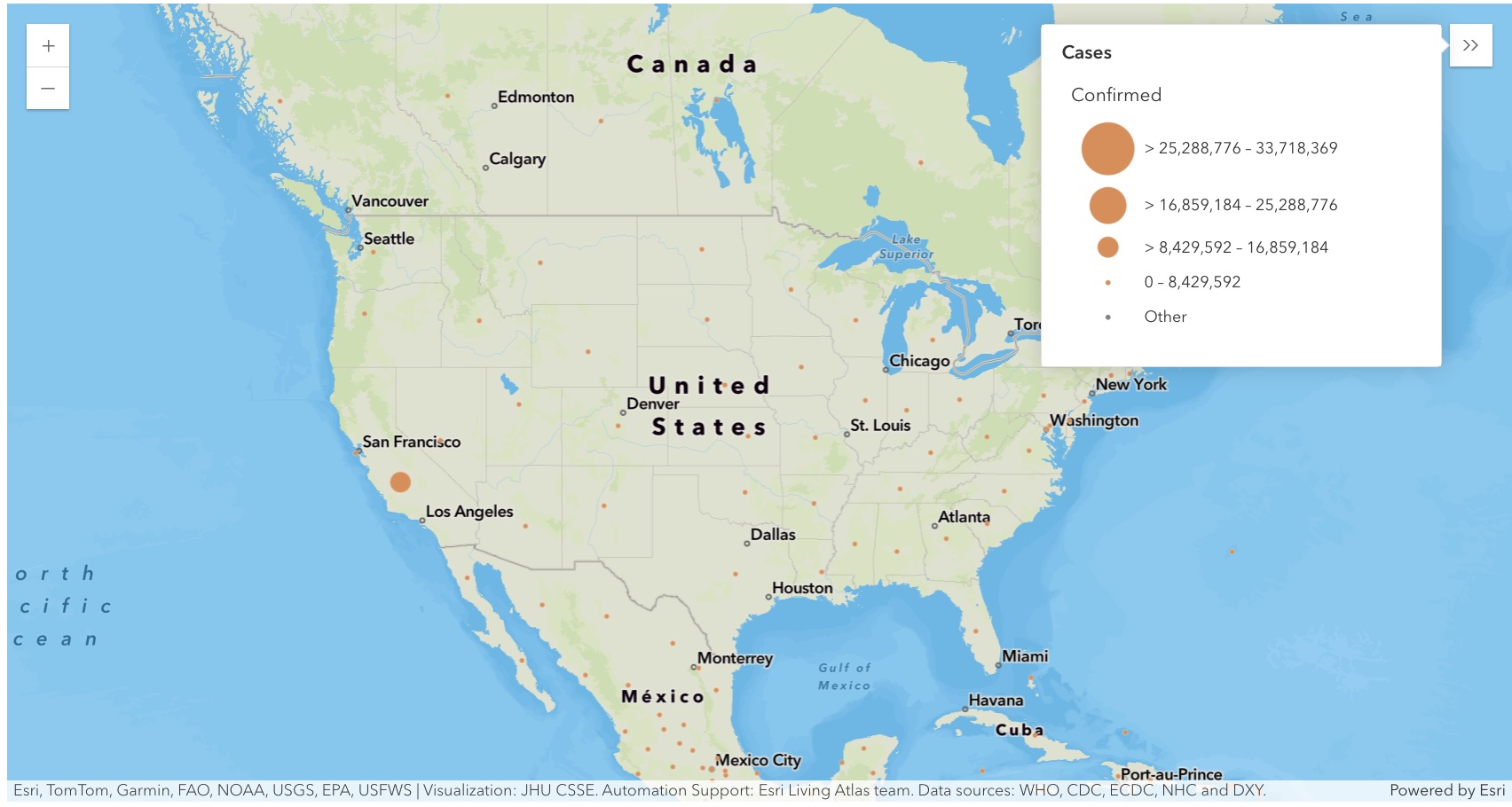
map4.zoom = 3
map4.center = [40.24195886889022, -95.9833441926828]map4.content.add(fl)render_1 = map4.content.renderer(0)
render_1.smart_mapping().class_breaks_renderer(break_type="size", field="Confirmed", num_classes=4)map4.legend.enabled = TrueMap the confirmed cases in the U.S. as polygons
map4a = gis.map("US")
map4a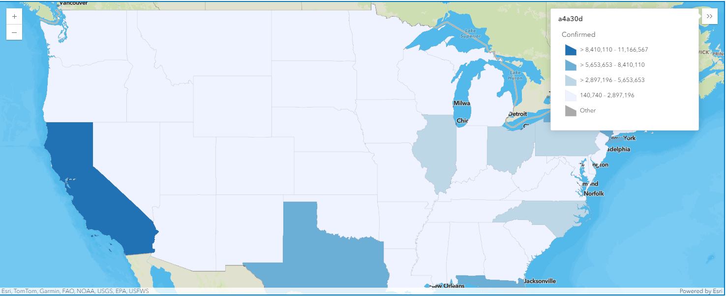
map4a.zoom = 4
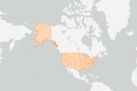
map4a.center = [40.24195886889022, -95.9833441926828]overlap_rows_usa.spatial.plot(map4a)True
render_1 = map4a.content.renderer(0)
render_1.smart_mapping().class_breaks_renderer(break_type="color", field="Confirmed", num_classes=4, classification_method='equal-interval')
map4a.legend.enabled = TrueMap the COVID-19 deaths in the U. S.
Map the death cases in the U.S. as points
map4b = gis.map("US")
map4b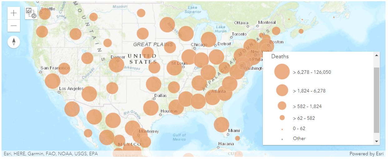
map4b.content.add(fl)render_1 = map4b.content.renderer(0)
render_1.smart_mapping().class_breaks_renderer(break_type="size", field="Deaths", num_classes=5, classification_method='equal-interval')map4b.zoom=4
map4b.legend.enabled=TrueMap the death cases in the U.S. as polygons
map4c = gis.map("US")
map4c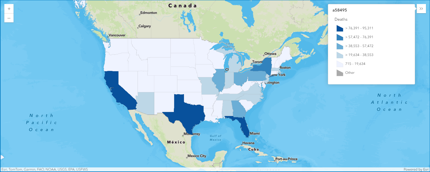
map4c.zoom = 4
map4c.center = [40.24195886889022, -95.9833441926828]overlap_rows_usa.spatial.plot(map4c)True
render_1 = map4c.content.renderer(0)
render_1.smart_mapping().class_breaks_renderer(break_type="color", field="Deaths", num_classes=5, classification_method='equal-interval')
map4c.legend.enabled = True4. Map the COVID-19 cases globally
Now we have learned how to map COVID-19 cases in China, and the United States, let's take a look at how to map across the globe. For illustration purpose, the rest of this section will only talk about mapping the confirmed cases globally, yet the workflow is almost the same to map deaths and recovered cases globally.
Map the confirmed COVID-19 cases globally
We are going to walk through how the confirmed cases across the globe can be mapped in the Map widget:
- call the
add()method off thecontentproperty to add the specified layer or item (i.e. the FeatureLayer object created asfl) to the map widget - plot the derived SeDF on the map view directly
Once the layer is added to the map, we can access the RendererManager using the renderer property, and subsequently call the smart_mapping() to render the data and visualize using size and color to differentiateranges of values.
Map the global confirmed cases as points
map5a = gis.map("Italy")
map5a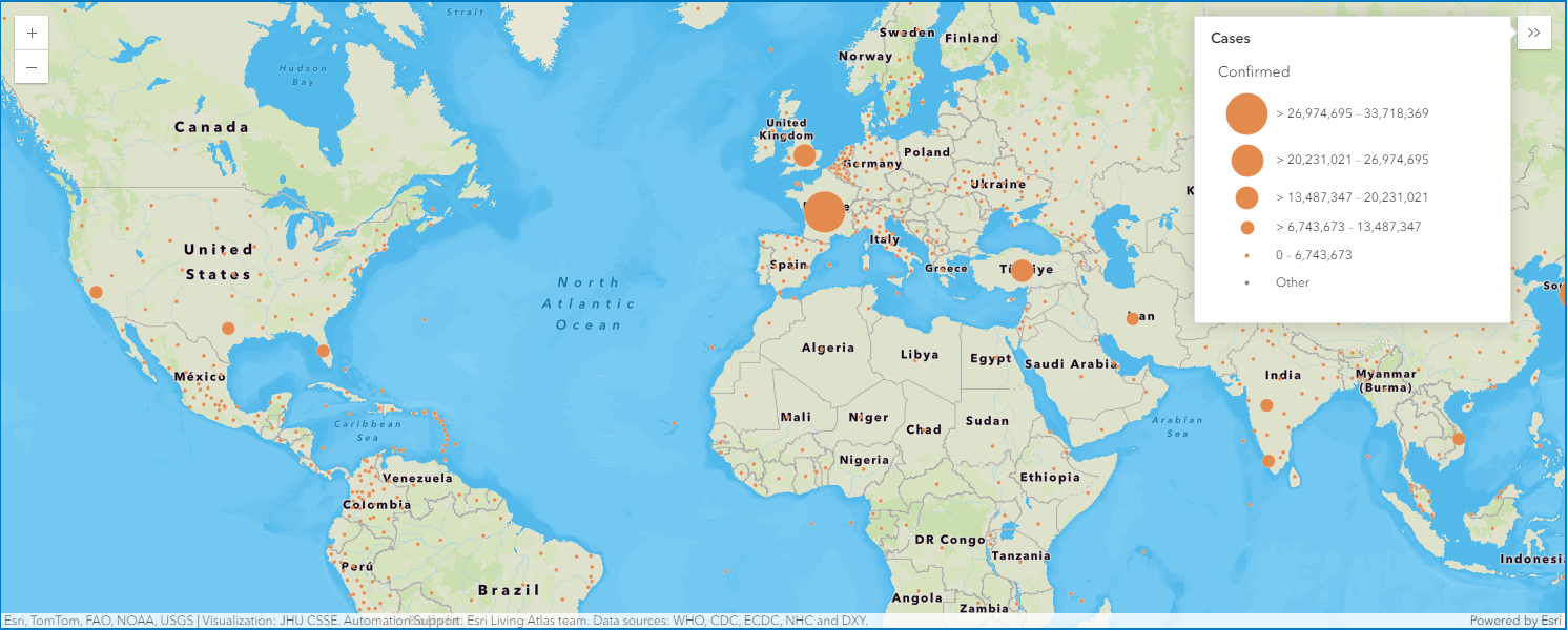
map5a.content.add(fl)render_1 = map5a.content.renderer(0)
render_1.smart_mapping().class_breaks_renderer(break_type="size", field="Confirmed", num_classes=5)map5a.legend.enabled=True
map5a.zoom = 4Map the global confirmed cases as polygons
map5b = gis.map("Italy")
map5b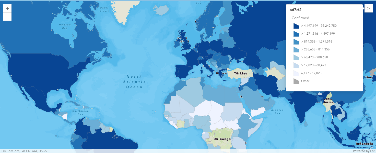
world_merged1.spatial.plot(map5b)True
render_1 = map5b.content.renderer(0)
render_1.smart_mapping().class_breaks_renderer(break_type="color", field="Confirmed", num_classes=7, classification_method='quantile')
map5b.zoom = 4
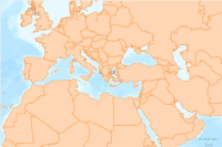
map5b.legend.enabled = TrueWhen map5b is created centering Brazil, the legend added along shows that yellow polygons (the 2nd class in the colormap) indicate that the countries are of number of confirmed cases ranging within (28026277, 33631532], and purple polygons represent those ranging between (5605255, 11210511].
5. What's next?
This notebook demonstrates accessing the corona viruses statistics, tabularizing them in DataFrames, and finally mapping the outbreak in different regions or counties. Next step, you can refer to Part 2 notebook for analyzing and charting time-series of the 2019 Novel Coronavirus.
References
[1] https://www.cdc.gov/coronavirus/2019-ncov/about/index.html
