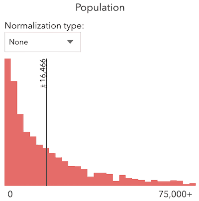
This sample visualizes cities in Mexico by population and demonstrates how to visualize the distribution of the data using a Histogram widget.
The histogram can be generated with the histogram() statistics function, then constructed with the fromHistogramResult() convenience method.
const params = {
layer: layer,
field: "pobtot",
numBins: 30
};
const histogramResult = await histogram(params);
// Creates a Histogram instance from the returned histogram result
const histogramWidget = Histogram.fromHistogramResult(
histogramResult
);
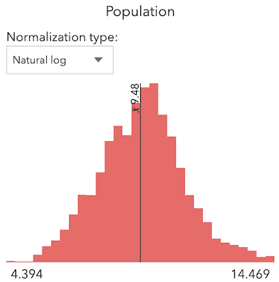
histogramWidget.container = "histogram";You can also specify a normalization to normalize skewed histograms. For example, a histogram representing a total count, such as population, will typically be skewed to the right.

Normalizing the data by natural-log may help you work with and understand the data better.

The Histogram widget is also used in the smart mapping slider widgets. All the options available on a standalone histogram can also be set in the sliders. See the related samples below for more examples.