How it works
This sample demonstrates how to utilize the SketchViewModel to add drawing functionality to an application. The Sketch widget is often used if an application includes drawing, and this is because the Sketch widget provides most drawing functionality out-of-the-box. This is illustrated in the sketch-geometries sample. The purpose of this sample is to show an example of how to add sketching to an application without using the Sketch widget, and additionally allow users to update graphic symbology with ease.
To use the SketchViewModel, create a new instance, and set its view and layer properties.
// setup the SketchViewModel
const sketchVM = new SketchViewModel({
view: view,
layer: graphicsLayer
});Custom UI
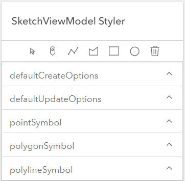
The SketchViewModel provides the logic for the Sketch widget. An important advantage of using the SketchViewModel, is that it provides the developer freedom to implement their own custom User Interface (UI) and strap the drawing tools to it. This eliminates the reliance on the Sketch widget’s UI to handle this. The point, polygon, polyline, and multipoint draw tools can be called from whatever UI component a developer designs. This sample demonstrates how to call these tools from a custom calcite-panel created using the Calcite Design System.

Overriding Symbology
This sample also highlights a key component of the SketchViewModel, and that is the ability to override the default symbology. This sample allows a user to override the point, polygon, and polyline properties with a UI.
The following shows an example of the symbology that can be set using this sample.

The code snippet below is needed to programmatically set the symbology in the image above if there is no UI available to set this.
const sketchVM = new SketchViewModel({
view: view,
layer: graphicsLayer,
polygonSymbol: {
type: "simple-fill",
style: "cross"
color: "#EFC8B1",
outline: {
width: 3,
style: "solid",
color: "#514644"
}
}
});If you would like to keep using the Sketch widget in your applications, but also want to take advantage of symbol overriding in your application, then the SketchViewModel would be useful in this scenario as well. For example, the same code snippet provided above can be passed into the viewModel property of the Sketch widget. The code to achieve this will look like the code snippet below. To confirm this works, use the following code in the sketch-geometries sample to have all polygons drawn with the Sketch widget utilize this symbology.
const sketch = new Sketch({
view: view,
layer: graphicsLayer,
viewModel: new SketchViewModel({
view: view,
layer: graphicsLayer,
polygonSymbol: {
type: "simple-fill",
style: "cross",
color: "#EFC8B1",
outline: {
width: 3,
style: "solid",
color: "#514644"
}
}
})
});Snapping
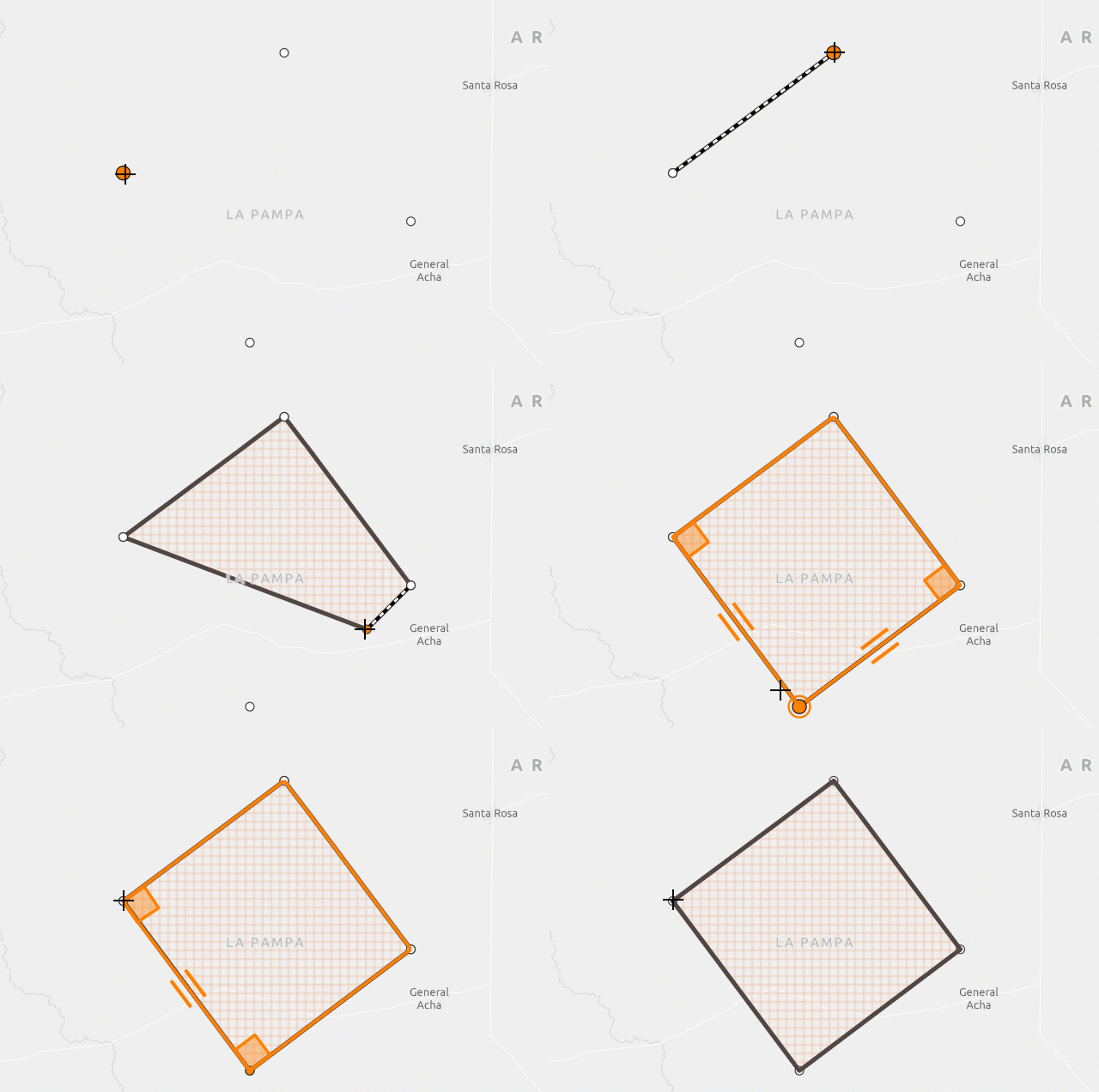
The SketchViewModel.snappingOptions property allows a developer to configure the snapping properties in their application. This sample demonstrates how the SnappingControls widget can be configured with the SketchViewModel to provide a UI to handle the snapping functionality in the application. Of course, a custom UI can still be designed by a developer to handle snapping. However, this sample shows how this out-of-the-box snapping UI can be incorporated in applications that utilize the SketchViewModel.
To configure the SnappingControls widget with the SketchViewModel, set the snappingOptions of the widget to the Sketch.
// initialize the SnappingControls widget
const snappingControls = new SnappingControls({
view: view,
snappingOptions: sketchVM.snappingOptions
});Default Create and Update Options
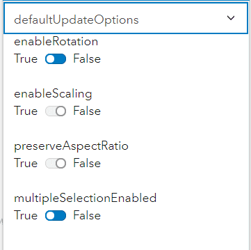
Finally, there are defaultCreateOptions and defaultUpdateOptions properties available to configure your sketching experience. Whether you want to disable rotation or resizing on selection, or simple change the default drawing mode (click, hybrid, or freehand). There are several more properties available as the documentation states, but this sample only focuses on a few. This sample allows for these properties to be updated easily via toggles and other UI elements.
