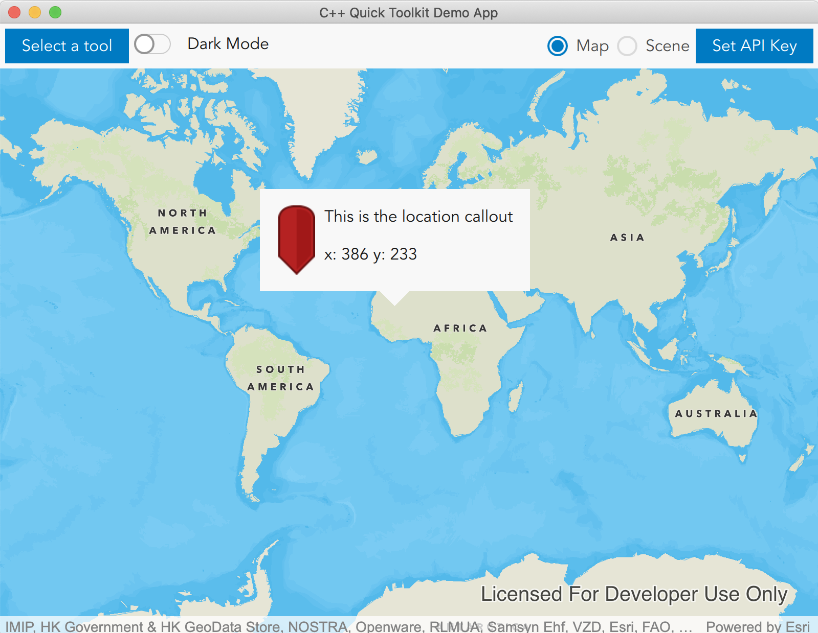
A view for displaying information at a geographic location on a Map. More...
| Since: | Esri.ArcGISRuntime 100.10 |
Properties
- accessoryButtonType : string
- accessoryButtonVisible : bool
- autoAdjustWidth : bool
- calloutData : var
- customImageUrl : string
- leaderHeight : int
- leaderPosition : var
- leaderWidth : int
- maxWidth : real
- screenOffsetX : int
- screenOffsetY : int
Signals
Methods
- dismiss()
- showCallout()
Detailed Description
A Callout can be displayed for several different scenarios:
- To display the coordinates where a user tapped on the map.
- To display information about a GeoElement that has been identified on the MapView.
- To display a callout at your current location.
For more information, please see the CalloutData documentation.

Example code in the QML API (C++ API might differ):
        MapView {
            id: view
            Map {
                initBasemapStyle: Enums.BasemapStyleArcGISDarkGray
            }
            calloutData {
                imageUrl: "qrc:///esri.com/imports/Esri/ArcGISRuntime/Toolkit/images/pin-tear.svg"
                title: "This is the location callout"
                detail: "x: " + xClickLoc + " y: " + yClickLoc
            }

            Callout{
                id:callout
                calloutData: view.calloutData
                accessoryButtonVisible: false
            }
            onMouseClicked : {
                if (calloutData.visible) {
                    callout.dismiss();
                } else {
                    xClickLoc = mouse.mapPoint.x.toFixed(2);
                    yClickLoc = mouse.mapPoint.y.toFixed(2);
                    calloutData.location = mouse.mapPoint
                    callout.showCallout()
                }
            }
        }
Note: That the Callout has gone through a major revision as of ArcGISRuntime 100.14. Part of this revision has been a change to the styling behaviour of the Callout, making the Callout compliant with your currently applied theme. To revert to the classic Callout look, you can supply the old style properties to the Callout as provided below.
For example, if you have code like
Callout {
  calloutData: myCalloutData
}
you can rewrite it as
Callout {
  calloutData: myCalloutData
  titleTextColor: "#000000"
  backgroundColor: "#ffffff"
  borderColor: "#000000"
  borderWidth: 2
  cornerRadius: 5
  leaderHeight: 10
  leaderWidth: 20
  leaderPosition: Callout.LeaderPosition.Bottom
}
Property Documentation
The type of accessory button to be displayed in the Callout.
Default is "Info".
- "Info"
- "Add"
- "Custom"
Whether to show the accessoryButton of the Callout.
The default is true.
The CalloutData to display in the Callout.
The CalloutData controls the data that is being displayed in the Callout view. Use CalloutData to set title text, detail text, images, GeoElements, and so on. CalloutData is obtained from the MapView.
The url of the image to be used for the accessory button of the Callout if the type of the accessoryButton is "Custom".
The property to set the leader position of the callout.
leaderPosition can be one of:
| Constant | Description |
|---|---|
Callout.LeaderPosition.UpperLeft | (0) |
Callout.LeaderPosition.Top | (1) |
Callout.LeaderPosition.UpperRight | (2) |
Callout.LeaderPosition.Right | (3) |
Callout.LeaderPosition.LowerRight | (4) |
Callout.LeaderPosition.Bottom | (5) |
Callout.LeaderPosition.LowerLeft | (6) |
Callout.LeaderPosition.Left | (7) |
Callout.LeaderPosition.Automatic | (8) The default. |
Callout.LeaderPosition.Automatic will decide the best placement, based on the location of the callout within the visible area of the MapView.
The default is Callout.LeaderPosition.Automatic.
The width of the callout contents.
When autoAdjustWidth is false, the width of the callout content will be fixed to this value.
When autoAdjustWidth is true, the content width is calculated dynamically and may be smaller than this value, but will be no greater than this value.
This property defaults to 300.
Signal Documentation
The signal emitted when the accessory button is clicked.
Note: The corresponding handler is onAccessoryButtonClicked.
Method Documentation
Dismisses the Callout from the MapView.
The Callout does not hide itself automatically, so you must explicitly call this method to hide the Callout from the MapView.
Show the Callout on the MapView.
Before showing the callout, set your desired properties for CalloutData (which controls the information that is displayed) and for Callout (which controls how the view appears on the MapView).