Create a ListView widget
This tutorial describes how to create a custom Web AppBuilder in-panel widget that does the following:
- Displays features from a feature layer in a list view
- Displays each list item with several preconfigured fields
Note:
The web map used in this tutorial contains a feature layer that has a thumbnail image for each feature.
Create a widget folder structure
You can either use the Widget Generator in this Web AppBuilder generator tool, or complete the following steps to create a simple widget as your starting point.
Caution:
You may use the Web AppBuilder generator tool in this sample; however, it is not supported.
- Make a copy of the Demo folder at path/to/WAB/client/stemapp/ widgets/samplewidgets.
- Paste it to the widgets under stemapp or (stemapp3d if you're developing a widget for 3D apps).
- Rename the folder ListView.
- In manifest.json, update the widget’s general information, such as the name and author. The value of the name field should be the same as the widget folder name, in this case, ListView. And in the nls folder, update the value of the _widgetLabel variable to ListView in the strings.js files (you can remove unused i18n folders as needed).
Note:
See Add i18n support for more information on adding i18n support. - Replace the widget icon.png file with a different image to use as the icon.
- Open Web AppBuilder and click New App.
The ListView widget appears as a member of the widgets on the Choose Widget dialog box.

The configuration page of the ListView widget now only has a sample text box.

The UI of the widget contains some sample UI components.
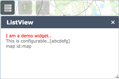
You will update these pages later in this tutorial.
Customize the settings page
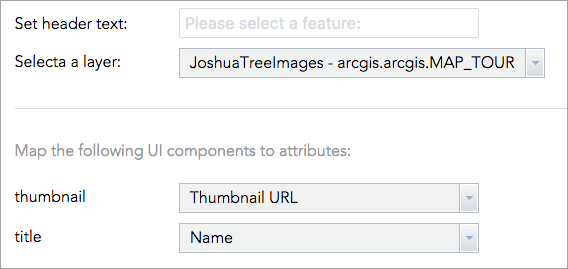
For the ListView widget, the widget’s header text should be configurable. The list should be populated from a user-selected feature layer and allow the user to define which feature attributes to use to populate the list items.
Update the config.json file
The config.json file in a widget folder provides optional default settings to initialize a widget. You can configure these setting options.
In the following steps, the sample configuration that comes with the Demo widget will be removed, and a new attribute will be added to populate the header section of the widget:
- Open config.json at path/to/WAB/client/stemapp/widgets/ListView.
- Replace everything with the following:
{
	"widgetHeaderText":"Please select a feature:"
}
Update the settings (configuration) page UI
In the following steps, you will update the UI of the settings page by adding the following:
- A text box to enter text for the header
- A drop-down list to select a feature layer from the map
- A set of drop-down lists to map attributes from the feature layer to UI elements
- Open strings.js at path/to/WAB/client/stemapp/widgets/ListView/setting/nls.
- Remove configText and add the following attributes:
define({ root: ({ headerText: "Set header text:", selectLayerText: "Select a layer:", pickAttributeText: "Map the following UI components to attributes:", UIElementNames: { thumbnail: "thumbnail", title: "title" } }) }); - Open Setting.html at path/to/WAB/client/stemapp/widgets/ListView/setting.
- Replace the entire page with the following:
<div>
	<div>
		<label>${nls.headerText}</label>
		<input class="jimu-input" data-dojo-attach-point="headerTextNode">
	</div>
	<div>
		<label>${nls.selectLayerText}</label>
		<select data-dojo-type="dijit/form/Select" data-dojo-attach-point="layerSelect"></select>
	</div>
	<hr>
	<h3>${nls.pickAttributeText}</h3>
	<div>
		<label>${nls.UIElementNames.thumbnail}</label>
		<select data-dojo-type="dijit/form/Select" data-dojo-attach-point="thumbnailSelect"></select>
	</div>
	<div>
		<label>${nls.UIElementNames.title}</label>
		<select data-dojo-type="dijit/form/Select" data-dojo-attach-point="titleSelect"></select>
	</div>
</div>
Note:
The jimu-input class name is added to the text input to restyle its look. This class is provided by the Jimu CSS framework, which also provides CSS styles for other UI elements. You can view the .css files at path/to/WAB/client/stemapp/jimu.js/css for details. You can also preview some of the jimu UI components by going to the following local test pages:
- CSS test: http://<server>[:port]/webappbuilder/stemapp/jimu.js/tests/test-css.html
- Dijit test: http://<server>[:port]/webappbuilder/stemapp/jimu.js/demo/dijit.html
- Open Setting.js at path/to/WAB/client/stemapp/widgets/ListView/setting.
- Add the following classes to the array of class declarations:
define([ 'dojo/_base/declare', 'jimu/BaseWidgetSetting', 'dojo/_base/lang', 'dojo/_base/array', 'dijit/_WidgetsInTemplateMixin', 'jimu/LayerInfos/LayerInfos', 'dijit/form/Select' ], function(declare, BaseWidgetSetting, lang, array, _WidgetsInTemplateMixin, LayerInfos) { return declare([BaseWidgetSetting, _WidgetsInTemplateMixin], { ... }); }); - Change the baseClass value to jimu-widget-listview-setting.
- In the setConfig method, remove the sample code and add the following line of code to populate the header node with the default string defined in the nls folder at path/to/WAB/client/stemapp/widgets/ListView:
setConfig: function(config){
      // Update header text
      this.headerTextNode.value = config.widgetHeaderText;
},
Get all the feature layer information from the map using the LayerInfos class from the Jimu framework, and populate the feature layer drop-down list as follows:
setConfig: function(config){ // Update header text this.headerTextNode.value = config.widgetHeaderText; // Get all feature layers from the map LayerInfos.getInstance(this.map, this.map.itemInfo) .then(lang.hitch(this, function(layerInfosObj) { var infos = layerInfosObj.getLayerInfoArray(); var options = []; array.forEach(infos, function(info) { if(info.originOperLayer.layerType === 'ArcGISFeatureLayer') { options.push({ label: info.title, value: info.id }); } }); this. layerSelect.set('options', options); })); }, - Attach an onChange event handler to the layerSelect dijit. When the selection in the layerSelect drop-down list changes, get a list of all attributes from the newly selected feature layer and use it to populate the attribute drop-down lists as follows:
setConfig: function(config){ ... // Get all feature layers from the map LayerInfos.getInstance(this.map, this.map.itemInfo) .then(lang.hitch(this, function(layerInfosObj) { ... this.layerSelect.set('options', options); this.layerSelect.on('change', lang.hitch(this, function(value) { var selectedLayer = layerInfosObj.getLayerInfoById(value); if(selectedLayer) { var fieldOptions = array.map(selectedLayer.layerObject.fields, function(field) { return { label: field.alias || field.name, value: field.name } }); this.thumbnailSelect.set('options', fieldOptions); this.titleSelect.set('options', fieldOptions); } })); })); }, - Go to the getConfig method in the return section, remove configText, and add the following code:
getConfig: function(){
      //WAB will get config object through this method
      return {
        widgetHeaderText: this.headerTextNode.value,
        layerId: this.layerSelect.get('value'),
        thumbnailField: this.thumbnailSelect.get('value'),
        titleField: this.titleSelect.get('value')
      };
    }
These configurations will be consumed by the ListView widget to access the feature layer object from the map and update the list with the defined fields.
- Add CSS styles in the style.css file at path/to/WAB/client/stemapp/widgets/ListView/setting/css to style the settings page as follows:
.jimu-widget-listview-setting > * {
  margin-bottom: 10px;
}

.jimu-widget-listview-setting label {
  display: inline-block;
  min-width: 150px;
  margin-right: 10px;
}
.jimu-widget-listview-setting h3 {
  color: #999;
  font-weight: normal;
  margin-bottom: 20px;
}
.jimu-widget-listview-setting hr {
  margin: 30px 0;
  border-style: solid;
  border-width: 0 0 1px 0;
  border-color: #ddd;
}
.jimu-widget-listview-setting .jimu-input,
.jimu-widget-listview-setting .dijitSelect {
  width: 300px;
}
.jimu-widget-listview-setting .dijitSelect .dijitButtonContents {
  width: 100%;
}
The settings page now looks like the following:
Create the widget's HTML template
The sample widget used in this tutorial is a template-based Dojo widget that contains a widget.html file as its HTML structure. In this section, you will remove any unused sample code from widget.html, and add two DOM nodes for the following UI components:
- Header
- List
These components will be populated with live data in later sections.
- Open path/to/WAB/client/stemapp/widgets/ListView/widget.html.
- Replace the content with the following HTML string:
<div>
	<div class="list-header" data-dojo-attach-point="headerNode"></div>
	<div data-dojo-attach-point="ListNode"></div>
</div>
Modify widget.js
Developing a Web AppBuilder widget is similar to developing a Dojo template widget. The widget.js file contains the basic widget life cycle methods, such as postCreate and startup, and additional methods customized for the Web AppBuilder environment, such as onOpen, onClose, and onMinimized. Visit the Widget life cycle page for details on the Web AppBuilder widget life cycle.
Set the widget's base class name
The baseClass property in the widget.js file is required. This string will be appended to the class attribute on the root HTML node of the widget when it is initialized. Multiple class names can be added by separating them with spaces. To rename baseClass to jimu-widget-listview, see the following:baseClass: 'jimu-widget-listview',
Remove unused sample code
Remove the following line of code from the startup method:this.mapIdNode.innerHTML = 'map id:' + this.map.id;
Now, the ListView pane appears empty in Web AppBuilder.

Add a list UI component using dGrid OnDemandList
Visit the dGrid page and the OnDemandList on OnDemandList.
- Add the following to the array of class declarations:
define(['dojo/_base/declare', 'jimu/BaseWidget', 'dojo/_base/lang', 'dojo/Deferred', 'dgrid/OnDemandList', 'dgrid/Selection', "dojo/store/Memory"], function(declare, BaseWidget, lang, Deferred, OnDemandList, Selection, Memory) { ... }); }); - Declare a new method named getDataStore, which will return a dataset to populate the list. Add some sample data to test the widget as follows:
getDataStore: function() { var def = new Deferred(); // SAMPLE DATA var SAMPLEDATA = [{ 'id': 0, 'title': 'Feature 1', 'thumbnailImg': 'http://placehold.it/120x90' }, { 'id': 1, 'title': 'Feature 2', 'thumbnailImg': 'http://placehold.it/120x90' }]; def.resolve(new Memory({ data: SAMPLEDATA })); return def; }, - Declare another method named createList, which consumes the data store returned from the getDataStore method and creates a new OnDemandList as follows:
createList: function() { this.getDataStore().then(lang.hitch(this, function(datastore) { var list = new (declare([OnDemandList, Selection]))({ 'store': datastore, 'selectionMode': 'single', 'renderRow': lang.hitch(this, function (object, options) { return this._createListItem(object); }) }, this.ListNode); list.startup(); })); }, - Note that the _createListItem method is called when rendering rows for the dGrid list. To create this method, do the following:
_createListItem: function(featureObj) { var listItemRoot = document.createElement('DIV'); listItemRoot.className = 'list-item'; if(featureObj) { var thumbnailImgWrapper, thumbnailImg, listItemTitle; // Create thumbnail if(featureObj.thumbnailImg) { thumbnailImgWrapper = document.createElement('div'); thumbnailImgWrapper.className = 'thumbnail-wrapper'; thumbnailImg = document.createElement('img'); thumbnailImg.src = featureObj.thumbnailImg; thumbnailImgWrapper.appendChild(thumbnailImg); listItemRoot.appendChild(thumbnailImgWrapper); } // Create title if(featureObj.title && typeof featureObj.title === 'string') { listItemTitle = document.createElement('H4'); listItemTitle.innerHTML = featureObj.title; listItemRoot.appendChild(listItemTitle); if(thumbnailImg) thumbnailImg.alt = featureObj.title; } } else { listItemRoot.innerHTML = 'NO DATA AVAILABLE'; } return listItemRoot; }, - Call the createList method from postCreate.
postCreate: function() { this.inherited(arguments); console.log('postCreate'); this.createList(); }, - Restart Web AppBuilder and re-add the ListView widget to the app. The following two sample results appear in the list:
Now you have the major pieces of the widget in place.
Read configuration and update UI elements
In this section, you'll read the configuration from the settings page and populate the list with real data.
- Update headerNode in the postCreate method.
postCreate: function() { this.inherited(arguments); console.log('postCreate'); this.headerNode.innerHTML = this.config.widgetHeaderText; this.createList(); }, - Populate the list with data from the feature layer.
- Get the feature layer from the map.
postCreate: function() { this.inherited(arguments); console.log('postCreate'); this.headerNode.innerHTML = this.config.widgetHeaderText; this.featureLayer = this.map.getLayer(this.config.layerId); this.createList(); }, - Add the query functionality from ArcGIS API for JavaScript to the widget.
define(['dojo/_base/declare', 'jimu/BaseWidget', 'dojo/_base/lang', 'dojo/Deferred', 'dgrid/OnDemandList', 'dgrid/Selection', "dojo/store/Memory", "esri/tasks/query"], function(declare, BaseWidget, lang, Deferred, OnDemandList, Selection, Memory, Query) { ... }); }); - In the getDataStore method, get the selected feature layer from the map using the configuration information.
getDataStore: function() { var def = new Deferred(); var layer = this.map.getLayer(this.config.layerId); ... }, - Query all features from the feature layer.
getDataStore: function() { ... // Query features var query = new Query(); query.returnGeometry = false; query.outFields = ["*"]; query.where = '1=1'; layer.queryFeatures(query, lang.hitch(this, function(featureSet) { })); ... }, - Remove the sample data and use the returned feature set instead.
- Remove the SAMPLEDATA variable.
- Remap the feature data to a new array named featureSetRemapped, and use it to create the data store.
getDataStore: function() {
      ...
layer.queryFeatures(query, lang.hitch(this, function(featureSet) {
  var featureSetRemapped = [];
        for(var index in featureSet.features) {
          var feature = featureSet.features[index];
          featureSetRemapped.push({
            'id': feature.attributes[this.featureLayer.objectIdField],
            'title': feature.attributes[this.config.titleField],
            'thumbnailImg': feature.attributes[this.config.thumbnailField]
          });
        }

        def.resolve(new Memory({
          data: featureSetRemapped
        }));
      }));

      return def;
    },
- Get the feature layer from the map.
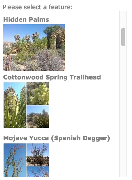
The ListView widget now shows the correct results from the configured feature layer without any applied styles.
Add CSS styles to change the widget's look
- Open the style.css file from path/to/WAB/client/stemapp/widgets/ListView /css and add the following CSS styles:
.jimu-widget-listview { background-color: #f1f1f1; position: absolute; top: 0; bottom: 0; left: 0; right: 0; overflow: auto; } .jimu-widget-listview .dgrid-list { height: auto; border: 0; position: absolute; top: 35px; left: 0; right: 0; bottom: 0; } .jimu-widget-listview .dgrid-scroller { padding: 10px 10px; overflow: auto; } .jimu-widget-listview .dgrid-row { background: #fff; border: 1px solid #e1e1e1; padding: 10px 10px; margin-bottom: 10px; } .jimu-widget-listview .list-item { -moz-transition: all, 0.2s, ease-out; -o-transition: all, 0.2s, ease-out; -webkit-transition: all, 0.2s, ease-out; transition: all, 0.2s, ease-out; } .jimu-widget-listview .list-item:after { content: ""; display: table; clear: both; } .jimu-widget-listview .list-item h4 { color: #00a8e1; line-height: 2; letter-spacing: 1px; margin: 0 15px; } .jimu-widget-listview .list-item .thumbnail-wrapper { float: left; width: 80px; height: 50px; margin-right: 15px; overflow: hidden; } .jimu-widget-listview .list-item .thumbnail-wrapper img { width: 100%; } .jimu-widget-listview .list-item.dgrid-selected { border: 1px solid #00a8e1; -moz-box-shadow: 0 4px 4px rgba(0, 0, 0, 0.2); -webkit-box-shadow: 0 4px 4px rgba(0, 0, 0, 0.2); box-shadow: 0 4px 4px rgba(0, 0, 0, 0.2); position: relative; z-index: 1; cursor: default; } .jimu-widget-listview .list-item.simple.dgrid-selected { margin-bottom: 0; } .jimu-widget-listview .list-header { padding: 10px; padding-bottom: 0; font-size: 14px; overflow: hidden; *zoom: 1; } .jimu-widget-listview .list-header > h3 { margin: 0; margin-top: 4px; padding: 0 10px; float: left; font-weight: normal; text-transform: uppercase; color: #ed1c25; } .jimu-widget-listview .list-header > h3 strong { margin: 0 5px; } .jimu-widget-listview .list-header label { color: #93999e; } - Refresh Web AppBuilder and add the ListView widget again to the app. The widget now has the new CSS styles applied.
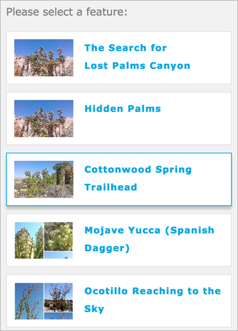
Communicate with the map
You'll now see how a widget can communicate with the map by adding the ability to highlight map graphics when a row in the list is selected. Learn how to access a map.
- Go to the createList method and add an onclick event handler to the rows of the list.
createList: function() { this.getDataStore().then(lang.hitch(this, function(datastore) { ... list.startup(); list.on('.dgrid-row:click', lang.hitch(this, function(evt) { })); })); }, - Use list.row(evt) to access the feature data from the selected row, query the feature layer to get the selected feature from the map, and bring it to the center of the map.
createList: function() { this.getDataStore().then(lang.hitch(this, function(datastore) { ... list.startup(); list.on('.dgrid-row:click', lang.hitch(this, function(evt) { var row = list.row(evt); var query = new Query(); query.objectIds = [row.data.id]; this.featureLayer.selectFeatures(query, esri.layers.FeatureLayer.SELECTION_NEW, lang.hitch(this, function(result) { if (result.length) { var feature = result[0], newMapCenter, geometry = feature.geometry, extent = geometry.getExtent(), shape = feature.getShape(); if(extent && extent.getCenter) { newMapCenter = extent.getCenter(); // polygon & polyline } else { newMapCenter = geometry; // point } this.map.centerAt(newMapCenter); // move to the feature if(shape) shape.moveToFront(); // move the feature to front } })); })); })); }, - Highlight the selected feature on the map.
- Add the following to the array of class declarations:
define(['dojo/_base/declare', ... "esri/tasks/query", "esri/symbols/SimpleMarkerSymbol", "esri/symbols/SimpleLineSymbol", "esri/symbols/SimpleFillSymbol" ], function(declare, BaseWidget, lang, Deferred, OnDemandList, Selection, Memory, Query, SimpleMarkerSymbol, SimpleLineSymbol, SimpleFillSymbol) { ... }); }); - In PostCreate, add code to the custom feature layer’s highlight symbol based on its geometry type.
postCreate: function() {
      ...

      this.featureLayer = this.map.getLayer(this.config.layerId);

      var highlightSymbol;
      switch(this.featureLayer.geometryType) {
        case 'esriGeometryPoint':
        highlightSymbol = new SimpleMarkerSymbol(SimpleMarkerSymbol.STYLE_CIRCLE, 20, null, '#e74c3c');
        break;
        case 'esriGeometryPolyline':
        highlightSymbol = new SimpleLineSymbol(SimpleLineSymbol.STYLE_SOLID, '#e74c3c', 3);
        break;
        case 'esriGeometryPolygon':
        highlightSymbol = new SimpleFillSymbol(SimpleFillSymbol.STYLE_SOLID,
          new SimpleLineSymbol(SimpleLineSymbol.STYLE_SOLID, '#fff', 2),
          '#e74c3c');
        break;
      }
      this.featureLayer.setSelectionSymbol(highlightSymbol);

      this.createList();
    },
- Add the following to the array of class declarations: