Create a new default layout
This topic explains how to create a new default layout. To understand the basic concepts of a layout and its components in Web AppBuilder, as well as the differences between the default and non-default layouts, see Layouts.
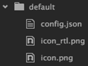
Create a new default layout folder structure
- Go to the layouts folder in the theme where the new layout will be created, such as ~/client/stemapp/themes/<YourTheme>/layouts.
- Create a new folder and name it default.
If you create a new default layout for an existing theme, make a copy of the original default layout folder first.
- Create a new config.json file in the default folder.
- Add icon images representing the layout in Web AppBuilder.
The folder structure should look like the following:
Register the new layout in manifest.json
To show the new layout in Web AppBuilder, register it in the theme's manifest.json file.
Tip:
You can skip this section if you're creating a new default layout for an existing theme as it should have already been registered in the manifest.json file.
- Open the manifest.json file at~/client/stemapp/themes/YourTheme/manifest.json.
- Add the following information about the default layout to the layouts:
- “name”—Must match the name of the layout folder. It is the default in this case.
- “description”—The description of the layout.
The code snippet in the manifest.json file should look similar to the following:
{ "name": "default", "description": "this is the default layout" } - Reload Web AppBuilder.
The new layout appears under the theme as shown below:

Create a minimal layout structure in config.json
A typical default layout structure contains the following components:
- widgetOnScreen—Includes layout properties for widgets placed on the UI, such as a controller, predefined widgets, and widget placeholders.
- map—Defines the position of the map.
- widgetPool—Includes a list of widgets placed in the controller widget if there is a controller defined in the widgetOnScreen section.
- mobileLayout—Optional. It provides the layout for mobile devices, overriding the properties configured in the widgetOnScreen, map, and widgetPool sections.
- Open the config.json file at ~/client/stemapp/themes/YourTheme/layouts/default/config.json.
- Add the following code snippet:
{ "widgetOnScreen": { "widgets": [] }, "map": {}, "widgetPool": { "panel": {} } } - In Web AppBuilder, create a new app with the new layout.
The app should show nothing but a map.
Add a controller widget
Most out-of-the-box themes come with a controller widget. In this example, the HeaderController widget from the Foldable or Jewelry Box theme is added to the default layout.
- Make sure the widget's folder exists in the theme folder, and copy the HeaderController widget folder from the Foldable or Jewelry Box theme into it.
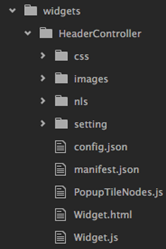
- In the config.json file, add the HeaderController widget to the widgetOnScreen section, and configure its properties.
For a full list of widget properties, see Widget configuration.
{
  "widgetOnScreen": {
    "widgets": [
      {
        "uri": "themes/YourTheme/widgets/HeaderController/Widget",
        "position": {
          "left": 40,
          "top": 40,
          "right": 40,
          "height": 40,
          "relativeTo": "browser"
        }
      }
    ]
  },

  "map": {},

  "widgetPool": {
    "panel": {}
  }
}
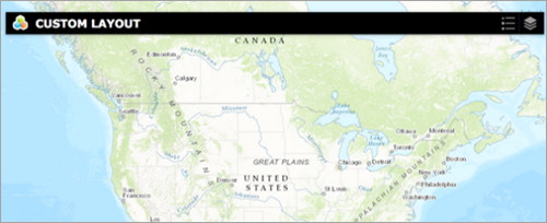
In this layout, the HeaderController is positioned 40 pixels away from the top and left and right sides of the screen.
Note:
The layout system of Web AppBuilder uses absolute positioning. The top, left, right, bottom, and zIndex properties are equivalent to the top, left, right, bottom, and z-index properties in CSS.
Configure position properties for the map
In this layout, the map will use the entire screen.
- Add the following code snippet for the map:
{
  "widgetOnScreen": {
    "widgets": [
      {
        "uri": "themes/YourTheme/widgets/HeaderController/Widget",
        "position": {
          "left": 40,
          "top": 40,
          "right": 40,
          "height": 40,
          "relativeTo": "browser"
        }
      }
    ]
  },

"map": {
    "position": {
      "left": 0,
      "top": 0,
      "right": 0,
      "bottom": 0
    }
  },

  "widgetPool": {
    "panel": {}
  }
}
Legend and Layer List widgets in the header are automatically added by Web AppBuilder. They are not part of the layout.
Add more on-screen widgets
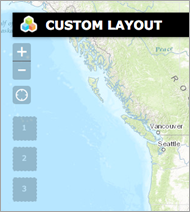
In this step, both the ZoomSlider and MyLocation widgets are added to the layout along with the widget placeholders.
- Open the config.json file. Add layout properties for the ZoomSlider and MyLocation widgets in the same way you did for the HeaderController widget.
{ "widgetOnScreen": { "widgets": [ { ... }, { "uri": "widgets/ZoomSlider/Widget", "position": { "top": 70, "left": 20 } }, { "uri": "widgets/MyLocation/Widget", "position": { "left": 20, "top": 140 } } ] }, "map": { ... }, "widgetPool": { "panel": {} } } - Add widget placeholders by defining their position properties.
{
  "widgetOnScreen": {
    "widgets": [
      { ... },
      { ... },
      { ... },
      {
        "position": {
          "left": 20,
          "top": 190
        }
      },
      {
        "position": {
          "left": 20,
          "top": 240
        }
      },
      {
        "position": {
          "left": 20,
          "top": 290
        }
      }
    ]
  },

  "map": { ... },

  "widgetPool": {
    "panel": {}
  }
}
In this example, three widget placeholders are added to the layout config file.
Add predefined widgets to the header
The widgets in the widgetPool section are automatically added to the app when the layout is selected. Their behavior is managed by the controller widgets.
The following widgets will be added to the widgetPool:
- BasemapGallery
- About
- In the widgetPool section, add a new property called widgets, and give it a value of an empty array.
"widgetPool": { "panel": {}, "widgets": [] } - Add layout properties for both the BasemapGallery and the About widgets in the widgets array, similar to the widgets in the widgetOnScreen section.
"widgetPool": {
    "panel": {},
    "widgets": [
      {
        "uri": "widgets/BasemapGallery/Widget"
      },
      {
        "uri": "widgets/About/Widget"
      }
    ]
  }
The purpose of defining properties in the widgets array is to populate the widget icon in the header panel by the HeaderController widget. As a result, the position properties are not defined here.
- Add other optional properties.
- Use a different icon for the BasemapGallery widget.
By default, Web AppBuilder uses a path to the widget icon, which can be overridden by the icon property defined in a widget’s layout configuration.
"widgetPool": { "panel": {}, "widgets": [ { "uri": "widgets/BasemapGallery/Widget", "icon": "uri/to/new_icon.png" }, { "uri": "widgets/About/Widget" } ] } - Change the widget label.
By default, Web AppBuilder reads the label text from a path to the widget/nls folder if needed. The text can be overridden by adding a label property to the widget’s layout configuration. In this example, the default label “Basemap Gallery” for the BasemapGallery widget will be changed to “Select a basemap:”.
"widgetPool": {
  "panel": {},
    "widgets": [
      {
        "uri": "widgets/BasemapGallery/Widget",
        "icon": "uri/to/new_icon.png",
        "label": "Select a basemap:"
      },
      {
        "uri": "widgets/About/Widget"
      }
    ]
  }
When the BasemapGallery widget opens in Web AppBuilder, the header text of the widget's panel is shown as follows:

Note:
There are other properties that can be added to a widget’s configuration. For a full list of available properties, see Widget configuration. The addition of other properties is dependent on the controller widget honoring those properties.
- Use a different icon for the BasemapGallery widget.
Change the default panel in the widgetPool
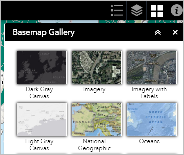
Widgets in the widgetPool are wrapped in a panel when they open. The default panel is BaseWidgetPanel. In this step, you'll use the FoldablePanel to display widgets in the widgetPool.
Note:
This also applies to the widgets in the widgetOnScreen section.
- Copy the FoldablePanel folder at ~/client/stemapp/themes/FoldableTheme/panels, and paste it into the ~/client/stemapp/themes/YourTheme/panels folder if the panel widget does not exist in the target directory.
- Import the FoldablePanel CSS style sheet into ~/client/stemapp/themes/YourTheme/common.css as shown below.
@import url ("panels/FoldablePanel/style.css"):
This step is optional if the panel widget folder does not include its own style sheet.
- Add the FoldablePanel widget to the panel section.
"widgetPool": {
    "panel": {
      "uri": "themes/YourTheme/panels/FoldablePanel/Panel",
      "position": {
        "top": 70,
        "right": 20,
        "bottom": 10,
        "width": 300
      }
    },
    "widgets": [{...}, {...}]
  }
Use a different panel in the widgetPool
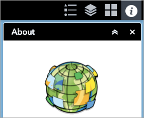
The panel widget added in the previous step applies to all widgets in the widgetPool. This step shows how a specific widget uses a panel other than the default. The SimpleBorderPanel will display the About widget.
Note:
This also applies to the widgets in the widgetOnScreen section.
- Make sure the SimpleBorderPanel folder is in the ~/client/stemapp/themes/YourTheme/panels folder. If not, copy one from DemoTheme at ~/client/stemapp/themes/DemoTheme/panels.
- In the widgetPool, add a groups property as follows:
"widgetPool": { "panel": {...}, "widgets": [{...}, {...}], "groups": [] } - Add a new object in the following structure to the groups array:
"widgetPool": { "panel": {...}, "widgets": [{...}, {...}], "groups": [{ "panel": {}, "widgets": [] }] } - Move the About widget configuration from the widgetPool widgets array to the widgets array in groups as follows:
"widgetPool": { "panel": {...}, "widgets": [{...}], "groups": [{ "panel": {}, "widgets": [{ "uri": "widgets/About/Widget" }] }] } - Add the SimpleBorderPanel configuration to the panel property in the first object in groups as follows:
"widgetPool": {
    "panel": {...},
    "widgets": [{...}],
    "groups": [{
      "panel": {
        "uri": "themes/YourTheme/panels/SimpleBorderPanel/Panel",
        "position": {
          "top": 70,
          "right": 20,
          "width": 200,
          "height": 200
        }
      },
      "widgets": [{
        "uri": "widgets/About/Widget"
      }]
    }]
  }
Add a layout for mobile devices
The configuration in this step is a subset of what you've done in the previous steps.
In a mobile layout, you can only define the positions of the widgets and groups with either array or object type as follows:
- With array, you must define the position of the widget and group individually.
- With object, you can use both the widget URI as a key and position as a value to define the position. For the placeholder widget without a URI, use ph_<i> as the key, where <i> is the index of the placeholder defined in the widgetOnScreen section. For the group, use g_<i> as the key, where <i> is the index of the group. The index starts from 0. In this example, you'll use the second method to override the positions.
Do the following to add a layout for devices:
- Remove the spaces between the HeaderController widget and the edges of the screen.
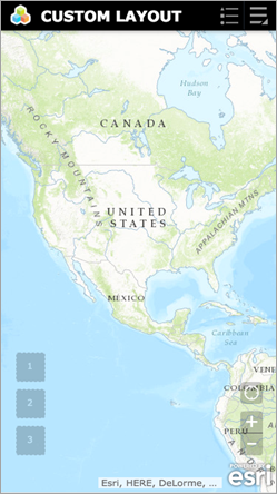
- Place the ZoomSlider and MyLocation widgets at the bottom right of the screen.
- Place widget placeholders at the bottom left of the screen.
- In the mobileLayout, add widgetOnScreen as a new property with its value as an object and widgets property inside of widgetOnScreen with a value as an object as well.
"mobileLayout": {
    "widgetOnScreen": {
      "widgets": {}
    }
  }
Caution:
For the default layout, the widget's property inside the mobileLayout is an array.
- Add the HeaderController layout configuration to the widget's object.
"mobileLayout": {
    "widgetOnScreen": {
      "widgets": {
        "themes/YourTheme/widgets/HeaderController/Widget": {
          "position": {
            "left": 0,
            "top": 0,
            "right": 0,
            "height": 40,
            "relativeTo": "browser"
          }
        }
      }
    }
  }
The widget configuration structure is an object, where the widget URI serves as the key of the object.
- Move the ZoomSlider and MyLocation widgets to the bottom right.
"mobileLayout": { "widgetOnScreen": { "widgets": { "themes/YourTheme/widgets/HeaderController/Widget": {...}, "widgets/ZoomSlider/Widget": { "position": { "bottom": 30, "right": 20 } }, "widgets/MyLocation/Widget": { "position": { "right": 20, "bottom": 100 } } } } } - Move the widget placeholders to the bottom left.
"mobileLayout": {
    "widgetOnScreen": {
      "widgets": {
        "themes/DemoThemeTest/widgets/HeaderController/Widget": {...},
        "widgets/ZoomSlider/Widget": {...},
        "widgets/MyLocation/Widget": {...},
        "ph_3": {
          "position": {
            "left": 20,
            "bottom": 130
          }
        },
        "ph_4": {
          "position": {
            "left": 20,
            "bottom": 80
          }
        },
        "ph_5": {
          "position": {
            "left": 20,
            "bottom": 30
          }
        }
      }
    }
  }
Here is the result on an iPhone 6.
In this topic
- Create a new default layout folder structure
- Register the new layout in manifest.json
- Create a minimal layout structure in config.json
- Add a controller widget
- Configure position properties for the map
- Add more on-screen widgets
- Add predefined widgets to the header
- Change the default panel in the widgetPool
- Use a different panel in the widgetPool
- Add a layout for mobile devices