Create a new style for a theme
You can create a basic style in ArcGIS Web AppBuilder to customize brand colors, fonts, and other basic UI properties in a theme. Although this topic uses a Jewelry Box theme, it applies to other themes in ArcGIS Web AppBuilder as well.
The new style modifies the following CSS properties of UI elements:
- Background color
- Text color
- Font family
- Font size
- Padding
The UI components to be styled in the Jewelry Box theme are the HeaderController widget, a foldable panel, and a map pop-up.
Note:
The above list of to-be-styled components can vary from theme to theme depending on the available widgets, panels, and other UI elements in the theme.
Create a new style folder
Create a new folder by completing the following steps.
- Go to the styles folder in the theme, for example, ~/client/stemapp/themes/JewelryBoxTheme/styles.
- Create a new folder and name it myStyle.
- Create a new style.css file in the myStyle folder.
Optionally, you can add more folders and style sheets, such as images or .lib files, in the myStyle folder. Keep in mind that all resources must be referenced in the style.css file.
The folder structure should look like this:

Register the style in the manifest.json file
To display the new style in ArcGIS Web AppBuilder, register it in the theme's manifest.json file.
- Open the manifest.json file from ~/client/stemapp/themes/JewelryBoxTheme/manifest.json.
- Add the following myStyle properties to the styles:
- "name"—Must match the name of the style folder.
- “description”—The style description.
- “styleColor”—Defines the background of the style’s representative swatch in the ArcGIS Web AppBuilder UI. The value can be a valid color name or a HEX.
The code snippet in the manifest.json file should look similar to the following:
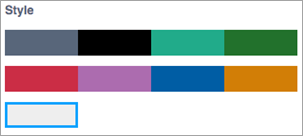
{ "name": "myStyle", "description": "this is demo style", "styleColor": "#eee" } - Reload the app. The new style appears under the Jewelry Box theme as shown below.
Override brand colors for the HeaderController widget
To update the main color scheme with black and white for the HeaderController widget, you'll add CSS styles to the style.css file.
- Make the background color white (#fff).
.jimu-main-background {
  background-color: #fff;
}
The class name for the background-color property is jimu-main-background. It is a common class name from the Jimu CSS framework and may have an impact on other UI elements. For a full list of Jimu CSS class names, see CSS framework.
- Change the title and subtitle colors in the header to dark gray (#323232).
.jimu-title, .jimu-subtitle { color: #323232; } - Remove the shadow and add a border at the bottom. Unlike the class names in steps 1 and 2 from Jimu CSS framework, a widget-specific class name is used here.
.jimu-widget-header-controller {
  -moz-box-shadow: none;
  -webkit-box-shadow: none;
  box-shadow: none;
  border-bottom: 3px solid #323232;
}
A widget-specific class name follows the pattern of jimu-widget-{widgetname}.
- Change the background color, remove the right border, and change the opacity of the icon nodes.
.jimu-widget-header-controller .icon-node {
  opacity: 1;
  background: #323232;
  border-right: 0;
}
Now the HeaderController should look like this:

- Add styles to resize and align the icon nodes properly.
- Make the icon nodes smaller.
.jimu-widget-header-controller .icon-node {
  opacity: 1;
  background: #323232;
  border-right: 0;
  height: 30px !important;
  width: 30px !important;
}
With !important, the HeaderController widget dynamically adds inline styles and calculates the height of the icon nodes by reading the height property defined in the layout.json file.
- Add margin properties to align the icon nodes.
.jimu-widget-header-controller .icon-node { opacity: 1; background: #323232; border-right: 0; height: 30px !important; width: 30px !important; margin-top: 4px; margin-right: 10px; } - Add additional styles, such as border-radius.
.jimu-widget-header-controller .icon-node { opacity: 1; background: #323232; border-right: 0; height: 30px !important; width: 30px !important; margin-top: 4px; margin-right: 10px; -moz-border-radius: 50%; -webkit-border-radius: 50%; border-radius: 50%; } - Make the icon images smaller.
.jimu-widget-header-controller .icon-node img {
  height: 14px;
  width: 14px;
}
The HeaderController widget should now look like this:

- Add selected state styles.
.jimu-widget-header-controller .icon-node.jimu-state-selected {
  border-top: 0;
  background-color: #2196f3;
}
Jimu defines a list of state classes. In this example, jimu-state-selected is used.
- Add the CSS rule to override widget group icons when the group display mode is show in Dropdown Menu. See Controller widget for more information.
To align the drop-down arrow correctly in a widget group icon node, place the drop-down arrow at the bottom center of the icon node.
.jimu-widget-header-controller .drop-triangle {
    bottom: 5px;
    margin-left: -5px;
}
Make the background color of the drop-down menu dark gray (#323232).
.jimu-widget-header-controller .jimu-drop-menu {
  background-color: #323232;
}
Make the widget icons in the drop-down menu the same size as other widget icons to align them correctly.
.jimu-widget-header-controller .jimu-drop-menu .menu-item img {
  width: 14px;
  height: 14px;
  margin-top: 13px;
}
Make the text labels in the drop-down menu smaller.
.jimu-widget-header-controller .jimu-drop-menu .menu-item .label {
    font-size: 12px;
}
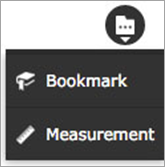
The widget group icon should look something like this when opened:
- Make the icon nodes smaller.
- Change the link color in the header to gray (#666), and add a few links in ArcGIS Web AppBuilder.
.jimu-link:link, .jimu-link:visited {
  color: #666;
}
The links display in gray in the HeaderController widget.

- The controllers in themes such as Foldable, Jewelry Box, and LaunchPad have the ability to wrap any widget icons into more widget pop-ups when there is not enough space. Complete the following steps to add a more widgets icon
 and restyle the pop-up.
- Make the overlay DIV, which covers the entire screen when the pop-up opens, opaque white.
.jimu-more-icon-cover { background-color: #323232; opacity: .65; } - Change the background color of the pop-up to black (#000).
.jimu-header-more-popup { background: #000; } - Change the background color of the icon tiles to dark gray (#323232).
.jimu-header-more-popup .icon-node { background-color: #323232; } - Change the background color of the pop-up footer (pagination) to black (#000).
.jimu-header-more-popup .points { background: #000; } - Adjust the Close button and pagination dots styles.
Use blue (#2196f3) for the Close button.
.jimu-header-more-popup .close,
.jimu-header-more-popup .close-inner {
  background-color: #2196f3;
}
Make the pagination dots smaller and apply gray (#9e9e9e—normal state) and white (#fff—active state) to the background colors.
.jimu-header-more-popup .points-inner { position: relative; top: -3px; } .jimu-header-more-popup .point { width: 5px; height: 5px; background-color: #9e9e9e; } .jimu-header-more-popup .point-selected { background-color: #fff; } - Resize the icon images to make them smaller.
.jimu-header-more-popup img {
  height: 30px !important;
  width: 30px !important;
}
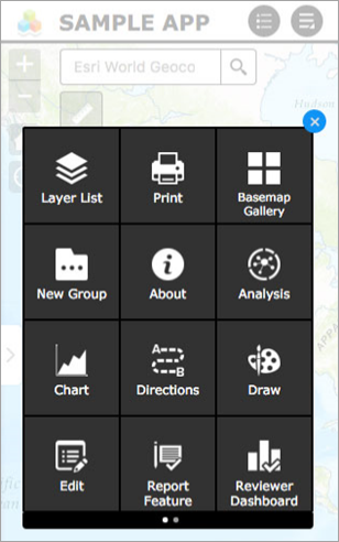
Now the pop-up looks like this:
- Make the overlay DIV, which covers the entire screen when the pop-up opens, opaque white.
Override brand colors for panel widgets
The panel widgets include foldable panels and on-screen panels. For the title panes in panel widgets in myStyle, the background colors will be updated in blue, and the borders will be removed.
- For both on-screen and foldable panels, change the background color of the title panes to blue (#2196F3).
.jimu-on-screen-widget-panel>.jimu-panel-title, .jimu-foldable-panel>.jimu-panel-title { background-color: #2196F3; } - Remove the borders.
.jimu-panel {
  border: 0;
}
Override brand colors for the map pop-up widget
Similar to the panel widgets, change the background colors of the pop-up's title pane.
- Change the background color of the pop-up’s title pane to blue (#2196F3).
.esriPopup .titlePane {
  background-color: #2196F3;
}
Use a different font family
Change the default font to Open Sans. The jimu-main-font is the class name from the Jimu class framework.
- By default, theOpen Sans font is not available on many devices. To import it, add the following line of code at the beginning of the style.css file in myStyle:
@import url(//fonts.googleapis.com/css?family=Open+Sans);
- Override the default font in .jimu-main-font.
.jimu-main-font {
  font-family: 'Open Sans';
}