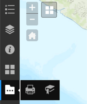
Create a controller widget
This topic explains how to create a sidebar controller widget in Web AppBuilder. The sidebar controller vertically displays and controls other widgets defined in widgetPool. As a result, it does not have a logo, title, or link.
Create a controller widget folder structure
- Open the DemoTheme folder at ~/client/stemapp/themes.
- Create a new folder and name it widgets if a widgets folder does not already exist.
- Copy the Demo widget folder from ~/client/stemapp/widgets/samplewidgets to the widgets folder and change its name to SidebarController. The widgets folder should look similar to the following:
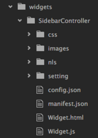
Note:
The Demo folder provides all the required files and folders to create a custom widget.
- Update the general information for the SidebarController widget, such as its name and label in the manifest.json and nls/string.js files as needed.
- In the manifest.json file, add the following properties to inform Web AppBuilder that this is a controller widget:
"properties": {
    "inPanel": false,
    "isController": true,
    "isThemeWidget": true
  }
Add SidebarController to the default layout
- Open the config.json file from the ~/client/stemapp/themes/DemoTheme/layouts/default folder.
- Add the following configuration to the widgets array in the widgetOnScreen section:
{
      "uri": "themes/DemoTheme/widgets/SidebarController/Widget",
      "position": {
        "left": 0,
        "top": 0,
        "bottom": 0,
        "width": 50,
        "relativeTo": "browser"
      }
    }
The controller is placed at the left of the screen with a width of 50 pixels and a height of 100 percent of the browser window.
- Reposition other on-screen widgets and widget placeholders to make space for SidebarController by adding 60 pixels to their left values.
For example, the left value of the Scalebar widget is increased from 25 to 85.
{ "uri": "widgets/Scalebar/Widget", "position": { "left": 85, "bottom": 25 } } - Reload the Web AppBuilder app, and choose DemoTheme.
The SidebarController widget is added as shown below.
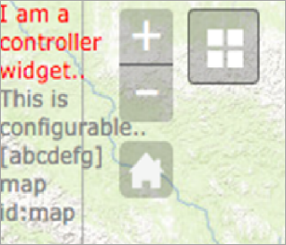
The SidebarController widget still displays the sample content from the Demo widget, and there are no styles added yet.
In addition, the controller configuration option is available as shown below.

Customize the controller template
The widget.html file contains the HTML structure of the controller. In this section, you'll remove any sample code from the Demo widget and add a new dom element to contain widget icons that will be added when the app loads.
- Open widget.html in the SidebarController folder and replace the content with the following:
<div>
  <div data-dojo-attach-point="containerNode"></div>
</div>
Caution:
Don’t reload Web AppBuilder yet, because widget.js is still looking for the previous value of data-dojo-attach-point that was removed from the template.
Customize the controller widget
The widget.js file contains the basic widget life cycle methods and event handlers such as postCreate, startup, onSignIn, and onSignOut.
- Set the controller’s base class name or names.
Find the baseClass property and change its name to jimu-widget-sidebar-controller. This class name will help target the controller widget when you define its CSS styles. Add another class called jimu-main-background from the Jimu class framework to help create multiple styles.
baseClass: 'jimu-widget-sidebar-controller jimu-main-background', - Remove the following unused event handlers since they don't apply to the SidebarController widget:
- onOpen
- onClose
- onMinimize
- onMaximize
- onSignIn
- onSignOut
- Remove the following line of unused code from the startup method:
this.mapIdNode.innerHTML = 'map id:' + this.map.id; - Open Web AppBuilder, create a new app, and choose the Demo theme.
The SidebarController widget appears as a red vertical bar on the left side of the screen as shown below.
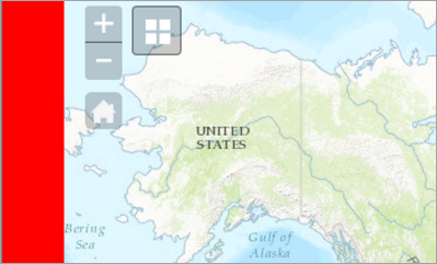
Note:
The red background color is from the default style of DemoTheme that contains a CSS rule targeting the class name jimu-main-background.
- Read the app’s config file and populate the widget and group icons from widgetPool.
- Add jimu/PoolControllerMixin to the array of class declarations in widget.js.
define(['dojo/_base/declare', 'jimu/PoolControllerMixin', 'jimu/BaseWidget'], function(declare, PoolControllerMixin, BaseWidget) { return declare([BaseWidget, PoolControllerMixin], { ... }); }); - Declare a new widget property called allConfigs along with an empty array as its value.
allConfigs: [],In the postCreate method, call getAllConfigs provided by PoolControlerMixin to get configurations for all the widgets and groups defined in the widget pool, and assign its returned value to this.allConfigs.
this.allConfigs = this.getAllConfigs();Note:
See Create a controller widget for all the methods provided by PoolControlerMixin.
- Declare a new method called _createIconNode, and add logic to create HTML elements for widget and group icons in SidebarController.
_createIconNode: function(iconConfig, targetNode) { var iconNode, iconImage; if(!targetNode) targetNode = this.containerNode; iconNode = document.createElement('DIV'); iconNode.className = 'icon-node'; if(iconConfig.icon) { iconImage = document.createElement('img'); iconImage.src = iconConfig.icon; } if(iconConfig.label) { iconNode.title = iconConfig.label; iconImage.alt = iconConfig.label; } iconNode.appendChild(iconImage); targetNode.appendChild(iconNode); return iconNode; } - Loop through this.allConfigs and call _createIconNode to add widget and group icons to the UI in the postCreate method.
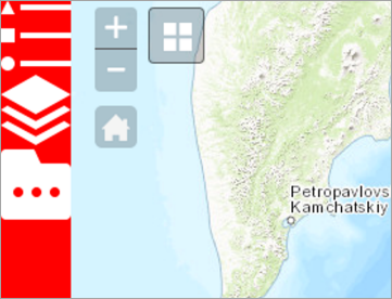
postCreate: function() { this.inherited(arguments); console.log('postCreate'); this.allConfigs = this.getAllConfigs(); for(var i = 0; i < this.allConfigs.length; i++) { this._createIconNode(this.allConfigs[i]); } }, - Restart Web AppBuilder, choose Demo theme, and add a few widgets and groups to SidebarController. The icons of widgets and groups display in the sidebar as shown below.
- Add jimu/PoolControllerMixin to the array of class declarations in widget.js.
- Display a widget in a panel when the widget icon is clicked.
jimu/PoolControllerMixin provides an instance of jimu/PanelManger that can be accessed in widget.js by this.panelManager. When you pass a widget’s configuration in the showPanel method, the widget displays in the panel configured in the widget pool, or in the Jimu’s default on-screen panel.
- Declare a new method in widget.js and add logic to open a widget in a panel.
_showWidgetContent: function(iconConfig) {
  this.panelManager.showPanel(iconConfig);
}
Note:
The above code does not support off-panel widgets when the inPanel property is set to false. You can use the following code to access the content of an off-panel widget and manually add its dom node to the interface. Note, however, it does not support groups.
if(!iconConfig.inPanel) { var self = this; this.widgetManager.loadWidget(iconConfig).then(function(widget) { // add code to display off-panel widgets here self.widgetManager.openWidget(widget); }); } - Attach the onclick event handler to icon nodes, and call _showWidgetContent to open the widget.
In the _createIconNode method, add the following code before return iconNode:
var self = this;
this.own(on(iconNode, 'click', function() {
  self._showWidgetContent(iconConfig);
}));
Note:
Make sure that the dojo/on class has been declared at the beginning of the file.
- Use SimpleBorderPanel as the default panel in widgetPool. Open the config.json file in the default layout folder, and add the following code after the map section:
"widgetPool": {
    "panel": {
      "uri": "themes/DemoTheme/panels/SimpleBorderPanel/Panel",
      "position": {
        "top": 0,
        "left": 50,
        "bottom": 0,
        "width": 300
      }
    }
  }
The panel will be placed next to the SidebarController widget when opened.
- Add functionality to close an open panel when a different icon is clicked.
- Add a new widget property called openedWidgetId to store the current open widget ID.
openedWidgetId: '', - In the _showWidgetContent method, add code to close an open panel, and update openedWidgetId.
_showWidgetContent: function(iconConfig) {
  if(this.openedWidgetId) {
    this.panelManager.closePanel(this.openedWidgetId + '_panel');
  }
  this.panelManager.showPanel(iconConfig);
  this.openedWidgetId = iconConfig.id;
}
- Add a new widget property called openedWidgetId to store the current open widget ID.
- Declare a new method in widget.js and add logic to open a widget in a panel.
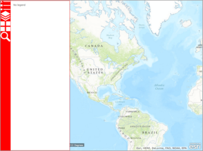
- Create a new app in Web AppBuilder and choose Demo theme. Click the legend widget.
The panel displays next to the sidebar.
- Add or remove the active state class name to or from icon nodes.
- Include dojo/dom-class and dojo/query in the array of class declarations.
define(['dojo/_base/declare', 'dojo/on', 'dojo/query', 'dojo/dom-class', 'jimu/PoolControllerMixin', 'jimu/BaseWidget' ], function(declare, on, query, domClass, PoolControllerMixin, BaseWidget) { ... - Add the jimu-state-active class name to the selected icon node in the icon node’s onclick event handler.
this.own(on(iconNode, 'click', function() { domClass.add(this, 'jimu-state-active'); self._showWidgetContent(iconConfig); })); - Remove the jimu-state-active class name from any existing icon node.
this.own(on(iconNode, 'click', function() {
  query('.jimu-state-active', self.domNode).removeClass('jimu-state-active');
  domClass.add(this, 'jimu-state-active');
  self._showWidgetContent(iconConfig);
}));
- Include dojo/dom-class and dojo/query in the array of class declarations.
- Close an open panel when its active icon node is clicked.
- Add a new widget property called activeIconNode.
activeIconNode: null, - In the icon node’s onclick event handler, assign the currently selected icon node to activeIconNode.
this.own(on(iconNode, 'click', function() { query('.jimu-state-active', self.domNode).removeClass('jimu-state-active'); domClass.add(this, 'jimu-state-active'); self._showWidgetContent(iconConfig); self.activeIconNode = this; })); - Add logic to check whether the currently clicked node is the active icon node, and close its panel if true.
this.own(on(iconNode, 'click', function() {
  query('.jimu-state-active', self.domNode).removeClass('jimu-state-active');
  if(self.activeIconNode === this) {
    self.panelManager.closePanel(iconConfig.id + '_panel');
    self.activeIconNode = null;
    return;
  }
  domClass.add(this, 'jimu-state-active');
  self._showWidgetContent(iconConfig);
  self.activeIconNode = this;
}));
- Add a new widget property called activeIconNode.
- Remove the active state from an icon node when its panel is closed
- Add callback functions to this.panelManager.showPanel.
_showWidgetContent: function (iconConfig) { if (this.openedWidgetId) { this.panelManager.closePanel(this.openedWidgetId + '_panel'); } var self = this; this.panelManager.showPanel(iconConfig).then(function (widget) { // the panel displays successfully }, function (err) { // the panel failed to display }); this.openedWidgetId = iconConfig.id; }, - In the success callback function, add an event handler to the widget’s onClose event to remove the active state from the selected icon node.
_showWidgetContent: function (iconConfig) {
  if (this.openedWidgetId) {
    this.panelManager.closePanel(this.openedWidgetId + '_panel');
  }
  var self = this;
  this.panelManager.showPanel(iconConfig).then(function (widget) {
    // the panel displays successfully
    self.own(on.once(widget, 'close', function () {
      domClass.remove(self.activeIconNode, 'jimu-state-active');
      self.activeIconNode = null;
    }));
  }, function (err) {
    // the panel failed to display
  });
  this.openedWidgetId = iconConfig.id;
},
Note:
The above code removes the jimu-state-active class from the currently selected icon node, which is the same icon node that opens the panel currently displaying. This may not be the case if multiple panels can be opened at the same time, such as with the Launchpad theme.
- Add callback functions to this.panelManager.showPanel.
- Configure the widget to open automatically when the app starts.
A widget can open automatically when the app loads when openAtStart is true. You want this functionality with SidebarController.
- Insert the following code after the icon node creation in the _createIconNode method:
_createIconNode: function(iconConfig, targetNode) { ... targetNode.appendChild(iconNode); // check if the widget is set to open at start if (iconConfig.openAtStart) { this.activeIconNode = iconNode; domClass.add(iconNode, 'jimu-state-active'); this._showWidgetContent(iconConfig); } ... }, - Restart Web AppBuilder. Set a widget in the controller to open at start by turning on the dot to dark green. Refresh the page, and the widget should automatically open when the app loads.
- Insert the following code after the icon node creation in the _createIconNode method:
- Handle group icons.
Different controllers handle widget groups and opening their widgets differently. In this example, widgets in a group will have the following in common:
- Their icons will be wrapped in a ToolTip container.
- When a widget in a group is clicked, the icon of the group will be replaced by the currently selected widget icon, and the SimpleBorderPanel is displayed with its content.
- Declare a new widget property called groupTooltips along with an empty object as its value. This property will store all ToolTips created for the widget group.
groupTooltips: {}, - Create a new method called _isGroupIcon to check whether an icon is a group icon.
_isGroupIcon: function(iconConfig) { return iconConfig.widgets && iconConfig.widgets.length > 1; } - In the _createIconNode method, after the if (iconConfig.openAtStart) {} statement, add a new if statement to check whether the current icon is a group icon. If it is, create a new ToolTip, loop through the widget icons and add them to the ToolTip. Then store the ToolTip in the this. groupTooltips array
_createIconNode: function(iconConfig, targetNode) { ... if (iconConfig.openAtStart) {...} // check if the icon is a group icon if(this._isGroupIcon(iconConfig)) { // if group's tooltip has not been created yet if(!this.groupTooltips[iconConfig.id]) { // create group tooltip and its content var groupTooltip = document.createElement('div'); groupTooltip.className = 'group-tooltip'; document.body.appendChild(groupTooltip); for(var i = 0; i < iconConfig.widgets.length; i++) { this._createIconNode(iconConfig.widgets[i], groupTooltip); } this.groupTooltips[iconConfig.id] = groupTooltip; } } ... }, - In the icon node’s onclick event handler, add additional logic to handle clicking a group icon.
this.own(on(iconNode, 'click', function() { // remove active state from any icon node query('.jimu-state-active', self.domNode).removeClass('jimu-state-active'); // close panel self.panelManager.closePanel(self.openedWidgetId + '_panel'); // close group tooltips query('.group-tooltip').removeClass('show'); // if clicked on an active icon node if(self.activeIconNode === this) { self.activeIconNode = null; return; } // clicking on a group icon if (self._isGroupIcon(iconConfig)) { self.openedWidgetId = null; domClass.add(self.groupTooltips[iconConfig.id], 'show'); } else { // clicking on a widget icon // show panel self._showWidgetContent(iconConfig); } domClass.add(this, 'jimu-state-active'); self.activeIconNode = this; })); - Reposition the ToolTip when opened.
- Add the following styles to the SidebarController widget’s style.css files:
.group-tooltip { display: none; position: absolute; background: #000; } .group-tooltip.show { display: block; } .group-tooltip .icon-node { display: inline-block; } - Add a new method called _positionTooltip.
_positionTooltip: function(tooltip, iconNode) { var iconBoundingRect = iconNode.getBoundingClientRect(); tooltip.style.top = iconBoundingRect.top + 'px'; tooltip.style.left = (iconBoundingRect.width || iconNode.clientWidth) + 'px'; } - Call the _positionTooltip method when a group icon is clicked.
this.own(on(iconNode, 'click', function() {
  // clicking on a group icon
  if (self._isGroupIcon(iconConfig)) {
    self.openedWidgetId = null;
    self._positionTooltip(self.groupTooltips[iconConfig.id], this);
    domClass.add(self.groupTooltips[iconConfig.id], 'show');
  } else { // clicking on a widget icon
    ...
  }
  ...
}));
- Add the following styles to the SidebarController widget’s style.css files:
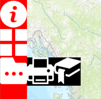
Your result should look similar to the following:
Add CSS styles
You can add the following CSS styles to the SidebarController widget:
- style.css from the~/client/stemapp/themes/DemoTheme/widgets/SidebarController/css folder—The widget-specific style regardless of the theme or style.
- common.css from the ~/client/stemapp/themes/DemoTheme folder—The common CSS styles apply to all styles in the Demo theme.
- style.css from the path/to/WAB/client/stemapp/themes/DemoTheme/styles/{styleName} folder—The CSS styles are only applied when a certain style is selected.
For the SidebarController widget, the CSS styles will be added to the following:
- The style.css file in the SidebarController folder—Contains only the minimal styles for the layout purpose.
- The style.css in the Default style folder—Defines the details of the widget UI.
- Open style.css from ~/client/stemapp/themes/DemoTheme/widgets/SidebarController/css, and replace the content with the following CSS rules:
.icon-node {
  min-width: 50px;
  padding: 12px 5px;
  text-align: center;
}
.icon-node img {
  width: 80%;
  max-width: 24px;
}
.icon-node.jimu-state-active {
  background: #000;
}
.group-tooltip {
  display: none;
  position: absolute;
  background: #000;
}
.group-tooltip.show {
  display: block;
}
.group-tooltip .icon-node {
  display: inline-block;
}
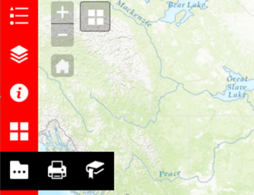
Your result should look similar to the following:
- Replace the styles with the following code in style.css from ~\client/stemapp/themes/DemoTheme/styles/default:
.jimu-main-background {
  background-color: #323232;
}

.icon-node img {
  opacity: 0.65;
}

.icon-node.jimu-state-active {
  background-color: #111;
  position: relative;
}

.icon-node.jimu-state-active:before {
  content: "";
  display: block;
  height: 100%;
  width: 3px;
  background-color: #2196F3;
  position: absolute;
  left: 0;
  top: 0;
}

.icon-node.jimu-state-active:after {
  content: "";
  display: block;
  height: 0;
  width: 0;
  border-width: 4px 4px 4px 0;
  border-style: solid;
  border-color: transparent #fff transparent transparent;
  margin-top: -4px;
  position: absolute;
  right: 0;
  top: 50%;
}

.icon-node:hover img,
.icon-node.jimu-state-active img,
.group-tooltip .icon-node.jimu-state-active:hover img {
  opacity: 1;
}

.group-tooltip {
  background-color: #111;
  border-left: 2px solid #fff;
}

.group-tooltip .icon-node.jimu-state-active:before,
.group-tooltip .icon-node.jimu-state-active:after {
  content: none;
}

.group-tooltip .icon-node.jimu-state-active img {
  opacity: 0.65;
}

.jimu-border-panel {
  border: 0;
  -webkit-box-shadow: 1px 0 0.5px rgba(0,0,0,0.2), 1px 0 2px rgba(0,0,0,0.07);
  box-shadow: 1px 0 0.5px rgba(0,0,0,0.2), 1px 0 2px rgba(0,0,0,0.07);
}
Your result should look similar to the following:
