Preview apps on smaller screens
The Previews button allows you to interactively preview the app in a simulated device browser. You can interact with the application as if it was a live app on various simulated platforms.
Note:
The Previews button is not available when you build 3D apps.
For each preview, adjust the Width and Height value in the left pane, and interactively view the changes in the right pane. In addition, rotate the view by clicking the portrait or landscape button in the upper-right corner of the preview window. Once completed, click Configure to return to the configuration page.
There are two styles of layout in a theme. One is for desktop and one is for mobile devices. When either the height or width of a screen display is less than 600 pixels, the mobile layout applies. You can also overwrite the default value with mobileBreakPoint url parameter.
Caution:
The previews window does not illustrate the varied versions of compiled code that can be exported through the application. It simply helps preview how the application looks and works on different devices.
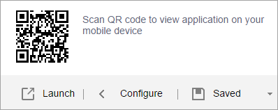
Further, you can scan QR code to view the app on your mobile device.
