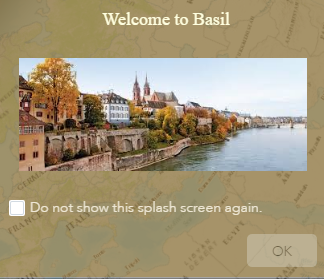
Splash widget
(Added at v1.0)
The Splash widget defines the display content on the app's splash screen. It appears before users start to interact with the app.
Tip:
When you embed a Web AppBuilder app that contains a Splash widget, you can add the &disableSplashFocus=true parameter to the end of the URL so the web page doesn't automatically scroll to the app.
Configure the Splash widget
A Splash widget is an off-panel widget. By default, it is turned off.
- To show the Splash widget in the app, hover over the widget and click the Show this widget button
 to turn it on.
- Hover over the widget and click the Configure this widget button
 to open the configuration window.
Note:
If you need to add the widget to the app first, click a widget placeholder on the Widget tab. In the Choose Widget window that opens, select the widget and click OK.
- In the configuration window, on the Content tab, use the basic web text editor to add text, images, and hyperlinks.
Caution:
If you configured the app prior to version 2.16 and used custom XSS for this content, you may need to modify it to ensure that it appears as expected now because XSS filters have since been implemented for improved security.
- Write and style text or add text by clicking the Paste From Word button
 . The content pasted from Microsoft Word keeps the same format it has in Word.
 - Click the Add image button
 to add an image by browsing. The size of the image should not be over 1,024K; otherwise, you will see a warning message. To remove the image, select and delete it.
In Chrome, the image is selected when it is covered by the color blue. In Firefox, the image is selected when you click it.
- Write and style text or add text by clicking the Paste From Word button
- Click the Appearance tab to set the appearance of the splash screen.
- Select a predefined size for the splash screen, or click Custom to set the width and height you prefer.
- Select a color or upload an image as the background of the screen. Adjust the transparency of the fill color if needed.
For the best result, the image should be 160 pixels wide by 90 pixels high. Other sizes will be adjusted to fit. Acceptable image formats are PNG, GIF, and JPEG.
- Select a fill color for the button on the screen. Adjust its transparency if needed.
- Change the text on the button if you want. By default, it is OK.
- Select a font color for the confirmation texts. Adjust its transparency if needed.
- Click the Options tab to set the behavior of the splash screen.
- By default, the Do not require confirmation to continue option is selected. When it is selected, you can decide if you want to provide users the option to disable the splash screen when the app starts.
- Select the Require confirmation to continue option. When it is selected, you can modify the text in the Confirmation Texts box and decide if you want to always show the splash screen when the app launches.
- Click OK to save the configuration and close the window.
Use the Splash widget
The following steps describe how to use the Splash widget.
- Start the app.

The splash screen appears.
- Check the confirmation check box and click OK.
The splash screen displays when accessing the app for the first time. When the app is accessed the next time with the same browser, the splash screen will not display until the browser's cookies are cleared.