 Hide Table of Contents
 Tutorials
 About the API
 Work with the API
 Graphics and feature layers
 Popups and Info Windows
 Mobile
 ArcGIS Server Services
 References
 What's New archive
Using the Dijit layout widgets
Dojo's layout dijits provide a way to create flexible layouts with minimal effort. The ArcGIS JavaScript API includes the DOJO UI libraries so you can use the Dojo layout dijits to create applications that incorporate mapping and analysis functionality in a visually appealing design.The ArcGIS JavaScript API samples provide a great way to learn how to use specific mapping and analysis functionality available from the API.Unfortunately, when building web applications with this functionality, it sometimes takes more time to figure out how to arrange the various HTML UI elements on the page than coding with the ArcGIS JavaScript API. Each application typically provides one or more UI elements in addition to the map for user interaction or displaying the results of some analysis. Since the ArcGIS JavaScript API includes all of the Dojo UI libraries, you can use the Dojo BorderContainer to easily lay out these elements in a standard way.
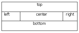
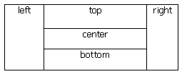
Each instance of the BorderContainer allows for up to 5 different regions: top, bottom, right, left, and center. Each region typically contains one of the following Dojo layout elements:
- AccordionContainer
- ContentPane
- SplitContainer
- StackContainer
- TabContainer
To break a region into additional sections you can create nested BorderContainers.
The BorderContainer's design attribute defines how the child elements are arranged. The valid values for the design attribute are headline and sidebar. If the value is set to headline, the top and bottom regions take precedence and stretch to 100% of the width.

Setting the value to sidebar stretches the right and left regions to 100% of the height.

The location of each child element is set with the region attribute. It's important to note that for the top and bottom regions you shouldn't set the width, only set the height. For the right and left regions don't set the height, only set the width. No width or height should be set for the center region as the BorderContainer will fill in the remaining space with this element.
Design Considerations:
- The BorderContainer's "gutters" attribute, which by default is true, adds a 5px margin around all child elements.
- Use CSS to make sure the html and body tags use the entire view port.
html, body { height: 100%; width: 100%; margin: 0; padding: 0; } - Set the Dojo theme and application background color in the body tag.
<body class="soria" style="background-color: steelblue; overflow: hidden;">
- The first element inside the body tag should be a BorderContainer.Use the style attribute to add an
overall margin if desired.
<div dojotype="dijit.layout.BorderContainer" design="headline" gutters="false" style="width: 96%; height: 95%;
margin: 2%; border:solid 3px silver;">
- Use a Dojo ContentPane for the map div so it's positioned correctly relative to the other UI elements. The ContentPane
provides a "resize" event for repositioning and resizing the map.
<div id="map" dojotype="dijit.layout.ContentPane" region="center" style="border:solid thin silver;
overflow:hidden;"></div>
The Sample Code section of the help contains several sample layouts. These samples show simple user interfaces built using the BorderContainer and are a good starting point for your own work.