 Hide Table of Contents
 Tutorials
 About the API
 Work with the API
 Graphics and feature layers
 Popups and Info Windows
 Mobile
 ArcGIS Server Services
 References
 What's New archive
Feature Layers are client side layers that access data and draw features as vector graphics in the browser. Feature Layers can be visualized with the techniques outlined below using one of several renderers available in the API.
Density
Density can be visualized in a number of different ways using most renderers available in the ArcGIS API for JavaScript. Two of these renderers - HeatMapRenderer and DotDensityRenderer - make it easy for developers to quickly create maps visualizing areas with dense counts of points or amounts of any numeric attribute in the layer.
Heat Map Renderer
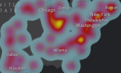
The heatmaprenderer renders point data into a raster visualization that emphasizes areas of higher density or weighted values.
|
var heatmapRenderer = new HeatmapRenderer({
  field: "Magnitude",
  blurRadius: blurCtrl.value,
  maxPixelIntensity: maxCtrl.value,
  minPixelIntensity: minCtrl.value
});

heatmapFeatureLayer.setRenderer(heatmapRenderer);
|
It is an efficient way to display generalized point pattern locations. This may be helpful in circumstances when rendering individual points becomes less useful and visually appealing. For details on how HeatmapRenderer works and its properties, see the API reference and the samples: Explore Heat Maps | Use Heat Maps
Dot Density Renderer
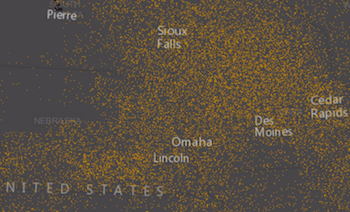
The DotDensityRenderer visualizes quantitative data in polygons with numerous randomly placed dots. The relative sparseness of the dots indicates the distribution of a discrete spatial phenomenon, such as population distribution map, crop production map, etc.
|
var renderer = new DotDensityRenderer({
  fields: [{
    name: "Total_Emp",
    color: new Color([52, 114, 53])
  }],
  dotValue: 4000,
  dotSize: 2
});
layer.setRenderer(renderer);
|
Multiple fields may be visualized in the same layer using different colors. See the API reference for more details on how to work with this renderer. Samples using this renderer may also be viewed here: Dot density renderer | Dot density with multiple classes
Color
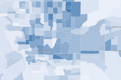
Effective use of color can quickly communicate spatial trends to the user. The ClassBreaksRenderer class provides a streamlined method when defining breaks for a range of predetermined data values. These data values are assigned a specific color.
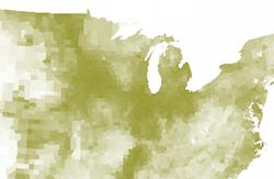
In many cases, the process of determining the number and range of breaks can be complicated and confusing. For this reason, each renderer has a visualVariables property. This property allows developers to define continuous color ramps without breaks. It takes a colorInfo object which provides a simple color ramp to visualize data.
Size
Whether your data is represented as points, lines, or polygons, size may be used to represent variations in numerical data. For example: the traffic count of highways, the population of states, etc.
Simliar to working with color to visualize data, you may use a ClassBreaksRenderer to symbolize your data with graduated symbols. Alternatively, you may use proportional symbols by defining a sizeInfo object and setting it on the visualVariables property of the renderer.
When using a sizeInfo visual variable on point data, the minimum and maximum size of the symbol is scaled based on the map scale.
Depending on the geometry type of the layer, symbol scaling affects your map differently:
| Point | Line | Polygon |
|---|---|---|
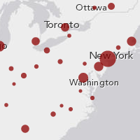
The size of marker symbol is scaled.
|
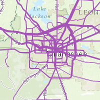
The width of line symbol is scaled.
|
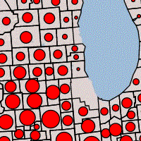
The size of the marker symbol placed in polygon is scaled.
|
- Color ramp with rotation and proportional symbols
- Symbol size and outline width based on map scale
- Proportional symbols for lines
Predominance
Mapping predominant values is a popular visualization technique for communicating the dominant attribute when two or more competing attributes are considered. For example, several presidential candidates run for office each election cycle. Each candidate earns a certain number of votes in each county. You can use predominance to depict which presidential candidate won the most votes in each county. This can be done using the following renderers.
Unique Value Renderer
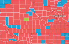
The UniqueValueRenderer visualizes qualitative data based on a single attribute or combination of attributes. If an attribute describes a dominant attribute from a set of competing fields in a feature, then this renderer can be used to depict predominance. Using the example above, this renderer would use a field indicating the winner in each county or feature.
|
  var renderer = new UniqueValueRenderer(defaultSymbol, "COLLEGE_ATTENDANCE");

  //add symbol for each possible value
  renderer.addValue("Majority did not attend",
    new SimpleFillSymbol().setColor(new Color([255, 0, 0, 0.5])));
  renderer.addValue("Majority did attend",
    new SimpleFillSymbol().setColor(new Color([0, 255, 0, 0.5])));
|
Blend Renderer
When the predominant attribute (or winning attribute) among competing attributes is not known, a BlendRenderer may be used to depict predominance. With this renderer, each competing field is assigned a different color. Features that are clearly shaded with one of those predefined colors represent areas where the attribute corresponding to that color dominates the other competing attributes. When any two attributes (or more) are equal, a blend of those colors will shade the feature.
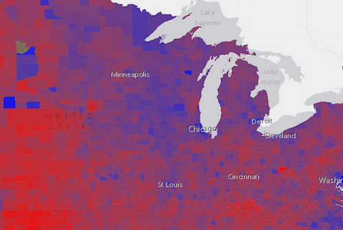
|
var renderer = new BlendRenderer({
  fields: [{field: "OWNER_CY", color: new Color([0, 0, 255])},
           {field: "RENTER_CY", color: new Color([255, 0, 0])}],
  opacityStops: [{ value: 0.1, opacity: 0 },
                 { value: 1, opacity: 0.7 }],
  normalizationField: "TOTHU_CY"
});
layer.setRenderer(renderer);
|
- BlendRenderer - Lawrence, KS by age and population size
- BlendRenderer - Los Angeles housing status
- BlendRenderer - Minority demographics
Multivariate maps
Multivariate maps depict two or more attributes or variables from a dataset in a single map. BlendRenderer discussed in the previous section, may be used in multivariate mapping. For example, in the map below three attributes are mapped using three different visualization techniques:
- Color is used to shade each feature based on unique values.
- Size is used to show the count of a particular attribute in each feature.
- Opacity is used to depict the strength of the predominace in each unique value.
In the case of elections, a fully opaque color would mean the candidate represented by a particular color won 100 percent of the vote. A feature with a highly transparent color would indicate that whoever won the vote in the county, did so by a small margin.
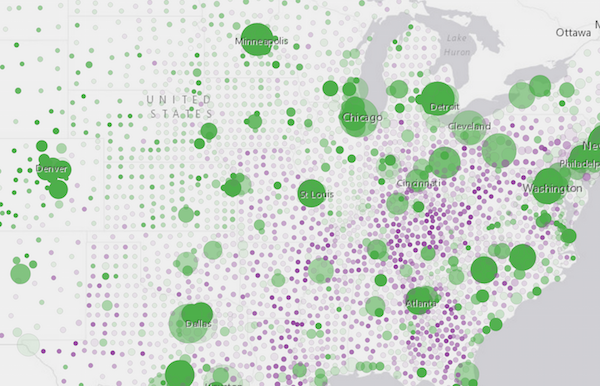
Because of Smart Mapping and visual variables, multivariate mapping has never been easier. Examples of sizeInfo and colorInfo visual variables were mentioned above. These objects, in addition to opacityInfo, can be combined to create visually impressive maps that reveal patterns, trends, and overall influences that may not be visible in single variable maps.