require(["esri/widgets/CatalogLayerList"], (CatalogLayerList) => { /* code goes here */ });
import CatalogLayerList from "@arcgis/core/widgets/CatalogLayerList.js";
esri/widgets/CatalogLayerList
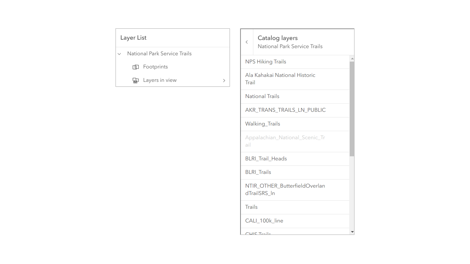
The CatalogLayerList widget provides a way to display and interact with CatalogLayers. The widget displays a list of layers in the dynamicGroupLayer and allows you to toggle their visibility.
The ListItem API provides access to each layer's properties, allows the developer to configure actions related to the layer, and allows the developer to add content to the item related to the layer.
const catalogLayerList = new CatalogLayerList({
  catalogLayer,
  view
});

view.ui.add(catalogLayerList, "top-right");
Constructors
-
Parameterproperties Objectoptional
See the properties for a list of all the properties that may be passed into the constructor.
Example// typical usage const catalogLayerList = new CatalogLayerList({ catalogLayer, view }); view.ui.add(catalogLayerList, "top-right");
Property Overview
| Name | Type | Summary | Class |
|---|---|---|---|
The collection of ListItems representing the catalogLayer's dynamicGroupLayer. | CatalogLayerList | ||
The CatalogLayer to display in the widget. | CatalogLayerList | ||
Indicates whether the widget is collapsed. | CatalogLayerList | ||
The ID or node representing the DOM element containing the widget. | Widget | ||
The name of the class. | Accessor | ||
Placeholder text used in the filter input if visibleElements.filter is true. | CatalogLayerList | ||
Specifies a function to handle filtering list items. | CatalogLayerList | ||
The value of the filter input if visibleElements.filter is true. | CatalogLayerList | ||
Indicates the heading level to use for the heading of the widget. | CatalogLayerList | ||
Icon which represents the widget. | CatalogLayerList | ||
The unique ID assigned to the widget when the widget is created. | Widget | ||
The widget's default label. | CatalogLayerList | ||
A function that executes each time a ListItem is created. | CatalogLayerList | ||
The minimum number of list items required to display the visibleElements.filter input box. | CatalogLayerList | ||
A collection of selected ListItems representing catalogItems selected by the user. | CatalogLayerList | ||
Specifies the selection mode. | CatalogLayerList | ||
| CatalogLayerList | |||
The view model for this widget. | CatalogLayerList | ||
Determines the icons used to indicate visibility. | CatalogLayerList | ||
Indicates whether the widget is visible. | Widget | ||
The visible elements that are displayed within the widget. | CatalogLayerList |
Property Details
-
catalogItems
PropertycatalogItems Collection<ListItem>readonly -
The collection of ListItems representing the catalogLayer's dynamicGroupLayer.
- See also
-
catalogLayer
PropertycatalogLayer CatalogLayer |null |undefined -
The CatalogLayer to display in the widget.
- Default Value:null
ExamplecatalogLayerList.catalogLayer = new CatalogLayer({ url });
-
collapsed
Propertycollapsed Boolean -
Indicates whether the widget is collapsed. When collapsed, only the collapse button and the heading are displayed.
- Default Value:false
- See also
ExamplecatalogLayerList.collapsed = true;
-
container
InheritedPropertycontainer HTMLElement |null |undefinedautocastInherited from WidgetAutocasts from String -
The ID or node representing the DOM element containing the widget. This property can only be set once. The following examples are all valid use case when working with widgets.
Examples// Create the HTML div element programmatically at runtime and set to the widget's container const basemapGallery = new BasemapGallery({ view: view, container: document.createElement("div") }); // Add the widget to the top-right corner of the view view.ui.add(basemapGallery, { position: "top-right" });// Specify an already-defined HTML div element in the widget's container const basemapGallery = new BasemapGallery({ view: view, container: basemapGalleryDiv }); // Add the widget to the top-right corner of the view view.ui.add(basemapGallery, { position: "top-right" }); // HTML markup <body> <div id="viewDiv"></div> <div id="basemapGalleryDiv"></div> </body>// Specify the widget while adding to the view's UI const basemapGallery = new BasemapGallery({ view: view }); // Add the widget to the top-right corner of the view view.ui.add(basemapGallery, { position: "top-right" });
-
filterPlaceholder
PropertyfilterPlaceholder String -
Placeholder text used in the filter input if visibleElements.filter is true.
- Default Value:""
- See also
ExamplecatalogLayerList.filterPlaceholder = "Filter layers";
-
filterPredicate
PropertyfilterPredicate FilterPredicate |null |undefinedSince: ArcGIS Maps SDK for JavaScript 4.32CatalogLayerList since 4.30, filterPredicate added at 4.32. -
Specifies a function to handle filtering list items.
- Default Value:null
ExamplelayerList.filterPredicate = (item) => item.title.toLowerCase().includes("streets");
-
filterText
PropertyfilterText String -
The value of the filter input if visibleElements.filter is true.
- Default Value:""
- See also
ExamplereactiveUtils.watch( () => catalogLayerList.filterText, (filterText) => console.log(filterText) );
-
headingLevel
PropertyheadingLevel Number -
Indicates the heading level to use for the heading of the widget. By default, the heading is rendered as a level 2 heading (e.g.,
<h2>Catalog Layer List</h2>). Depending on the widget's placement in your app, you may need to adjust this heading for proper semantics. This is important for meeting accessibility standards.- Default Value:2
- See also
ExamplecatalogLayerList.headingLevel = 3;
-
icon
Propertyicon String -
Icon which represents the widget. It is typically used when the widget is controlled by another one (e.g. in the Expand widget).
- Default Value:"catalog-dataset"
- See also
-
label
Propertylabel String -
The widget's default label.
-
listItemCreatedFunction
PropertylistItemCreatedFunction ListItemCreatedHandler |null |undefined -
A function that executes each time a ListItem is created. Use this function to add actions and panels to list items, and to override the default settings of a list item. Actions can be added to list items using the actionsSections property of the ListItem.
- Default Value:null
Example// Create a new CatalogLayerList with a listItemCreatedFunction // that adds an "add-layer" action to each catalog layer list item const catalogLayerList = new CatalogLayerList({ catalogLayer, listItemCreatedFunction: (event) => { const { item } = event; const { layer } = item; if (isLayerFromCatalog(layer)) { item.actionsSections = [ [ { title: "Add layer to map", icon: "add-layer", id: "add-layer" } ] ]; } }, view }); // Listen for the trigger-action event on the CatalogLayerListViewModel // and add layers from the catalog to the map when the "add-layer" action is triggered. // To correctly add a layer to the map, you must create a footprint from the layer // and then create a new layer from the footprint. catalogLayerList.on("trigger-action", async (event) => { const { id } = event.action; const { layer } = event.item; if (id === "add-layer") { const parentCatalogLayer = catalogUtils.getCatalogLayerForLayer(layer); const footprint = parentCatalogLayer.createFootprintFromLayer(layer); const layerFromFootprint = await parentCatalogLayer.createLayerFromFootprint(footprint); map.add(layerFromFootprint); } });
-
minFilterItems
PropertyminFilterItems Number -
The minimum number of list items required to display the visibleElements.filter input box.
- Default Value:10
- See also
ExamplelayerList.visibleElements.filter = true; layerList.minFilterItems = 5;
-
selectedItems
PropertyselectedItems Collection<ListItem>autocast -
A collection of selected ListItems representing catalogItems selected by the user.
- See also
-
selectionMode
PropertyselectionMode String -
Specifies the selection mode. Selected items are available in the selectedItems property.
Value Description multiple Allows any number of items to be selected at once. This is useful when you want to apply an operation to multiple items at the same time. none Disables selection. Use this when you want to prevent selecting items. single Allows only one item to be selected at a time. If another item is selected, the previous selection is cleared. This is useful when you want to ensure that a maximum of one item is selected at a time. single-persist Allows only one item to be selected at a time and prevents de-selection. Once an item is selected, it remains selected until another item is selected. This is useful when you want to ensure that there is always exactly one selected item. Possible Values:"multiple" |"none" |"single" |"single-persist"
- Default Value:"none"
- See also
ExamplecatalogLayerList.selectionMode = "multiple";
-
- Default Value:null
-
viewModel
PropertyviewModel CatalogLayerListViewModelautocast -
The view model for this widget. This is a class that contains all the logic (properties and methods) that controls this widget's behavior. See the CatalogLayerListViewModel class to access all properties and methods on the widget.
-
visibilityAppearance
PropertyvisibilityAppearance String -
Determines the icons used to indicate visibility.
Value Description Example default Displays view icons on the far side. Icons are hidden except on hover or if they have keyboard focus. See view-visible and view-hide calcite icons. 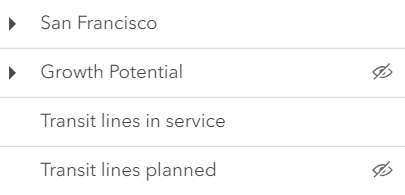
checkbox Displays checkbox icons on the near side. See check-square-f and square calcite icons. 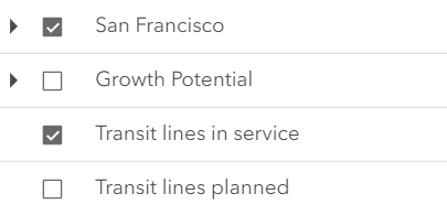
Possible Values:"default" |"checkbox"
- Default Value:"default"
ExamplecatalogLayerList.visibilityAppearance = "checkbox";
-
visible
InheritedPropertyvisible BooleanInherited from Widget -
Indicates whether the widget is visible.
If
false, the widget will no longer be rendered in the web document. This may affect the layout of other elements or widgets in the document. For example, if this widget is the first of three widgets associated to the upper right hand corner of the view UI, then the other widgets will reposition when this widget is made invisible. For more information, refer to the css display value of"none".- Default Value:true
Example// Hides the widget in the view widget.visible = false;
-
visibleElements
PropertyvisibleElements VisibleElementsautocast -
The visible elements that are displayed within the widget. This property provides the ability to turn individual elements of the widget's display on/off.
ExamplecatalogLayerList.visibleElements = { closeButton: false, collapseButton: true, errors: true, filter: true, heading: true, statusIndicators: true };
Method Overview
| Name | Return Type | Summary | Class |
|---|---|---|---|
Adds one or more handles which are to be tied to the lifecycle of the object. | Accessor | ||
A utility method used for building the value for a widget's | Widget | ||
Destroys the widget instance. | Widget | ||
Emits an event on the instance. | Widget | ||
Indicates whether there is an event listener on the instance that matches the provided event name. | Widget | ||
Returns true if a named group of handles exist. | Accessor | ||
| Widget | ||
| Widget | ||
| Widget | ||
Registers an event handler on the instance. | Widget | ||
Executes after widget is ready for rendering. | Widget | ||
Removes a group of handles owned by the object. | Accessor | ||
This method is implemented by subclasses for rendering. | Widget | ||
Renders widget to the DOM immediately. | Widget | ||
Schedules widget rendering. | Widget | ||
Triggers the trigger-action event and executes the given action or action toggle. | CatalogLayerList | ||
Promise |
| Widget |
Method Details
-
Inherited from Accessor
-
Adds one or more handles which are to be tied to the lifecycle of the object. The handles will be removed when the object is destroyed.
// Manually manage handles const handle = reactiveUtils.when( () => !view.updating, () => { wkidSelect.disabled = false; }, { once: true } ); this.addHandles(handle); // Destroy the object this.destroy();ParametershandleOrHandles WatchHandle|WatchHandle[]Handles marked for removal once the object is destroyed.
groupKey *optionalKey identifying the group to which the handles should be added. All the handles in the group can later be removed with Accessor.removeHandles(). If no key is provided the handles are added to a default group.
-
classes
InheritedMethodclasses(classNames){String}Inherited from Widget -
A utility method used for building the value for a widget's
classproperty. This aids in simplifying css class setup.ReturnsType Description String The computed class name. Example// .tsx syntax showing how to set css classes while rendering the widget render() { const dynamicClasses = { [css.flip]: this.flip, [css.primary]: this.primary }; return ( <div class={classes(css.root, css.mixin, dynamicClasses)} /> ); }
-
Inherited from Widget
-
Destroys the widget instance.
-
hasEventListener
InheritedMethodhasEventListener(type){Boolean}Inherited from Widget -
Indicates whether there is an event listener on the instance that matches the provided event name.
Parametertype StringThe name of the event.
ReturnsType Description Boolean Returns true if the class supports the input event.
-
hasHandles
InheritedMethodhasHandles(groupKey){Boolean}Inherited from Accessor -
Returns true if a named group of handles exist.
ParametergroupKey *optionalA group key.
ReturnsType Description Boolean Returns trueif a named group of handles exist.Example// Remove a named group of handles if they exist. if (obj.hasHandles("watch-view-updates")) { obj.removeHandles("watch-view-updates"); }
-
isFulfilled
InheritedMethodisFulfilled(){Boolean}Inherited from Widget -
isFulfilled()may be used to verify if creating an instance of the class is fulfilled (either resolved or rejected). If it is fulfilled,truewill be returned.ReturnsType Description Boolean Indicates whether creating an instance of the class has been fulfilled (either resolved or rejected).
-
isRejected
InheritedMethodisRejected(){Boolean}Inherited from Widget -
isRejected()may be used to verify if creating an instance of the class is rejected. If it is rejected,truewill be returned.ReturnsType Description Boolean Indicates whether creating an instance of the class has been rejected.
-
isResolved
InheritedMethodisResolved(){Boolean}Inherited from Widget -
isResolved()may be used to verify if creating an instance of the class is resolved. If it is resolved,truewill be returned.ReturnsType Description Boolean Indicates whether creating an instance of the class has been resolved.
-
on
InheritedMethodon(type, listener){Object}Inherited from Widget -
Registers an event handler on the instance. Call this method to hook an event with a listener.
ParametersReturnsType Description Object Returns an event handler with a remove()method that should be called to stop listening for the event(s).Property Type Description remove Function When called, removes the listener from the event. Exampleview.on("click", function(event){ // event is the event handle returned after the event fires. console.log(event.mapPoint); });
-
Inherited from Widget
-
Executes after widget is ready for rendering.
-
Inherited from Accessor
-
Removes a group of handles owned by the object.
ParametergroupKey *optionalA group key or an array or collection of group keys to remove.
Exampleobj.removeHandles(); // removes handles from default group obj.removeHandles("handle-group"); obj.removeHandles("other-handle-group");
-
Inherited from Widget
-
Renders widget to the DOM immediately.
-
Inherited from Widget
-
Schedules widget rendering. This method is useful for changes affecting the UI.
-
Triggers the trigger-action event and executes the given action or action toggle.
ParametersThe action to execute.
An item associated with the action.
-
Inherited from Widget
-
when()may be leveraged once an instance of the class is created. This method takes two input parameters: acallbackfunction and anerrbackfunction. Thecallbackexecutes when the instance of the class loads. Theerrbackexecutes if the instance of the class fails to load.ParametersReturnsType Description Promise Returns a new Promise for the result of callback.Example// Although this example uses the BasemapGallery widget, any class instance that is a promise may use when() in the same way let bmGallery = new BasemapGallery(); bmGallery.when(function(){ // This function will execute once the promise is resolved }, function(error){ // This function will execute if the promise is rejected due to an error });
Type Definitions
-
Specifies a function to handle filtering list items.
Parameteritem ListItemA list item created by the CatalogLayerList.
-
Function definition for the listItemCreatedFunction property. See the example snippet in the listItemCreatedFunction documentation for more details.
Parametersevent ObjectAn object containing a list item created by the LayerList.
Specificationitem ListItemA list item created by the CatalogLayerList. You can modify the properties of this item to customize the text, actions, panel content, and visibility of the list item. See the documentation for the listItemCreatedFunction for more details.
-
VisibleElements
Type DefinitionVisibleElements Accessor -
The visible elements that are displayed within the widget. This provides the ability to turn individual elements of the widget's display on/off.
- Properties
-
closeButton BooleanDefault Value:false
Indicates whether to display a close button in the header.
collapseButton BooleanDefault Value:falseIndicates whether to display a collapse button in the header.
errors BooleanDefault Value:falseIndicates whether to display layers with load errors.
filter BooleanDefault Value:falseIndicates whether to display a filter input box when then number of list items is equal to or greater than the value set in minFilterItems, allowing users to filter layers by their title.
flow BooleanDefault Value:trueDetermines whether the widget should be shown within its built-in flow component or if the flow component should be excluded. The widget will be displayed within its original flow component if set to
true. The flow component will be omitted from the widget if set tofalse. To place the widget into an existing Calcite flow component, set this property tofalse.heading BooleanDefault Value:falseIndicates whether to display the widget heading. The heading text is "Layer List". The heading level can be set with the headingLevel.
statusIndicators BooleanDefault Value:trueIndicates whether the status indicators will be displayed.
temporaryLayerIndicators BooleanDefault Value:falseIndicates whether temporary layer indicators will be displayed. A temporary icon will be displayed on the near side of the layer title.
Event Overview
| Name | Type | Summary | Class |
|---|---|---|---|
|
|
{action: ActionButton|ActionToggle,item: ListItem} |
Fires after the user clicks on an action or action toggle inside the CatalogLayerList widget. |
CatalogLayerList |
Event Details
-
Fires after the user clicks on an action or action toggle inside the CatalogLayerList widget. This event may be used to define a custom function to execute when particular actions are clicked.
- Properties
-
action ActionButton|ActionToggle
The action clicked by the user.
item ListItemThe ListItem associated with the action.