require(["esri/widgets/FeatureTable"], (FeatureTable) => { /* code goes here */ });
import FeatureTable from "@arcgis/core/widgets/FeatureTable.js";
esri/widgets/FeatureTable
The FeatureTable's functionality is described in the following sections:
- Overview
- Selection and highlighting
- Filtering and sorting
- Editing within the FeatureTable
- Related records
- Configuring columns
- Custom columns
- Menu and menu items
Overview
The FeatureTable widget provides an interactive tabular view of each feature's attributes in a layer. In addition, it also works with standalone tables that are not associated with underlying geometries. The FeatureTable supports the following layer types:
- FeatureLayer
- GeoJSONLayer
- CSVLayer
- ImageryLayer - Take note that it must have a mosaic dataset. Currently,
MapandFeatureTableinteraction withImageryLayersare not supported. - WFSLayer
- SceneLayer (with an associated FeatureLayer)
- KnowledgeGraphSublayer
- CatalogFootprintLayer
- MapImageLayer.sublayers
The FeatureTable varies slightly from other widgets in that it can work independently of a map or scene view. This means that the FeatureTable can be used in a standalone application or in a view that does not contain a map or scene. However, if the FeatureTable is used in conjunction with a map or scene view, the view must be set on the FeatureTable in order for the selection and highlighting to work. Implementing the FeatureTable programmatically is also slightly different than other widgets in that it is designed to be added to an application via its container element, as opposed to being added via the default UI, ie. view.ui.add(). The following example demonstrates how to add the FeatureTable to an application:
const featureTable = new FeatureTable({
 view: view,
layer: featureLayer,
container: "tableDiv"
});
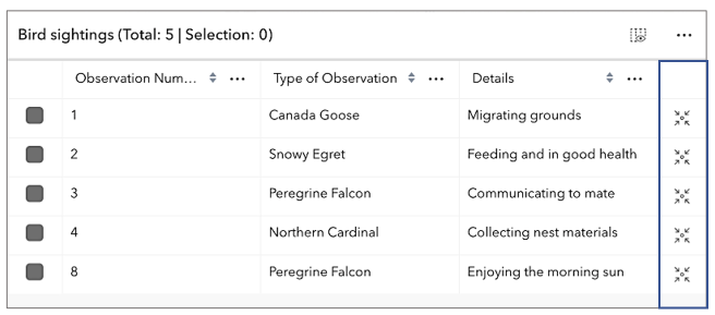
The FeatureTable can be configured to display specific columns (including attachments), filter features, and sort columns. It provides the ability to edit feature attributes, select and highlight features within the table and its associated view. In addition, it can also display and edit related records. The latter beginning with version 4.30. The following sections provide more detail on how to configure and use the FeatureTable.
Selection and highlighting
The FeatureTable allows manual interaction or programmatic control over selecting and highlighting features within both the table and its associated view.
To enable manual-driven selection and highlighting, ensure the table's view and highlightEnabled properties are configured.
Once set, interacting with a table row will select and highlight the corresponding feature in the view.
Multiple selections within the table are turned on by default. To update this behavior, set the multipleSelectionEnabled property to false.
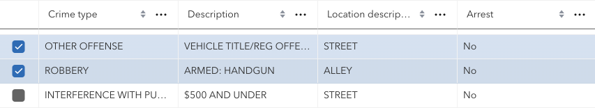
If you wish to independently wire up selection and highlighting, set the table's highlightIds. Modifying this collection by adding or removing feature object IDs will automatically update the selection status of the corresponding rows in the table. To deselect all features, simply clear the collection.
Highlighting rows within the table can be accomplished using rowHighlightIds. This property allows for the visual differentiation of rows based on criteria such as specific values or edits, without affecting their selection status. For example, you can use it to highlight rows that contain a specific value or rows that have been edited.
// This snippet highlights rows within the table that have been edited.
featureTable.layer.on("edits", (event) => {
  event.updatedFeatures.forEach((feature) => {
    featureTable.rowHighlightIds.push(feature.getObjectId());
  });
});
Additionally, selection and highlight behavior can be enhanced using the feature table's events. These events are designed to listen for cell interaction and include: cell-click, cell-keydown, cell-pointerout, and cell-pointerover. The latter two events are especially useful for tasks such as highlighting a feature in the view while hovering over a cell, all doing so without requiring the end-user to select the row. For example, these events can be used to display cell information in a tooltip that is attached to the mouse cursor.
In short, the highlightIds property is used to control and synchronize selections between the FeatureTable and other components of the SDK, whereas rowHighlightIds is for adding a highlight to some rows, based on some other interaction within the application. It allows the ability to select specific rows based on actions performed in the application, such as hovering over a feature on the map or applying a filter through another widget.
Filtering and sorting
The FeatureTable provides the ability to filter and sort features within the table. A few different approaches to filtering are outlined in the section below.
- Filtering by selection- By default, the table displays all rows, regardless of their selection status. However, if needing to display only selected rows, set the filterBySelectionEnabled property to
true. When set, the table will only display rows for selected features. This is useful for focusing on a specific subset of features. Setting the FeatureTable's objectIds performs similar functionality where only the set object IDs will display within the table. If the collection is empty, all features display. The difference between filterBySelectionEnabled and objectIds is the latter does not require a selection. Rather, it only displays features with a matching object ID, whereas setting filterBySelectionEnabled indicates to the table that it should only display features that are already selected. This selection is handled by passing in a collection of object IDs to the table's highlightIds. Setting this property selects the corresponding features within the table while highlighting them in the view. For an example of how to filter using these properties, see the sample FeatureTable with related records. - Filtering by geometry- This is done by setting the filterGeometry property to a geometry. When set, the table will only display rows for features that intersect the geometry. This is useful for focusing on a specific subset of features that intersect a geometry. See the samples, FeatureTable with a map, and FeatureTable with related records) for an example of how to filter features by geometry.
- Filtering by time- To achieve this, configure the timeExtent property to a time extent. Once configured, the table will exclusively show rows corresponding to features that are within the defined time extent. Filtering by selection and geometry- This is accomplished by setting both the objectIds and filterGeometry properties. When set, the table will only display rows for features that match the corresponding object ID and and intersect the geometry.
It is possible to control sort order individually per column or on multiple columns. The latter is accomplished by setting the multiSortEnabled property to true. When set, the table will allow sorting on multiple columns. The table's sortColumn method is used to sort columns. This method takes the field name and sort order as parameters. The sort order can be set to either asc or desc. The priority of columns and their sort order can be set using initialSortPriority. This property is used to set the initial sort priority for a column.
If the table is in its default sort mode with no initial sort order provided, the first field on the layer automatically sorts in ascending order.
Editing within the FeatureTable
The FeatureTable provides the ability to edit feature attributes within the table. This is accomplished by setting the editingEnabled property to true. The editing experience is similar to that of a spreadsheet, where end-users can click into a cell to edit its value. The table automatically saves edits to the layer once navigating away from the cell or Enter is pressed. Press the Esc key to cancel an edit. The FeatureTable also provides the ability to delete selected records. This is done by selecting the rows to delete and clicking the Delete Selection menu item. The Delete Selection menu item is only available if the editingEnabled property is set to true and the feature service supports editing.
Editing permissions can be separated into the following levels of priority:
- FeatureLayer.editingEnabled - This is derived from the layer's FeatureLayer property. This must always be
truefor editing to be enabled. - Field - This is derived from the FeatureLayer. It takes what is set in the Field.editable
property. This must always be
truefor editing to be enabled, although it can be overridden tofalse(not vice-versa) via a field column template. - FeatureTable - The FeatureTable.editingEnabled property must be set on the table in order for any type of editing to be enabled.
- Template - The editable permissions on a field can be configured by setting the editable property of the FieldColumnTemplate.
- If the service's field is not editable, it is not possible to override its permissions using any of the options above. FieldColumnTemplate.editable can never override what is set on the layer, field, or table.
- Editing is disabled for big integer fields that contain a value that falls outside of the max and min whole number threshold of -9007199254740991 and 9007199254740991. Any attempts to edit value higher or lower than these thresholds will not work and those edits will not be saved.
- An Object ID field is required for editing to work.
Related records
Beginning with version 4.30, the FeatureTable supports the ability to display and edit related records within the table.
| Origin table with related records |
|---|
 |
| Destination table with related records |
|---|
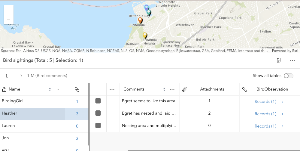 |
This is done by setting the relatedRecordsEnabled property to true. When this property is set, the table will contain a field that links to any related records associated with each feature in the table. When clicked, a separate table displays the related records for that feature. The FeatureTable provides the ability to show nested related records, which are related records that contain their own related records. It automatically recognizes if there are any related tables associated a table and, if applicable, displays links to related records for that feature or row. The following example demonstrates how to configure the FeatureTable to display related records:
const featureTable = new FeatureTable({
  view: view,
  layer: featureLayer,
  relatedRecordsEnabled: true,
  container: "tableDiv"
});
The main difference with how related records work in comparison to the Editor widget is that the FeatureTable does not have to have a template configured with relationship information for it to be recognized and automatically picked up within the table. In order for related data to display within the table, the relatedRecordsEnabled property must be set to true, the origin table must have an associated relationship class, and its related data must also be contained within the map. If these conditions are met, any related records associated with the table's features will automatically display with embedded links to its related data. The FeatureTable also provides the ability to show nested related records, which are related records that contain their own related records. This is useful for displaying complex relationships within the table.
There are a couple of known limits when working with relationships in the FeatureTable:
- Displaying and editing related records is only supported using ArcGIS Online and ArcGIS Enterprise version 11.2 or higher feature services.
- Editing related records is only supported if the related table is editable.
- The related layers or tables must also be added to the map to be able to display related records within the table.
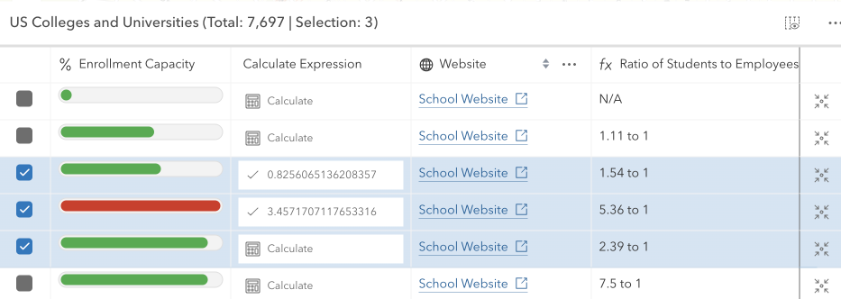
Configuring columns
The FeatureTable provides various column types that can be configured to display within the table.
These column types include:
column(Column) - This is the column type that supports the underlying functionality for the various column types listed below. Use this column type to create custom columns that display within the table and are not directly tied to data within a layer.field(FieldColumn) - This is the column type that displays the field name and value within the table. This column type is the type used to display the field name and value for features within the table.action(ActionColumn) - This is the column type that displays action buttons within the table.relationship(RelationshipColumn) - This is the column type that displays related records within the table.attachment(AttachmentsColumn) - This is the column type that displays attachments within the table. Take note that viewing attachments directly within the table's cell is not supported, although if a feature contains attachments, the total count per feature will display.group(GroupColumn) - This is the column type that groups columns within the table.
These column classes contain information about the current table state. And although it is possible to interact directly with these columns, ie. updating properties, calling methods, etc., the recommended approach is to set the tableTemplate with configured column templates prior to table creation. The reason for this is because templates are designed to help configure columns prior to table creation and therefore wil not update based on the table's underlying state changes.
At version 4.30, the FeatureTable's API has been improved to not regenerate columns unless in only very necessary cases, e.g. setting an entirely new tableTemplate and forcing the table to refresh. Although this approach is supported, it may not be necessary as it is possible to directly interact with the underlying columns and not cause unnecessary re-renders.
The column configuration of the FeatureTable is designed to be flexible, providing a rich user experience. While it is generally recommended to update the corresponding template when changes are made to a column's property, it is not mandatory if there is no need to regenerate columns forcefully.
There are some properties pertaining to width and alignment that may not function as expected if modified dynamically.
- The ColumnTemplate class can be used to create and configure custom columns that display within the table.
- The FieldColumnTemplate class is tied to a layer and is used to configure and display field names and values within the table.
- Lastly, the GroupColumnTemplate class is used to configure grouped columns within the table. Each template contains the field name, label, and other properties that define the column's behavior. The following example demonstrates how to configure the field columns within the FeatureTable's table template:
const featureTable = new FeatureTable({
 view: view,
 layer: featureLayer,
 tableTemplate: ({  // autocastable to table template
   columns: [{
     type: "field", // autocastable to field column template
     fieldName: "field1",
     label: "Field 1"
   },
   {
     type: "field,"
     fieldName: "field2",
     label: "Field 2"
   }]
 }),
 container: "tableDiv"
});
The template classes are designed primarily to configure columns prior to table creation. Once the table is created, the templates will not update based on state changes. The underlying column classes have information about the current table state.
Custom columns
Beginning with version 4.30, support for custom columns, ie. virtual columns, was added. Custom columns can be configured and displayed by leveraging the ColumnTemplate class. The following example demonstrates how to create a custom column that displays a rating of stars within the table based on a feature's rating. It does so using a calcite component that displays the rating as stars. In addition, it makes use of the column template's formatFunction property. This function is useful as it allows for dynamic content to be displayed within the table's cell and provides a way to add a rich user experience to the table.
const columnConfig = new ColumnTemplate({
  fieldName: "rating_stars",
  icon: "inspection",
  label: "Average Rating",
  formatFunction: ({ feature, index }) => {
    // Reuse existing components for optimal performance
    let component = ratingComponentMap.get(index);
    if (component) {
      return component;
    }
    component = document.createElement("calcite-rating");
    component.readOnly = true;
    component.value = Math.round(Math.random() * 5);
    ratingComponentMap.set(index, component);
    return component;
  }
});
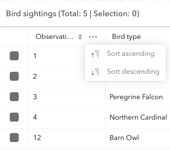
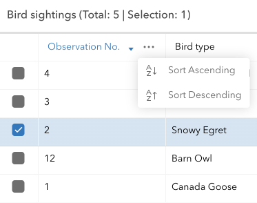
Menu and menu items
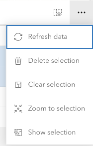
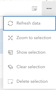
The FeatureTable provides functionality in the form of menu items within the FeatureTable's menu. These items perform various actions such as clearing the selection, deleting selected records, showing selected records, refreshing the data, and zooming to selected records.
The default menu items can be configured to be hidden, disabled, or selected by default. The menu items can also be configured to include customized functionality. This is handled via the table's menuConfig property. This property takes an object where custom menu items are set within the table's menu. This object contains an array of menu items that define the label, icon, and click function for each item and whether these items should display by default.
If you want to clear the selection, you can use the clearSelection menu item provided by the API. If you want to delete selected records, you can use the deleteSelection menu item provided by the API. The following example demonstrates how to configure the menu items with similar functionality but with different icons. The default menu items are not hidden and the custom menu items are appended to the menu items. If you wish to hide the default menu items, you can set their visible element to false.
| Default column menu items | Configured column menu items |
|---|---|
 |
 ) ) |
featureTable.menuConfig = {
  items: [
    {
      label: "Clear selection",
      icon: "erase",
      clickFunction: () => {
        featureTable.highlightIds.removeAll();
      }
    },
  {
    label: "Delete selection",
    icon: "group-x",
    clickFunction: () => {
      featureTable.viewModel.deleteSelectedRecords();
    }
  }]
};
In addition to configuring the table's menu items, it is also possible to configure an individual column's menu items. This is handled via the ColumnTemplate.menuConfig property. This is similar to what can be configured for the table's menuConfig, but also includes the ability to customize the column's menu icon, and the selection mode of the menu.
The following is an example of how to configure individual menu items within the FeatureTable's column menu. Similar to how the default table menu items are configured, any custom menu items are appended to the menu items. If you wish to hide the default menu items, you can set their visible element to false.
| Default table menu items | Configured table menu items |
|---|---|
 |
 ) ) |
const columnTemplate = new FieldColumnTemplate({
  menuConfig: {
    items: [{
      label: "Sort Ascending",
      icon: "a-z-down",
      clickFunction: () => {
        featureTable.sortColumn(columnTemplate.fieldName, "asc");
      }
    },
    {
      label: "Sort Descending",
      icon: "a-z-up",
      clickFunction: () => {
        featureTable.sortColumn(columnTemplate.fieldName, "desc");
      }
    }]
   }
});
- See also
Constructors
-
Parameterproperties Objectoptional
See the properties for a list of all the properties that may be passed into the constructor.
Example// Typical usage for the FeatureTable widget. This will recognize all fields in the layer if none are set. const featureTable = new FeatureTable({ view: view, // The view property must be set for the select/highlight to work layer: featureLayer, container: "tableDiv" // the table must be assigned to the container via the constructor });
Property Overview
| Name | Type | Summary | Class |
|---|---|---|---|
Configuration for the ActionColumn. | FeatureTable | ||
A read-only property indicating the type of filter used by the table. | FeatureTable | ||
Use this read-only property if needing to query features while retaining a column's sort order. | FeatureTable | ||
Indicates the table is displaying all related tables in | FeatureTable | ||
Indicates whether to display the | FeatureTable | ||
Use this property to configure how columns display within the table in regard to visibility, column order, and sorting. | FeatureTable | ||
Indicates whether the table should automatically refresh when the underlying data changes. | FeatureTable | ||
Indicates whether the table should allow reordering of columns. | FeatureTable | ||
A read-only collection of column, field, group, action, attachment, and relationship columns that are displayed within the table. | FeatureTable | ||
The ID or node representing the DOM element containing the widget. | FeatureTable | ||
The name of the class. | Accessor | ||
Text displayed in the table header, under the title. | FeatureTable | ||
Indicates whether the table is disabled. | FeatureTable | ||
Indicates whether editing is enabled on the data within the feature table. | FeatureTable | ||
The total number of records displayed in the table's current view. | FeatureTable | ||
Indicates whether the table only displays rows that are considered selected. | FeatureTable | ||
Set this property to filter the features displayed in the table. | FeatureTable | ||
A collection of string values which indicate field.names that should be hidden within the table. | FeatureTable | ||
Indicates whether to highlight the associated feature when a row is selected by checking the corresponding checkbox. | FeatureTable | ||
This property accepts and returns a collection of feature object IDs. | FeatureTable | ||
The string value which indicates the displayed icon. | FeatureTable | ||
The unique ID assigned to the widget when the widget is created. | Widget | ||
The user-provided number of total features accessed from the data source. | FeatureTable | ||
Indicates if the table is querying or syncing data. | FeatureTable | ||
Indicates if the table is syncing attachment edits. | FeatureTable | ||
The widget's default label. | FeatureTable | ||
The associated CatalogFootprintLayer, CSVLayer, FeatureLayer, GeoJSONLayer, ImageryLayer, KnowledgeGraphSublayer, SceneLayer, or WFSLayer containing the fields and attributes to display within the widget. | FeatureTable | ||
The layer view associated with the table's layer. | FeatureTable | ||
An array of layers listed within the dropdown component of the table's header. | FeatureTable | ||
This property is applicable when working with layers that contain a large number of features, as it provides the ability to limit the displayed total feature count. | FeatureTable | ||
Set this object to customize the feature table's menu content. | FeatureTable | ||
Indicates whether sorting multiple columns is supported within the table. | FeatureTable | ||
Controls whether the table allows multiple selected rows. | FeatureTable | ||
This property accepts and returns a collection of feature object IDs. | FeatureTable | ||
An array of field names from the table's data source to include when the table requests data. | FeatureTable | ||
Number of pages of features to be displayed in the table, based on the total number of features and configured pageSize. | FeatureTable | ||
Represents the index of the page of the feature currently being displayed. | FeatureTable | ||
The default page size used when displaying features within the table. | FeatureTable | ||
Controls whether the table should only display a single page of features at any time. | FeatureTable | ||
Indicates whether to display any related records associated with rows within the table. | FeatureTable | ||
A nested table instance which represents a relationship to another table. | FeatureTable | ||
A collection of nested table instances. | FeatureTable | ||
Indicates whether to fetch geometries for the corresponding features displayed in the table. | FeatureTable | ||
Indicates whether geometries fetched for the corresponding features contain M values, if supported. | FeatureTable | ||
Indicates whether the fetched features' geometries contain Z values. | FeatureTable | ||
This property accepts and returns a collection of feature object IDs. | FeatureTable | ||
Total number of records currently displayed in the table. | FeatureTable | ||
The state of the widget. | FeatureTable | ||
A reference to top-level controller table. | FeatureTable | ||
A reference to the instance of a table widget that is directly associated with this table. | FeatureTable | ||
The associated template used for the feature table. | FeatureTable | ||
The TimeExtent in which to filter and display data within the FeatureTable widget. | FeatureTable | ||
Dates and times displayed in the widget will be in terms of this time zone. | FeatureTable | ||
Replacement title for the table widget. | FeatureTable | ||
| FeatureTable | |||
The view model for this widget. | FeatureTable | ||
Indicates whether the widget is visible. | Widget | ||
The visible elements that are displayed within the widget. | FeatureTable |
Property Details
-
actionColumnConfig
PropertyactionColumnConfig ActionColumnConfig |null |undefinedSince: ArcGIS Maps SDK for JavaScript 4.30FeatureTable since 4.15, actionColumnConfig added at 4.30. -
Configuration for the ActionColumn. This property allows for customizing the action column's appearance and behavior. The action column is a column that contains interactive buttons for each row. These buttons can be used to perform actions such as editing, deleting, or viewing additional information about a feature. This column is displayed as the last column in the table and is only displayed if this property is set.
 Example
// The following snippet demonstrates how to configure an action column that adds a button
// to each row which allows an end-user to zoom to the associated row's feature within the view.
featureTable.actionColumnConfig = {
  label: "Go to feature",
   icon: "zoom-to-object",
   callback: (params) => {
    view.goTo(params.feature);
 }
}
-
activeFilters
PropertyactiveFilters Collection<(GeometryFilter|SelectionFilter)>readonly -
A read-only property indicating the type of filter used by the table. It returns either filters by geometry or selections using a row's object ID.
- See also
-
activeSortOrders
PropertyactiveSortOrders ColumnSortOrder[]readonlySince: ArcGIS Maps SDK for JavaScript 4.25FeatureTable since 4.15, activeSortOrders added at 4.25. -
Use this read-only property if needing to query features while retaining a column's sort order. It returns an array of ColumnSortOrder which contains a column's name and its sort direction. The sort priority is honored in the returned ColumnSortOrder if multiSortEnabled is
truewith a set initialSortPriority.- Default Value:[]
-
allRelatedTablesVisible
PropertyallRelatedTablesVisible BooleanreadonlySince: ArcGIS Maps SDK for JavaScript 4.31FeatureTable since 4.15, allRelatedTablesVisible added at 4.31. -
Indicates the table is displaying all related tables in
show allmode.
-
attachmentsEnabled
PropertyattachmentsEnabled Boolean -
Indicates whether to display the
Attachmentsfield in the table. It displays the count of attachments per feature and is only applicable if the feature layer supports attachments.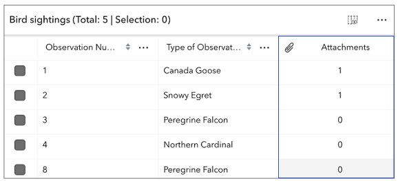
- Default Value:false
- See also
-
attributeTableTemplate
PropertyattributeTableTemplate AttributeTableTemplate |null |undefinedautocastSince: ArcGIS Maps SDK for JavaScript 4.31FeatureTable since 4.15, attributeTableTemplate added at 4.31. -
Use this property to configure how columns display within the table in regard to visibility, column order, and sorting.
This property differs from the tableTemplate property. The
tableTemplateproperty provides more fine-grained control over how the table is rendered within the application by offering more advanced configurations such as custom cell rendering, column formatting, and more. It is useful for application-level development that remains within an application. Use the attributeTableTemplate property to access the table's settings across different applications. By using this property, the settings can be saved within a webmap or layer. Please refer to the AttributeTableTemplate and TableTemplate documentation for more information.- See also
-
autoRefreshEnabled
PropertyautoRefreshEnabled BooleanSince: ArcGIS Maps SDK for JavaScript 4.23FeatureTable since 4.15, autoRefreshEnabled added at 4.23. -
Indicates whether the table should automatically refresh when the underlying data changes. This property is useful when the table is displaying data from a feature layer that is being updated by other clients.
- Default Value:true
-
columnReorderingEnabled
PropertycolumnReorderingEnabled BooleanSince: ArcGIS Maps SDK for JavaScript 4.16FeatureTable since 4.15, columnReorderingEnabled added at 4.16. -
Indicates whether the table should allow reordering of columns.
- Default Value:true
-
columns
Propertycolumns Collection<(Column|FieldColumn|GroupColumn|ActionColumn|AttachmentsColumn|RelationshipColumn)>readonly -
A read-only collection of column, field, group, action, attachment, and relationship columns that are displayed within the table.
By default fields such as
CreationDate,Creator,EditDate,Editor, andGlobalIDdo not show. If these fields are needed, set them via TableTemplate.columnTemplates. In this scenario, it is also necessary to set the column template'svisibleproperty totrue.
-
container
Propertycontainer HTMLElement |null |undefinedautocastAutocasts from String -
The ID or node representing the DOM element containing the widget. Take note that this property can only be set once. The snippets below provide some examples for setting this.
The FeatureTable widget's container property must be set within its constructor and not via the
view.ui.add()method.Examples// Create the HTML div element programmatically at runtime and set to the widget's container const featureTable = new FeatureTable({ view: view, container: document.createElement("tableDiv") });// Specify an already-defined HTML div element in the widget's container const featureTable = new FeatureTable({ view: view, container: featureTableDiv }); // HTML markup <body> <div id="viewDiv"></div> <div class="container"> <div id="tableDiv"></div> </div> </body>
-
Since: ArcGIS Maps SDK for JavaScript 4.30FeatureTable since 4.15, description added at 4.30. -
Text displayed in the table header, under the title. This can be a basic string or custom function that returns a string. This is useful in situations where additional context is needed for the table.
-
disabled
Propertydisabled BooleanSince: ArcGIS Maps SDK for JavaScript 4.30FeatureTable since 4.15, disabled added at 4.30. -
Indicates whether the table is disabled. When disabled, the table will not display any data or allow interaction. This is purely a visual override and does not prevent the table from attempting to render data. This property has no effect on the current state property value.
- Default Value:false
-
editingEnabled
PropertyeditingEnabled BooleanSince: ArcGIS Maps SDK for JavaScript 4.16FeatureTable since 4.15, editingEnabled added at 4.16. -
Indicates whether editing is enabled on the data within the feature table. Double-clicking in a cell will enable editing for that value. In order to edit a feature, the layer must be editable and the user must have the appropriate permissions. In addition, the layer must contain an object ID field.
- Default Value:false
- See also
-
effectiveSize
PropertyeffectiveSize NumberreadonlySince: ArcGIS Maps SDK for JavaScript 4.31FeatureTable since 4.15, effectiveSize added at 4.31. -
The total number of records displayed in the table's current view. Normally, this is equivalent to size for default configurations. If paginationEnabled is true,
effectiveSizereflects the total number of visible rows for the current page. This value is usually equivalent to pageSize unless viewing the last page of data. The last page may display less features than the maximum number for a single page. This property also takes into account all active filters and the current value of maxSize.
-
filterBySelectionEnabled
PropertyfilterBySelectionEnabled BooleanSince: ArcGIS Maps SDK for JavaScript 4.30FeatureTable since 4.15, filterBySelectionEnabled added at 4.30. -
Indicates whether the table only displays rows that are considered selected. Row selection can be modified by adding or removing associated object IDs from
highlightIds. This will cause the store to fetch fresh features to ensure the expected sort order is honored.- Default Value:false
- See also
-
filterGeometry
PropertyfilterGeometry GeometryUnion |null |undefinedautocastSince: ArcGIS Maps SDK for JavaScript 4.19FeatureTable since 4.15, filterGeometry added at 4.19. -
Set this property to filter the features displayed in the table. It accepts a Geometry, e.g. Extent, and uses it as a spatial filter. When modifying this property, the
FeatureTablewill completely refresh and re-query for all features.- Default Value:null
- See also
Example// Listen for when the view is stationary. // If true, check the view's extent and set // the table to display only the attributes // for the features falling within this extent. reactiveUtils.when( () => view.stationary === true, () => { // Get the new extent of view/map whenever map is updated. if (view.extent) { // Filter out and show only the visible features in the feature table. featureTable.filterGeometry = view.extent; } }, { initial: true });
-
hiddenFields
PropertyhiddenFields Collection<string>autocastArcGIS Maps SDK for JavaScript 4.16FeatureTable since 4.15, hiddenFields added at 4.16. -
A collection of string values which indicate field.names that should be hidden within the table. By default fields such as
CreationDate,Creator,EditDate,Editor, andGlobalIDdo not show. If these fields are needed, set them via TableTemplate.columnTemplates. In this case, it is required to set column template's visible property totrue.- See also
Examplesconst featureTable = new FeatureTable({ layer: featureLayer, view: view, hiddenFields: ["Primary_Type", "incident_date"], // will not show these two fields within the table container: document.getElementById("tableDiv") });// Set this syntax if needing to display a default hidden field, e.g. 'CreationDate` const featureTable = new FeatureTable({ layer: featureLayer, view: view, tableTemplate: { // autocastable to TableTemplate columnTemplates: [ // takes an array of FieldColumnTemplate and GroupColumnTemplate { //autocastable to FieldColumnTemplate type: "field", fieldName: "date_created", label: "Date created", visible: true }] } container: document.getElementById("tableDiv") });
-
highlightEnabled
PropertyhighlightEnabled BooleanSince: ArcGIS Maps SDK for JavaScript 4.25FeatureTable since 4.15, highlightEnabled added at 4.25. -
Indicates whether to highlight the associated feature when a row is selected by checking the corresponding checkbox. This property is only applicable when working with a map and the view property is set.
- Default Value:true
- See also
-
highlightIds
PropertyhighlightIds Collection<(number|string)>autocastSince: ArcGIS Maps SDK for JavaScript 4.25FeatureTable since 4.15, highlightIds added at 4.25. -
This property accepts and returns a collection of feature object IDs. Use this to access and control which features are currently selected in the table and subsequently highlighted within the map. Once an application sets a collection of object IDs, the table will select the corresponding row and highlight its feature within the map.
Example// This example instantiates the table with highlighted features const featureTable = new FeatureTable({ view: view, layer: featureLayer, container: "tableDiv", highlightIds }); // Push the object IDs into a collection and select featureTable.highlightIds.push(2, 3, 4); // Listen for changes in the collection of highlighted features featureTable.highlightIds.on("change", (event) => { console.log("features selected", event.added); console.log("features deselected", event.removed); });
-
Since: ArcGIS Maps SDK for JavaScript 4.31FeatureTable since 4.15, initialSize added at 4.31. -
The user-provided number of total features accessed from the data source. This is used for initial load of the data store as opposed to querying a specified layer. Additionally, the table will query data counts to verify the data's integrity, or when requested via refresh.
-
isQueryingOrSyncing
PropertyisQueryingOrSyncing BooleanreadonlySince: ArcGIS Maps SDK for JavaScript 4.31FeatureTable since 4.15, isQueryingOrSyncing added at 4.31. -
Indicates if the table is querying or syncing data. This is useful when determining if the table is busy. This can be especially helpful when the table is querying a large amount of features.
-
isSyncingAttachments
PropertyisSyncingAttachments BooleanreadonlySince: ArcGIS Maps SDK for JavaScript 4.31FeatureTable since 4.15, isSyncingAttachments added at 4.31. -
Indicates if the table is syncing attachment edits.
-
label
Propertylabel String -
The widget's default label.
-
layer
Propertylayer CatalogFootprintLayer |CSVLayer |FeatureLayer |GeoJSONLayer |ImageryLayer |KnowledgeGraphSublayer |SceneLayer |WFSLayer |OrientedImageryLayer |Sublayer |null |undefined -
The associated CatalogFootprintLayer, CSVLayer, FeatureLayer, GeoJSONLayer, ImageryLayer, KnowledgeGraphSublayer, SceneLayer, or WFSLayer containing the fields and attributes to display within the widget.
- The table's pagination defaults to
50records at a time. If the layer contains less than 50 records, it will use whatever count it has. Note that 0 records do not apply. - Support for CatalogFootprintLayer was added at version 4.30.
- Support for GeoJSONLayer, CSVLayer, ImageryLayer, and WFSLayer was added at version 4.21.
- For an ImageryLayer to work with FeatureTable, it must have a mosaic dataset.
- See also
- The table's pagination defaults to
-
Since: ArcGIS Maps SDK for JavaScript 4.30FeatureTable since 4.15, layerView added at 4.30. -
The layer view associated with the table's layer.
-
layers
Propertylayers Array<(CatalogFootprintLayer|CSVLayer|FeatureLayer|GeoJSONLayer|ImageryLayer|KnowledgeGraphSublayer|SceneLayer|WFSLayer)> |null |undefinedSince: ArcGIS Maps SDK for JavaScript 4.30FeatureTable since 4.15, layers added at 4.30. -
An array of layers listed within the dropdown component of the table's header. This component allows changing which table layer it should display. Typically, the dropdown component will display all supported layers within the view unless a specific set of layers is set. The table supports CatalogFootprintLayer, CSVLayer, FeatureLayer, GeoJSONLayer, ImageryLayer, KnowledgeGraphSublayer, SceneLayer, and WFSLayer layers.
-
Since: ArcGIS Maps SDK for JavaScript 4.31FeatureTable since 4.15, maxSize added at 4.31. -
This property is applicable when working with layers that contain a large number of features, as it provides the ability to limit the displayed total feature count. If paginationEnabled is
true, andmaxSizeis greater than the current value of pageSize, multiple pages usually display. IfmaxSizeis less than pageSize, a single page shows the total number of features limited tomaxSize.
-
menuConfig
PropertymenuConfig TableMenuConfig |null |undefinedSince: ArcGIS Maps SDK for JavaScript 4.16FeatureTable since 4.15, menuConfig added at 4.16. -
Set this object to customize the feature table's menu content.
Prior to version 4.30,
menuConfigwas of typeButtonMenuConfig. With the necessary changes needed to move to a more flexible menu system,ButtonMenuConfighas been deprecated in favor of TableMenuConfig, Calcite components - Dropdown, Calcite components - List, or Calcite components - Menu web components instead. In addition to this, there is no longer a direct reference tomenufrom the FeatureTable. Although themenuproperty has been removed beginning with 4.30, its corresponding ButtonMenu class has not. Take note that it has been deprecated starting at 4.30. All feature table configurations should be handled directly on TableMenuConfig.
-
multiSortEnabled
PropertymultiSortEnabled BooleanSince: ArcGIS Maps SDK for JavaScript 4.23FeatureTable since 4.15, multiSortEnabled added at 4.23. -
Indicates whether sorting multiple columns is supported within the table. Use this in combination with the FieldColumnTemplate.initialSortPriority and FieldColumnTemplate.direction properties to set sorting functionality for multiple columns.
Exampleconst featureTableVM = new FeatureTable({ layer: featureLayer, multiSortEnabled: true, tableTemplate: { // autocastable to TableTemplate columnTemplates: [ // takes an array of FieldColumnTemplate and GroupColumnTemplate { // autocastable to FieldColumnTemplate type: "field", fieldName: "ObjectId", direction: "asc", // In order to use initialSortPriority, make sure direction is set initialSortPriority: 1, // This field's sort order takes second-highest priority. }, { type: "field", fieldName: "Name", direction: "asc", // In order to use initialSortPriority, make sure direction is set initialSortPriority: 0, // This field's sort order takes the highest priority. }, { type: "field", fieldName: "Status", direction: "asc", // In order to use initialSortPriority, make sure direction is set initialSortPriority: 2 // This field's sort order is prioritized after Name and ObjectId, respectively. }] }, container: "tableDiv" });
-
multipleSelectionEnabled
PropertymultipleSelectionEnabled Boolean -
Controls whether the table allows multiple selected rows.
- Default Value:true
-
objectIds
PropertyobjectIds Collection<(number|string)>autocastSince: ArcGIS Maps SDK for JavaScript 4.30FeatureTable since 4.15, objectIds added at 4.30. -
This property accepts and returns a collection of feature object IDs. Use this to access and control which features are currently visible in the table. When the collection is empty, all potential rows are displayed. Modifying object IDs is not supported while filterBySelectionEnabled is
trueas these properties are mutually exclusive. This filter can also be combined with filterGeometry to display features that satisfy both conditions.
-
Since: ArcGIS Maps SDK for JavaScript 4.31FeatureTable since 4.15, outFields added at 4.31. -
An array of field names from the table's data source to include when the table requests data. By default, all fields are requested. This property is useful when working with many fields and only a subset of them is needed for the table. Take note that doing so can improve the table's load time.
-
pageCount
PropertypageCount NumberreadonlySince: ArcGIS Maps SDK for JavaScript 4.31FeatureTable since 4.15, pageCount added at 4.31. -
Number of pages of features to be displayed in the table, based on the total number of features and configured pageSize.
-
pageIndex
PropertypageIndex NumberSince: ArcGIS Maps SDK for JavaScript 4.31FeatureTable since 4.15, pageIndex added at 4.31. -
Represents the index of the page of the feature currently being displayed. The number of features per page can be adjusted by modifying the pageSize. Pagination must be enabled or the value of this property may not be not reliable due to virtualization of visible pages.
-
pageSize
PropertypageSize NumberSince: ArcGIS Maps SDK for JavaScript 4.19FeatureTable since 4.15, pageSize added at 4.19. -
The default page size used when displaying features within the table. By default, the page loads the first 50 features returned by the service. It can be used with paginationEnabled to display a subset of features.
It is not possible to overwrite the maximum page size on the server, ie.
maxRecordCount, as this property only applies to set values less than the maximum page size, i.e.maxRecordCount, set on the service.- Default Value:50
- See also
-
paginationEnabled
PropertypaginationEnabled BooleanSince: ArcGIS Maps SDK for JavaScript 4.31FeatureTable since 4.15, paginationEnabled added at 4.31. -
Controls whether the table should only display a single page of features at any time. Current page can be determined via the pageIndex property. The current page can be modified by calling the goToPage method and passing in the desired page index.
- Default Value:false
-
relatedRecordsEnabled
PropertyrelatedRecordsEnabled BooleanSince: ArcGIS Maps SDK for JavaScript 4.30FeatureTable since 4.15, relatedRecordsEnabled added at 4.30. -
Indicates whether to display any related records associated with rows within the table.
- Default Value:false
- See also
-
relatedTable
PropertyrelatedTable FeatureTable |null |undefinedSince: ArcGIS Maps SDK for JavaScript 4.31FeatureTable since 4.15, relatedTable added at 4.31. -
A nested table instance which represents a relationship to another table. This is a reference to the most recently generated table when multiple related tables exist. It is only applicable if the table instance manages all nested tables.
-
relatedTables
PropertyrelatedTables Collection<FeatureTable>Since: ArcGIS Maps SDK for JavaScript 4.31FeatureTable since 4.15, relatedTables added at 4.31. -
A collection of nested table instances. This is typically used to represent relationships between each other. These are configured and managed by a single table widget instance. Only applies if this particular table instance is responsible for managing all nested tables. Nested tables reference the main table controller via the tableController property.
-
returnGeometryEnabled
PropertyreturnGeometryEnabled BooleanSince: ArcGIS Maps SDK for JavaScript 4.27FeatureTable since 4.15, returnGeometryEnabled added at 4.27. -
Indicates whether to fetch geometries for the corresponding features displayed in the table.
Setting this to
truecan potentially impact the widget's performance.- Default Value:false
-
returnMEnabled
PropertyreturnMEnabled BooleanSince: ArcGIS Maps SDK for JavaScript 4.30FeatureTable since 4.15, returnMEnabled added at 4.30. -
Indicates whether geometries fetched for the corresponding features contain M values, if supported. The returnGeometryEnabled property must also be true.
Setting this to
truecan potentially impact the widget's performance.- Default Value:false
-
returnZEnabled
PropertyreturnZEnabled BooleanSince: ArcGIS Maps SDK for JavaScript 4.30FeatureTable since 4.15, returnZEnabled added at 4.30. -
Indicates whether the fetched features' geometries contain Z values. This is only applicable if Z-values are supported. The returnGeometryEnabled property must also be true.
Setting this to
truecan potentially impact the widget's performance.- Default Value:false
-
rowHighlightIds
PropertyrowHighlightIds Collection<(number|string)>autocastSince: ArcGIS Maps SDK for JavaScript 4.30FeatureTable since 4.15, rowHighlightIds added at 4.30. -
This property accepts and returns a collection of feature object IDs. It is used to access and control which rows display a darker background, i.e., highlighted. Take note that highlighted rows are not considered selected as this property is independent of the table's selection state. Use the highlightIds property to choose rows. Setting
rowHighlightIdsapplies an alternative highlight style to an entire row or rows.Use this property to highlight rows based on an event or action from another component (e.g. the view). For example, purposefully highlighting rows when hovering over a feature on the map or applying a "filter" via another widget to call out specific rows in the table. Generally, this property is not modified based on table events but rather an event or action from a different component. Example// This snippet adds an event listener which highlights (not selects) a row in the table // when a mouse pointer hovers over its corresponding row. featureTable.on("cell-pointerover", (event) => { // Add the event's feature to the rowHighlightIds collection if it's not already included if (!featureTable.rowHighlightIds.includes(event.objectId)) { featureTable.rowHighlightIds.push(event.objectId); } }); // This snippet adds an event listener which removes the highlight from a row in the table // when a mouse pointer moves out of its corresponding row. featureTable.on("cell-pointerout", (event) => { // Remove the event's feature from the rowHighlightIds collection if it's included const index = featureTable.rowHighlightIds.indexOf(event.objectId); if (index > -1) { featureTable.rowHighlightIds.splice(index, 1); } });
-
size
Propertysize NumberreadonlySince: ArcGIS Maps SDK for JavaScript 4.30FeatureTable since 4.15, size added at 4.30. -
Total number of records currently displayed in the table. This property takes into account all active filters and the current value of maxSize if it is configured.
- Default Value:0
-
state
Propertystate Stringreadonly -
The state of the widget.
Value Description disabled Dependencies are missing and therefore the widget is disabled. error Widget failed to load (added at version 4.30). loaded Widget is ready to use. loading Widget is busy loading its resources. ready Dependencies are met and has valid property values but hasn't started the load process. Possible Values:"disabled" |"loading" |"loaded" |"ready" |"error"
- Default Value:"disabled"
-
tableController
PropertytableController FeatureTable |null |undefinedSince: ArcGIS Maps SDK for JavaScript 4.31FeatureTable since 4.15, tableController added at 4.31. -
A reference to top-level controller table. This property is applicable if this table is a related table, nested within and controlled by another table widget.
-
tableParent
PropertytableParent FeatureTable |null |undefinedSince: ArcGIS Maps SDK for JavaScript 4.31FeatureTable since 4.15, tableParent added at 4.31. -
A reference to the instance of a table widget that is directly associated with this table. This only applies if this table is nested within another table widget. The parent table is responsible for creating this child table instance. The child table reacts to state changes on the parent table, including row selection.
The parent table that this property references may also be nested, meaning it would refer to a different parent table. The top-level table can always be referenced via the tableController property. If only one nested table exists, then the values of tableController and
tableParentare the same.
-
tableTemplate
PropertytableTemplate TableTemplate |null |undefinedautocast -
The associated template used for the feature table.
The tableTemplate is where you configure how the feature table should display and set any associated properties for the table and its columns.
The
TableTemplateprovides more fine-grained control over how the table is rendered within the application by offering more advanced configurations such as custom cell rendering, column formatting, and more.TableTemplateis useful for application-level development that remains within an application. This property differs from the attributeTableTemplate property as that property should be used to access the table's settings across different applications. By using attributeTableTemplate, the settings can be saved within a webmap or layer. Please refer to the AttributeTableTemplate and TableTemplate documentation for more information.Take note that it is required to set the
typeproperty when creating column templates.Exampleconst tableTemplate = new TableTemplate({ columnTemplates: [ // takes an array of FieldColumnTemplate and GroupColumnTemplate { // autocasts to FieldColumnTemplate type: "field", // This must be set when creating field column templates fieldName: "ObjectId", direction: "asc", // In order to use initialSortPriority, make sure direction is set initialSortPriority: 1 // This field's sort order takes the second-highest priority. }, { type: "field", fieldName: "NAME", label: "Name", direction: "asc", // In order to use initialSortPriority, make sure direction is set initialSortPriority: 0 // This field's sort order takes the highest priority }, { type: "field", fieldName: "STATUS", label: "Status", direction: "asc", // In order to use initialSortPriority, make sure direction is set initialSortPriority: 2 // This field's sort order is prioritized after Name and ObjectId, respectively. }] });
-
timeExtent
PropertytimeExtent TimeExtent |null |undefinedautocastSince: ArcGIS Maps SDK for JavaScript 4.30FeatureTable since 4.15, timeExtent added at 4.30. -
The TimeExtent in which to filter and display data within the FeatureTable widget. Setting this property directly on the widget or its viewModel takes precedence over the layer's timeExtent. If this property is set directly on the widget, the table will not refresh when the layer's timeExtent changes.
- See also
Example// Filters the table to display only features that fit within the time extent reactiveUtils.watch( () => timeSlider.timeExtent, (extent) => { featureTable.timeExtent = extent; } );
-
Since: ArcGIS Maps SDK for JavaScript 4.28FeatureTable since 4.15, timeZone added at 4.28. -
Dates and times displayed in the widget will be in terms of this time zone. If not supplied, the view's time zone is used (if available). Depending on the field type, individual columns may have their own unique time zone behavior when the time zone itself is
unknown.The following considerations apply when working with date, time, and big integer field types:
- By default, the FeatureTable displays timezones for
dateandtimestamp-offsetfield types reflecting the MapView's timezone. This timezone can be overridden by setting the table's timezone property. - If the table's view isn't set, and the table's esri/widgets/Feature#timeZone timeZone isn't set, the table defaults to
systemtime. The only time that this is not the case is when there is a preferredTimeZone set on the table's layer. If the latter is true, the preferred time zone is used as opposed tosystem.
- By default, the FeatureTable displays timezones for
-
Since: ArcGIS Maps SDK for JavaScript 4.30FeatureTable since 4.15, title added at 4.30. -
Replacement title for the table widget. This can be a basic string or custom function that returns a string. This is useful in situations where it may be necessary to dynamically update titles based on the current state of the table.
Example// Create the FeatureTable widget const featureTable = new FeatureTable({ // Set the title to a custom function that returns a string title : () => { if (!featureTable) { return; } const state = featureTable.state; switch (state) { case "loading": return "Loading layer data..."; case "loaded": const title = featureTable.layer?.title; const rowCount = featureTable.size; const selectedCount = featureTable.highlightIds?.length ?? 0; return `${title} (${selectedCount} rows selected out of ${rowCount} total)`; case "error": return "Error loading layer."; default: return; } } })
-
viewModel
PropertyviewModel FeatureTableViewModelautocast -
The view model for this widget. This is a class that contains all the logic, (ie. properties and methods), that controls the widget's behavior. See the FeatureTableViewModel class to access all properties and methods on the widget.
-
visible
InheritedPropertyvisible BooleanInherited from Widget -
Indicates whether the widget is visible.
If
false, the widget will no longer be rendered in the web document. This may affect the layout of other elements or widgets in the document. For example, if this widget is the first of three widgets associated to the upper right hand corner of the view UI, then the other widgets will reposition when this widget is made invisible. For more information, refer to the css display value of"none".- Default Value:true
Example// Hides the widget in the view widget.visible = false;
-
visibleElements
PropertyvisibleElements VisibleElementsautocast -
The visible elements that are displayed within the widget. This property provides the ability to turn individual elements of the widget's display on/off.
Method Overview
| Name | Return Type | Summary | Class |
|---|---|---|---|
Adds one or more handles which are to be tied to the lifecycle of the object. | Accessor | ||
A utility method used for building the value for a widget's | Widget | ||
Clears the current selection filter within the table. | FeatureTable | ||
Promise<void> | Deletes all the selected rows from the table. | FeatureTable | |
Destroys the widget instance. | Widget | ||
Emits an event on the instance. | Widget | ||
Promise<void> | Exports features associated with currently selected rows to a CSV file and displays a download prompt. | FeatureTable | |
Filters the table using the current row selection and displays only the selected table rows. | FeatureTable | ||
Finds the specified column within the feature table. | FeatureTable | ||
Instructs the table to scroll to or display a specific page of data. | FeatureTable | ||
Indicates whether there is an event listener on the instance that matches the provided event name. | Widget | ||
Returns true if a named group of handles exist. | Accessor | ||
Hides the specified column from the feature table. | FeatureTable | ||
| Widget | ||
| Widget | ||
| Widget | ||
Instructs the table to scroll to or display the next page of data. | FeatureTable | ||
Registers an event handler on the instance. | Widget | ||
Executes after widget is ready for rendering. | Widget | ||
Instructs the table to scroll to or display the previous page of data. | FeatureTable | ||
Promise<void> | Refreshes the table contents while maintaining the current scroll position. | FeatureTable | |
Re-renders the cell's content. | FeatureTable | ||
Removes a group of handles owned by the object. | Accessor | ||
This method is implemented by subclasses for rendering. | Widget | ||
Renders widget to the DOM immediately. | Widget | ||
Schedules widget rendering. | Widget | ||
Resets the horizontal scroll position of the table to the default view. | FeatureTable | ||
Scrolls the table to the bottom row. | FeatureTable | ||
Scrolls the table to a row based on a specified index. | FeatureTable | ||
Scrolls the table to a row based on a specified object ID. | FeatureTable | ||
Scrolls the table to the top row. | FeatureTable | ||
Shows all of the columns in the table. | FeatureTable | ||
Shows the specified column within the feature table. | FeatureTable | ||
Sorts the column in either ascending ("asc") or descending ("desc") order. | FeatureTable | ||
Toggles current visibility of the provided column. | FeatureTable | ||
Promise |
| Widget | |
Zooms the view to the extent of the current row selection. | FeatureTable |
Method Details
-
Inherited from Accessor
Since: ArcGIS Maps SDK for JavaScript 4.25Accessor since 4.0, addHandles added at 4.25. -
Adds one or more handles which are to be tied to the lifecycle of the object. The handles will be removed when the object is destroyed.
// Manually manage handles const handle = reactiveUtils.when( () => !view.updating, () => { wkidSelect.disabled = false; }, { once: true } ); this.addHandles(handle); // Destroy the object this.destroy();ParametershandleOrHandles WatchHandle|WatchHandle[]Handles marked for removal once the object is destroyed.
groupKey *optionalKey identifying the group to which the handles should be added. All the handles in the group can later be removed with Accessor.removeHandles(). If no key is provided the handles are added to a default group.
-
classes
InheritedMethodclasses(classNames){String}Inherited from Widget -
A utility method used for building the value for a widget's
classproperty. This aids in simplifying css class setup.ReturnsType Description String The computed class name. Example// .tsx syntax showing how to set css classes while rendering the widget render() { const dynamicClasses = { [css.flip]: this.flip, [css.primary]: this.primary }; return ( <div class={classes(css.root, css.mixin, dynamicClasses)} /> ); }
-
Since: ArcGIS Maps SDK for JavaScript 4.23FeatureTable since 4.15, clearSelectionFilter added at 4.23. Deprecated since version 4.30. UsefilterBySelectionEnabledorobjectIdsinstead. -
Clears the current selection filter within the table.
-
Since: ArcGIS Maps SDK for JavaScript 4.25FeatureTable since 4.15, deleteSelection added at 4.25. -
Deletes all the selected rows from the table.
There must be at least one selected row within the table for this to work. Also, make sure that editingEnabled is set to
trueand the underlying service data supports deletion.ParametershowWarningPrompt BooleanoptionalIndicates whether to display a prompt warning that the selected features will be deleted. Default behavior is to show a warning dialog before proceeding.
ReturnsType Description Promise<void> Resolves when the selection is deleted.
-
Inherited from Widget
-
Destroys the widget instance.
-
Since: ArcGIS Maps SDK for JavaScript 4.31FeatureTable since 4.15, exportSelectionToCSV added at 4.31. -
Exports features associated with currently selected rows to a CSV file and displays a download prompt. It automatically includes geometry for features with a
pointgeometry type if invoked from the table's menu. Geometry information is excluded on all other layer types.** Known limitations**
- This method must be used on selected rows within the table.
- Geometry information is only exported for for features with a
pointgeometry type. - Multi-part geometries are not supported.
ParameterincludeGeometry BooleanoptionalIndicates whether the geometry should be included in the exported file. Only applicable to features with
pointgeometries.ReturnsType Description Promise<void> Resolves when the export dialog is displayed.
-
Since: ArcGIS Maps SDK for JavaScript 4.16FeatureTable since 4.15, filterBySelection added at 4.16. Deprecated since version 4.30. UsefilterBySelectionEnabledorobjectIdsinstead. -
Filters the table using the current row selection and displays only the selected table rows.
-
findColumn
MethodfindColumn(fieldName){Column |GroupColumn |ActionColumn |AttachmentsColumn |RelationshipColumn |null |undefined}Since: ArcGIS Maps SDK for JavaScript 4.16FeatureTable since 4.15, findColumn added at 4.16. -
Finds the specified column within the feature table.
ParameterfieldName StringThe
fieldNameof the column to find. This should match the field name as defined at the feature service level.ReturnsType Description Column | GroupColumn | ActionColumn | AttachmentsColumn | RelationshipColumn | null | undefined The returned column.
-
hasEventListener
InheritedMethodhasEventListener(type){Boolean}Inherited from Widget -
Indicates whether there is an event listener on the instance that matches the provided event name.
Parametertype StringThe name of the event.
ReturnsType Description Boolean Returns true if the class supports the input event.
-
hasHandles
InheritedMethodhasHandles(groupKey){Boolean}Inherited from AccessorSince: ArcGIS Maps SDK for JavaScript 4.25Accessor since 4.0, hasHandles added at 4.25. -
Returns true if a named group of handles exist.
ParametergroupKey *optionalA group key.
ReturnsType Description Boolean Returns trueif a named group of handles exist.Example// Remove a named group of handles if they exist. if (obj.hasHandles("watch-view-updates")) { obj.removeHandles("watch-view-updates"); }
-
Since: ArcGIS Maps SDK for JavaScript 4.16FeatureTable since 4.15, hideColumn added at 4.16. -
Hides the specified column from the feature table.
ParameterfieldName StringThe field name of the column to hide. This should match the field name as defined by the data source.
-
isFulfilled
InheritedMethodisFulfilled(){Boolean}Inherited from WidgetSince: ArcGIS Maps SDK for JavaScript 4.19Widget since 4.2, isFulfilled added at 4.19. -
isFulfilled()may be used to verify if creating an instance of the class is fulfilled (either resolved or rejected). If it is fulfilled,truewill be returned.ReturnsType Description Boolean Indicates whether creating an instance of the class has been fulfilled (either resolved or rejected).
-
isRejected
InheritedMethodisRejected(){Boolean}Inherited from WidgetSince: ArcGIS Maps SDK for JavaScript 4.19Widget since 4.2, isRejected added at 4.19. -
isRejected()may be used to verify if creating an instance of the class is rejected. If it is rejected,truewill be returned.ReturnsType Description Boolean Indicates whether creating an instance of the class has been rejected.
-
isResolved
InheritedMethodisResolved(){Boolean}Inherited from WidgetSince: ArcGIS Maps SDK for JavaScript 4.19Widget since 4.2, isResolved added at 4.19. -
isResolved()may be used to verify if creating an instance of the class is resolved. If it is resolved,truewill be returned.ReturnsType Description Boolean Indicates whether creating an instance of the class has been resolved.
-
Since: ArcGIS Maps SDK for JavaScript 4.31FeatureTable since 4.15, nextPage added at 4.31. -
Instructs the table to scroll to or display the next page of data.
-
on
InheritedMethodon(type, listener){Object}Inherited from Widget -
Registers an event handler on the instance. Call this method to hook an event with a listener.
ParametersReturnsType Description Object Returns an event handler with a remove()method that should be called to stop listening for the event(s).Property Type Description remove Function When called, removes the listener from the event. Exampleview.on("click", function(event){ // event is the event handle returned after the event fires. console.log(event.mapPoint); });
-
Inherited from Widget
-
Executes after widget is ready for rendering.
-
Since: ArcGIS Maps SDK for JavaScript 4.31FeatureTable since 4.15, previousPage added at 4.31. -
Instructs the table to scroll to or display the previous page of data.
-
Since: ArcGIS Maps SDK for JavaScript 4.16FeatureTable since 4.15, refresh added at 4.16. -
Refreshes the table contents while maintaining the current scroll position.
ReturnsType Description Promise<void> Resolves when the table finishes refreshing.
-
Since: ArcGIS Maps SDK for JavaScript 4.30FeatureTable since 4.15, refreshCellContent added at 4.30. -
Re-renders the cell's content. Generally, this is only required if using a custom function for FieldColumnTemplate.formatFunction or ColumnTemplate.formatFunction. If the rendering function is dependent on external data or its state, and that data or state changes, calling this method will re-render the cell content. If the function is dependent on the feature's attributes, calling this method is not necessary as the cell content will automatically update when the feature's attributes change. The same applies if the function is dependent on the feature's geometry. Calling this method is not necessary as the cell content will automatically update when the feature's geometry changes.
-
Inherited from Accessor
Since: ArcGIS Maps SDK for JavaScript 4.25Accessor since 4.0, removeHandles added at 4.25. -
Removes a group of handles owned by the object.
ParametergroupKey *optionalA group key or an array or collection of group keys to remove.
Exampleobj.removeHandles(); // removes handles from default group obj.removeHandles("handle-group"); obj.removeHandles("other-handle-group");
-
Inherited from Widget
-
Renders widget to the DOM immediately.
-
Inherited from Widget
-
Schedules widget rendering. This method is useful for changes affecting the UI.
-
Since: ArcGIS Maps SDK for JavaScript 4.31FeatureTable since 4.15, scrollLeft added at 4.31. -
Resets the horizontal scroll position of the table to the default view.
-
Since: ArcGIS Maps SDK for JavaScript 4.31FeatureTable since 4.15, scrollToBottom added at 4.31. -
Scrolls the table to the bottom row. If pagination is enabled, the table scrolls to the bottom row of the current page.
-
Since: ArcGIS Maps SDK for JavaScript 4.19FeatureTable since 4.15, scrollToIndex added at 4.19. -
Scrolls the table to a row based on a specified index.
Parameterindex NumberIndex of the row in which the table should scroll.
-
Since: ArcGIS Maps SDK for JavaScript 4.31FeatureTable since 4.15, scrollToRow added at 4.31. -
Scrolls the table to a row based on a specified object ID. The row must already be loaded for this method to take effect.
ParameterobjectId NumberObject id of a row's associated feature in which the table should scroll.
-
Since: ArcGIS Maps SDK for JavaScript 4.31FeatureTable since 4.15, scrollToTop added at 4.31. -
Scrolls the table to the top row. If pagination is enabled, the table scrolls to the top row of the current page.
-
Since: ArcGIS Maps SDK for JavaScript 4.16FeatureTable since 4.15, showAllColumns added at 4.16. -
Shows all of the columns in the table.
-
Since: ArcGIS Maps SDK for JavaScript 4.16FeatureTable since 4.15, showColumn added at 4.16. -
Shows the specified column within the feature table.
ParameterfieldName StringThe
fieldNameof the column to show. This should match the field name as defined at the data source.
-
Since: ArcGIS Maps SDK for JavaScript 4.16FeatureTable since 4.15, sortColumn added at 4.16. -
Sorts the column in either ascending ("asc") or descending ("desc") order.
Parameters
-
Since: ArcGIS Maps SDK for JavaScript 4.30FeatureTable since 4.15, toggleColumnVisibility added at 4.30. -
Toggles current visibility of the provided column.
ParameterfieldName StringAssociated field name of the column to be hidden or made visible. This should match the field name as defined at the data source.
-
Inherited from Widget
Since: ArcGIS Maps SDK for JavaScript 4.19Widget since 4.2, when added at 4.19. -
when()may be leveraged once an instance of the class is created. This method takes two input parameters: acallbackfunction and anerrbackfunction. Thecallbackexecutes when the instance of the class loads. Theerrbackexecutes if the instance of the class fails to load.ParametersReturnsType Description Promise Returns a new Promise for the result of callback.Example// Although this example uses the BasemapGallery widget, any class instance that is a promise may use when() in the same way let bmGallery = new BasemapGallery(); bmGallery.when(function(){ // This function will execute once the promise is resolved }, function(error){ // This function will execute if the promise is rejected due to an error });
-
Since: ArcGIS Maps SDK for JavaScript 4.23FeatureTable since 4.15, zoomToSelection added at 4.23. -
Zooms the view to the extent of the current row selection. This can also be triggered as a menu item within the table. This item will display if at least one row is selected and the view is set on the
FeatureTable.
Type Definitions
-
The configuration for the table's menu.
- Properties
-
optionaldisabled Boolean
Indicates whether the menu is disabled. Default value is
false.items TableMenuItemConfig[]The menu items within the table menu.
optionalopen BooleanIndicates whether the menu is open. Default value is
false.
-
The configuration for an individual menu item within the table menu.
- Properties
-
label String
The text displayed for the menu item.
optionaldisabled BooleanIndicates whether the menu item is disabled. Default value is
false.optionalicon StringThe string value indicating the Calcite icon displayed for the menu item.
iconClass StringoptionalDeprecated Since version 4.30. Useiconinstead.This is the CSS class for the icon displayed for the menu item.
optionalselected BooleanIndicates whether the menu item is selected. Default value is
false.clickFunction TableMenuItemConfigClickFunctionThe function that executes when the menu item is clicked.
optional A function that determines whether the menu item is hidden. Default value is
false.
-
The function that executes when the menu item is clicked.
Parameterevent MouseEvent|KeyboardEventThe event.
-
The visible elements that are displayed within the widget. This provides the ability to turn individual elements of the widget's display on/off.
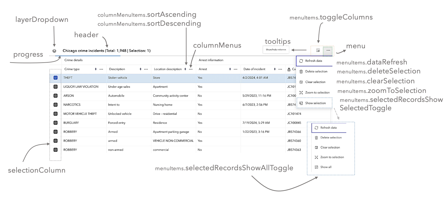
- Properties
-
optionalcolumnDescriptions Boolean
(Since 4.31) Indicates whether to display descriptions in the header cells of individual columns. Default value is
true.optionalcolumnMenus Boolean(Since 4.23) Indicates whether to display interactive menus in the header cells of individual columns. Default value is
true.optionalcolumnMenuItems Object(Since 4.30) The menu items within the column menu.
optionalheader BooleanIndicates whether to display the feature table's header information. Default value is
true.optionallayerDropdown Boolean(Since 4.30) Indicates whether to display the feature table's layer switch drop down menu. Default value is
false.optionallayerDropdownIcons Boolean(Since 4.32) Indicates whether to display layer-specific icons in the layer drop down menu. Default value is
true.optionalmenu BooleanIndicates whether to display the feature table's menu. Default value is
true.optionalmenuItems ObjectThe menu items within the feature table menu.
- Specification
-
optionalclearSelection Boolean
Indicates whether to display the
Clear selectionmenu item. Default value istrueand will display within the menu if any rows are selected.optionaldeleteSelection Boolean(Since 4.25) Indicates whether to display the
Delete Selectionmenu item. Default value istrueand will display ifeditingEnabledistrueand enabled on the feature service and rows are selected.optionalexportSelectionToCSV Boolean(Since 4.31) Indicates whether to display the
Export selection to CSVmenu item. Default value istrueand will display if rows are selected. Geometry is included in the final export if the layer's geometry is of type point.optionalrefreshData BooleanIndicates whether to display the
Refresh datamenu item. Default value istrue.optionalselectedRecordsShowAllToggle Boolean(Since 4.23) Indicates whether to toggle between showing only selected records in the table to showing all of the records. Default value is
true.optionalselectedRecordsShowSelectedToggle Boolean(Since 4.23) Indicates whether to display the
Show selected recordsmenu item. Default value istrueand will display within the menu if any rows are selected.optionaltoggleColumns BooleanIndicates whether to enable toggling column visibility within the menu. Default value is
true.optionalzoomToSelection Boolean(Since 4.23) Indicates whether to display the
Zoom to selectedmenu item. Default value istrueand will display within the menu if any rows are selected.
optionalprogress Boolean(Since 4.30) Indicates whether to display the progress indicator when the table is querying or syncing data. Default value is
true.optionalselectionColumn BooleanIndicates whether to display the selection column in the table. Each row has a checkbox that selects its corresponding feature. Default value is
true. If working with a map, make certain to set theFeatureTable.viewproperty as this enables highlighting the corresponding feature.optionaltooltips Boolean(Since 4.30) Indicates whether to display the tooltip for the Show/hide columns button. Default value is
true.
Event Overview
| Name | Type | Summary | Class |
|---|---|---|---|
|
|
{type: "cell-click",feature: Graphic,fieldName: String,index: Number,native: MouseEvent|PointerEvent|KeyboardEvent,objectId: Number|String} |
Fires when a cell within the table is clicked. |
FeatureTable |
|
|
{type: "cell-dblclick",feature: Graphic,fieldName: String,index: Number,native: MouseEvent|PointerEvent|KeyboardEvent,objectId: Number|String} |
Fires when a cell within the table is double-clicked. |
FeatureTable |
|
|
{type: "cell-keydown",feature: Graphic,fieldName: String,index: Number,native: MouseEvent|PointerEvent|KeyboardEvent,objectId: Number|String} |
Fires when a key is pressed down within a cell in the table. |
FeatureTable |
|
|
{type: "cell-pointerout",feature: Graphic,fieldName: String,index: Number,native: MouseEvent|PointerEvent|KeyboardEvent,objectId: Number|String} |
Fires when the mouse pointer is moved out of a cell within the table. |
FeatureTable |
|
|
{type: "cell-pointerover",feature: Graphic,fieldName: String,index: Number,native: MouseEvent|PointerEvent|KeyboardEvent,objectId: Number|String} |
Fires when the mouse pointer is moved over a cell within the table. |
FeatureTable |
|
|
{type: "column-reorder"} |
Fires when a column is reordered via drag-and-drop. |
FeatureTable |
Event Details
-
Since: ArcGIS Maps SDK for JavaScript 4.30FeatureTable since 4.15, cell-click added at 4.30. -
Fires when a cell within the table is clicked.
- Properties
-
type String
The type of cell interaction event.
The value is always "cell-click".
optionalfeature GraphicThe feature associated with the cell.
optionalfieldName StringThe field name associated with the cell.
optionalindex NumberSpecifies the index of the row (not just the individual cell).
optionalnative MouseEvent|PointerEvent|KeyboardEventThe native event object used for the interaction.
optional The object ID of the feature associated with the cell.
Example// This snippet removes the selection column and adds an event listener // which toggles the selection of a feature when a cell is clicked. featureTable.visibleElements.selectionColumn = false; featureTable.on("cell-click", (event) => { if (featureTable.highlightIds.includes(event.objectId)) { featureTable.highlightIds.remove(event.objectId); } else { featureTable.highlightIds.push(event.objectId); } });
-
Since: ArcGIS Maps SDK for JavaScript 4.31FeatureTable since 4.15, cell-dblclick added at 4.31. -
Fires when a cell within the table is double-clicked.
- Properties
-
type String
The type of cell interaction event.
The value is always "cell-dblclick".
optionalfeature GraphicThe feature associated with the cell.
optionalfieldName StringThe field name associated with the cell.
optionalindex NumberSpecifies the index of the row (not just the individual cell).
optionalnative MouseEvent|PointerEvent|KeyboardEventThe native event object used for the interaction.
optional The object ID of the feature associated with the cell.
-
Since: ArcGIS Maps SDK for JavaScript 4.30FeatureTable since 4.15, cell-keydown added at 4.30. -
Fires when a key is pressed down within a cell in the table.
- Properties
-
type String
The type of cell interaction event.
The value is always "cell-keydown".
optionalfeature GraphicThe feature associated with the cell.
optionalfieldName StringThe field name associated with the cell.
optionalindex NumberSpecifies the index of the row (not just the individual cell).
optionalnative MouseEvent|PointerEvent|KeyboardEventThe native event object used for the interaction.
optional The object ID of the feature associated with the cell.
Example// The following snippet listens for the Enter key to be pressed within a cell and zooms // to the feature associated with the row. featureTable.on("cell-keydown", (event) => { if (event.native.key === "Enter") { view.goTo(event.feature); } });
-
Since: ArcGIS Maps SDK for JavaScript 4.30FeatureTable since 4.15, cell-pointerout added at 4.30. -
Fires when the mouse pointer is moved out of a cell within the table. This event is useful for scenarios highlighting for things like highlighting a feature in the view, while hovering, without requiring manual interaction to select a row. Another example: these events can also be used to show information about the cell in a tooltip attached to the mouse.
- Properties
-
type String
The type of cell interaction event.
The value is always "cell-pointerout".
optionalfeature GraphicThe feature associated with the cell.
optionalfieldName StringThe field name associated with the cell.
optionalindex NumberSpecifies the index of the row (not just the individual cell).
optionalnative MouseEvent|PointerEvent|KeyboardEventThe native event object used for the interaction.
optional The object ID of the feature associated with the cell.
-
Since: ArcGIS Maps SDK for JavaScript 4.30FeatureTable since 4.15, cell-pointerover added at 4.30. -
Fires when the mouse pointer is moved over a cell within the table.
- Properties
-
type String
The type of cell interaction event.
The value is always "cell-pointerover".
optionalfeature GraphicThe feature associated with the cell.
optionalfieldName StringThe field name associated with the cell.
optionalindex NumberSpecifies the index of the row (not just the individual cell).
optionalnative MouseEvent|PointerEvent|KeyboardEventThe native event object used for the interaction.
optional The object ID of the feature associated with the cell.
-
Since: ArcGIS Maps SDK for JavaScript 4.31FeatureTable since 4.15, column-reorder added at 4.31. -
Fires when a column is reordered via drag-and-drop.
- Property
-
type String
The type of table interaction event.
The value is always "column-reorder".