 Hide Table of Contents
 Analysis
 Dynamic Layers
 Editing
 Feature Layers
 Feature Table
 Graphics
 Map
Map
 Mobile
 Online and Portal
 Popups and Info Windows
 Query and Select
 Renderers, Symbols, Visualization
 Search

Explore in the sandbox
Open in CodePen
View live sample
Description
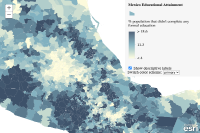
This sample demonstrates how to generate a relationship renderer to explore the potential relationship between two numeric attributes. This is done by calling the smartMapping.createRelationshipRenderer() method. This sample also demonstrates how you can change the labels, rotation, and colors of the associated legend depending on the information you're trying to convey.
This visualization is commonly known as a bivariate choropleth visualization, which classifies each variable in either 2, 3, or 4 classes along separate color ramps. One of those ramps is rotated 90 degrees and overlaid on the other to create a 2x2, 3x3, or 4x4 square grid. The x-axis indicates the range of values for one variable, and the y-axis indicates the range for the second variable. The squares running diagonal from the lower left corner to the upper right corner indicate features where the two variables may be related or in agreement with one another.
The lower right and upper left corners indicate features where one field has high values and the other field low values and vice versa.
Keep in mind that even if you observe a positive relationship between the two variables of interest, it doesn't mean they are statistically correlated. It also doesn't imply the presence of one variable influences the other. Therefore, this renderer should be used judiciously with some prior knowledge that two variables may likely be related.
Code
<!DOCTYPE html>
<html>
<head>
<meta charset="utf-8">
<meta name="viewport" content="initial-scale=1,maximum-scale=1,user-scalable=no">
<title>Relationship Renderer</title>

<link rel="stylesheet" href="https://js.arcgis.com/3.46/esri/css/esri.css">
<link rel="stylesheet" href="https://js.arcgis.com/3.46/dijit/themes/claro/claro.css">

<style>
  html, body, #map {
    padding: 0;
    margin: 0;
    height: 100%;
    width: 100%;
  }
  #menuDiv{
    z-index: 65;
    top: 0px;
    right: 0px;
    position: absolute;
    max-width: 280px;
    opacity: 0.9;
    background-color: whitesmoke;
    padding: 10px;
  }
</style>

<script>
  var dojoConfig = {
    has: {
      "esri-featurelayer-webgl": 1
    }
  };
</script>

<script src="https://js.arcgis.com/3.46/"></script>

<script>
require([
    "esri/map",
    "esri/layers/FeatureLayer",
    "esri/renderers/smartMapping",
    "esri/styles/relationship",
    "esri/dijit/Legend",
    "esri/dijit/PopupTemplate",
    "dojo/domReady!"
  ],
  function(
    Map,
    FeatureLayer,
    smartMapping,
    relationshipStyles,
    Legend,
    PopupTemplate
  ) {

    // create relationship Renderer

    const map = new Map("map", {
      basemap: "gray-vector",
      center: [-97.29614, 19.54323],
      zoom: 6
    });

    const url = "https://services.arcgis.com/V6ZHFr6zdgNZuVG0/ArcGIS/rest/services/Mexico_demographics/FeatureServer/0";

    // Create new feature layer pointing to service with educational
    // attainment data by city and assigns it a PopupTemplate

    const layer = new FeatureLayer(url, {
      outFields: [ "NAME", "EDUC01_CY", "EDUCA_BASE", "AVGHHSZ_CY" ],
      infoTemplate: new PopupTemplate({
        title: "{NAME}",
        description: "{EDUC01_CY} people in this municipality didn't complete any formal education.",
        fieldInfos: [{
          fieldName: "EDUC01_CY",
          label: "Population without formal education",
          format: { places: 0, digitSeparator: true }
        }, {
          fieldName: "EDUCA_BASE",
          label: "Total population"
        }, {
          fieldName: "AVGHHSZ_CY",
          label: "Average household size"
        }]
      })
    });

    // Add the layer to the map
    map.addLayer(layer);
    map.on("load", selectFields);

    let relationshipParams;

    /**
     * Sets the remaining parameters for the renderer and selects the
     * fields to use for generating predominance based on the selection
     * from the drop down menu.
     */
    function selectFields(){

      relationshipParams = {
        field1: {
          field: "EDUC01_CY",
          normalizationField: "EDUCA_BASE"
        },
        field2: {
          field: "AVGHHSZ_CY"
        },
        layer: layer,
        basemap: "gray-vector",
        classificationMethod: "natural-breaks",
        numClasses: 3,
        showOthers: false,
        focus: "HH"  // rotates the legend like a diamond. Set to null to make it a square
      };

      const schemes = relationshipStyles.getSchemes({
        theme: "default",
        basemap: "gray-vector",
        geometryType: "polygon",
        numColors: relationshipParams.numClasses
      });

      addOptions(schemes);

      // Creates the predominance renderer
      smartMapping.createRelationshipRenderer(relationshipParams)
        .then(applyRenderer);
    }

    /**
     * Creates the select for changing the color scheme.
     */
    function addOptions(schemes){
      const selectElem = document.getElementById("schemes");

      const option = document.createElement("option");
      option.value = "primary";
      option.text = "primary";
      selectElem.appendChild(option);

      const secondarySchemes = schemes.secondarySchemes;
      const primaryScheme = schemes.primaryScheme;

      secondarySchemes.forEach(function(scheme, i){
        const option = document.createElement("option");
        option.value = i;
        option.text = "secondary " + (i+1);
        selectElem.appendChild(option);
      });

      selectElem.addEventListener("change", function(event){
        const selection = event.target.value;
        relationshipParams.scheme = selection === "primary" ? primaryScheme : secondarySchemes[parseInt(selection)];
        smartMapping.createRelationshipRenderer(relationshipParams)
          .then(applyRenderer);
      });
    }

    // Create a legend

    const legend = new Legend({
      map: map,
      layerInfos: [{
        layer: layer,
        title: "Mexico Educational Attainment"
      }]
    }, "legendDiv");
    legend.startup();

    const showDescriptiveLabelsElement = document.getElementById("descriptive-labels");

    showDescriptiveLabelsElement.addEventListener("change", function(event){
      const renderer = changeRendererLabels(layer.renderer, showDescriptiveLabelsElement.checked);
      layer.setRenderer(renderer);
      layer.redraw();
      legend.refresh();
    });

    // Applies the generated renderer to the feature layer
    function applyRenderer(response){

      const renderer = changeRendererLabels(response.renderer, showDescriptiveLabelsElement.checked);
      layer.setRenderer(renderer);
      layer.redraw();

      if(!layer.visible){
        layer.setVisibility(true);
      }

      legend.refresh();
    }

    /**
     * Changes the labels and orientation of the relationship legend.
     *
     * @param {module:esri/renderers/UniqueValueRenderer} renderer - An instance of a relationship renderer.
     * @param {boolean} showDescriptiveLabels - Indicates whether to orient the legend as a diamond and display
     *   descriptive labels. If `false`, then the legend is oriented as a square with numeric labels, similar to
     *   a chart with an x/y axis.
     *
     * @return {renderer} - The input renderer with the modified descriptions and orientation.
     */
    function changeRendererLabels(renderer, showDescriptiveLabels){

      const numClasses = renderer.authoringInfo.numClasses;
      const field1max = renderer.authoringInfo.field1.classBreakInfos[ numClasses-1 ].maxValue;
      const field2max = renderer.authoringInfo.field2.classBreakInfos[ numClasses-1 ].maxValue;

      renderer.infos.forEach(function(info){
        switch (info.value) {
          case "HH":
            info.label = showDescriptiveLabels ? "Large Households<br>Not formally educated" : "";
            break;
          case "HL":
            info.label = showDescriptiveLabels ? "Small Households<br>Not much education" : Math.round(field1max * 100) + "%";
            break;
          case "LH":
            info.label = showDescriptiveLabels ? "Large Households<br>Formally educated" : field2max;
            break;
          case "LL":
            info.label = showDescriptiveLabels ? "Small Households<br>Not formally educated" : 0;
            break;
        }
      });

      renderer.authoringInfo.focus = showDescriptiveLabels ? "HH" : null;

      return renderer;
    }
  });
</script>
</head>

<body class="claro">
  <div id="map"></div>
  <div id="menuDiv">
    <div id="legendDiv"></div>
    <div id="select-div">
      <input type="checkbox" id="descriptive-labels" checked> Show descriptive labels<br>
      Switch color scheme: <select id="schemes"></select>
    </div>
  </div>
</body>

</html>